After the release of my Catalog Quick Pick plugin for Apple’s Backup application, I had a request for two more Quick Picks, so I whipped them up and updated the full archive. Easy peasy.
Thanks to David Watanabe for his improvements to the NewsFire RSS Quick Pick. A new version has been posted along with three new Quick Picks for ecto, Transmit and Linotype’s FontExplorer X.
Like most people, in practice I don’t end up backing up my system as often as I should. Knock on wood — I haven’t ever really been bit badly by this.
That said, the latest version of Backup included with my .Mac account has inspired a new sense of purpose in making backups and really utilizing all that storage space included with the account. Sure I used it before, but certainly not enough to feel like I was making the most of the service.
So, in the hopes of kicking my own butt and hopefully one day saving my bacon, I’ve put together a few Quick Pick plug-ins for Backup 3 which I’m making freely available to anyone who wants them.
Ah, the thing I missed yesterday… Right. Easy as pie. Unzip the archive and drop the Quick Pick file(s) into /Library/Application Support/Backup/QuickPicks/. I could build an installer for all this, but I don’t think it’s necessary or worth the effort.
If you can think of something else you’d like a Backup 3 Quick Pick for, drop a note in the comments. I’ve got a few more ideas cooked up, but this is good for now. Enjoy!
I had 10 seconds to spare today and decided to whip up a quick Backup 3 plug-in to backup my Catalog disc database. It was partially an excuse to see how easy it was and an excuse to skip out on doing real work for a few minutes and let my mind unwind.
It’s so easy to get Quick Picks working that I may have to write a few more of them so I can really get my money’s worth out of my .Mac account. If I do and they’re useful to others, I will certainly post them here for your downloading pleasure.
Reading Jakob Nielsen’s Alertbox for September 19th this morning got me thinking about something which has always bothered me with web applications and web forms in general. Jakob mentions the problem of scrunched screen elements and effective use of screen real-estate often being a problem with web forms.
In particular, he refers to avoiding drop-down menus and scroll lists by instead using lists of selectable items where “all items are visible simultaneously” to reduce errors and make selection more immediate. This made that little lightbulb over my head start flashing repeatedly…
One of the biggest annoyances with web forms for me typically rears its ugly head when faced with an e-commerce transaction and having to select a state/province or country from an excessively long drop-down menu. Raise your hand if you also find this annoying and tedious.
Some might argue that you can get around this by using a standard input field as some do. Yes, but then you have to deal with the problem of spelling and possibly abbreviations. So what’s a web geek to do?
An Answer?
What if the best solution was a combination of the two approaches? A simple text field with the capability to autocomplete based on user entry?
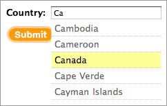
An example country selection autocomplete form field
Rather than force the user to scroll through a really long list, let them type the first few letters and choose from a much shorter list of options (or a single option depending on what they entered).
This approach would permit you to check against a list of common abbreviations, country codes, misspellings and still be able to deliver a useful, intuitive and responsive interface with less errors and more completed transactions.
Perhaps the most significant downside to this approach is that there are still massive numbers of users using antiquated browser software which is incompatible with “Web 2.0” DOM scripting and AJAX.
Nevertheless, given that we have wonderful technologies such as Rails, Behaviour and Script.aculo.us to help solve such design problems and for creating innovative web applications I’m a little surprised I haven’t seen anyone really try to tackle this issue in a new way. I can’t possibly be the first to consider this, can I?
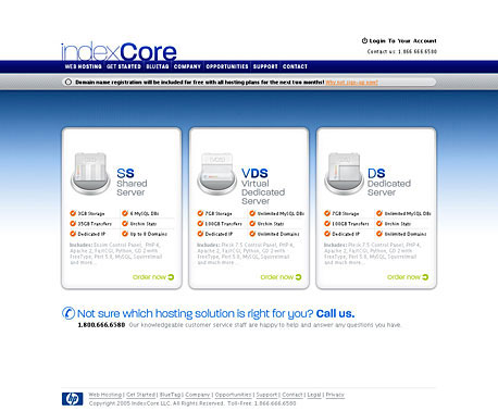
Wishingline Design Studio, Inc. has been working with Virginia-based newcomer web hosting provider IndexCore since August to redesign their existing public facing website and give it a fresh, cohesive and contemporary facelift. During that time we have worked with them to create what we see as an approachable and user-friendly design that will lend itself well to “Web 2.0” technologies such as Ajax.
IndexCore (IC) homepage design screenshot
A total of 46 different base screens were designed using an overall visual framework along with a series of custom-designed icons, buttons and an easy-to-follow, user-friendly order process which will allow the user to see exactly where they are in the order process when signing up for a hosting account.
At this time we are pleased to announce that the site design is now complete and ready to enter the code development stages, though due to previous project commitments, Wishingline Design Studio, Inc. will not be handling that aspect of the project. The final site launch is expected sometime in October.
For more information, visit the IndexCore website.
Thanks to Thomas Marban who found our site inspirational enough to list it on the wonderful (and even more inspiring) Screenspire site. It’s an honor to be featured amongst such good company.
There’s a major revision on the books so expect to see some changes around these parts sometime before next year’s May 1st CSS Reboot. At least that’s the plan ;)