The new Masterfile.com site is live and happily purring away. All that hard work, sweat, blood and lost/gray hair was worth it. Seeing as how this was a much larger undertaking than we anticipated I think it’s worthwhile to discuss the point and the process.
Starting Points
We’ve known this was coming for some time now, but the project didn’t really hit our desks until around six or seven weeks ago when we started to get glimpses of what was coming from the designers that were hired to take care of the company identity and re-branding work. They were also given an opportunity to help re-skin the website; to give it a fresh coat of paint.

At the time they were told that they couldn’t really change anything too drastically. The site works and is respected throughout the stock industry as one of the best. I’d say it’s in the top two, but I’m a little biased.
The site also has some of the best and most intelligently implemented features. Doing any damage to that — making the site any less usable was not an option. The equation we like to use comes from Ole Eichhorn’s Critical Section site and goes like this:
W=UH
Where, W=wrongness, U=ugliness and H=hardness. In plain English, this means: “if something is ugly or hard, it’s wrong”. In the world of software development and web design, we should all hold this to be true. This is our internal mantra at least and our task has been to ensure that the site is never any less usable than in a previous incarnation. I, and numerous clients and people outside the development team who have used the new site seem to agree that we succeeded in that aim.
Overall Goals and Expectations
The site changes are just a part of the overall re-branding project previously mentioned. The first step was the introduction of the new corporate identity, new stationary, marketing collateral, magazine advertisements (see the back covers of the current issues of HOW Design, Print and other popular industry publications) and re-establishing the company culture to be more reflective of the employees. Although the official launch is not until later this week, pieces of this have started to make their way out into the world.
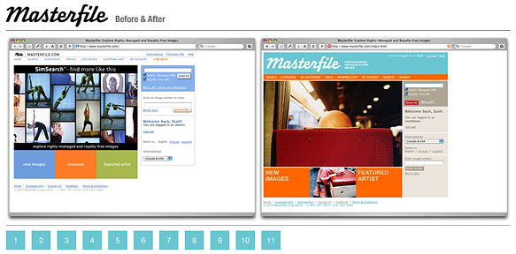
In discussions to get a grasp on the task of actually doing the work of re-skinning the website, we were told the point of the design changes to the website were focused around colour. The previous site was about photos and making them as prominent as possible while lessening the impact of everything else. This makes sense from a business point of view since that’s what the company sells. Getting in the way of users looking at photos is bad. This is still true, but now we’re reintroducing the idea of colour back into the site design to make the site more vibrant, to improve visibility of features and to improve usability.
The new design and identity are more representative of the company and its internal culture. Based on the old identity and site, you might think that from a culture point of view that Masterfile was a bit stuffy, old-school and took itself a little too seriously. On the contrary. The company is primarily made up of younger, creative employees who work hard and are knowledgeable and passionate about photography and design. So the new identity — which is funky, playful, and a little retro fits the bill. The web site also needs to express that same idea.
Site Changes Recap (Or The Things We Did To Make This Happen)
While this could easily be a long, drawn out and technical explanation of the things we did to get from where we were to where we are now with the site, but (for now) I’m going to keep it reasonably brief.
One of the notable goals we had with the new site was to make it possible to re-colour the site. CSS to the rescue! The catch — nearly 30 localized languages along with a fair bit of legacy code still using nested tables and other un-semantic markup. The plan is to switch up the site colours every so often to keep it fresh and fun. If you don’t like the current colour scheme, maybe you’ll like the next one better.
Compatibility is important and we had to make sure the site worked reasonably well in as many browsers as possible. In doing this though we had to be realistic and some browser stats helped us stay focused on the particular browsers we needed to target.
Yes, there are small quirks and inconsistencies in the new design, but upgrading to new(er) browsers clears up most or all of these issues. It’s also likely a number of these quirks are font-related issues for which there’s not much we can do. Our CSS font stack was designed to help minimize these issues and was based on research, but unfortunately there’s not really a good way to accommodate every possibility and permutation. Why can’t everyone just use Firefox or Safari :)
Other things we did to help the overall site usability based on research and user testing was to automatically select the search field so it’s ready for input when the user loads the page, completely reorganizing the information pages and updating the help documentation.
We also reworked the visual hierarchy of the pages by more effectively using page header styles and providing the utility boxes (Search, Categories, Lightboxes, Last Searches, etc.) with clearly defined headings to make them more easily identifiable. They were also re-skinned to be more visually neutral and not “in your face” so that they’re visible but not in the way. This is one of my personal favourite features.
A new price icon was added below image thumbnails for North American users allowing quick access to pricing information (RM calculator or RF pricing) via the enlarged image preview. This functionality is not available for international clients since certain collections are not available in all countries.
We also looked at how we could lighten the load of the site itself by reducing the sheer number of image assets required throughout the site design. Part of this was accomplished by moving to text-based site navigation (an unordered list) and using transparent images for buttons, leaving much of the actual visual styling to the CSS instead. With roughly 30 international versions of the site, the number of images that require changes quickly grows exponentially and time is better spent improving the site or adding new features rather than modifying image assets. We expect that users would tend to agree.
Other Little Bits
Of course there were lots of little things. We’ve probably forgotten half of the them, but here’s just a few.
- Link colours added (Active, Hover, Visited)
- Improved text-based tabs
- Simplification of the overall page layouts
- General code cleanup and validation improvements (still lots of room for improvement here)
- Static information pages moved to XHTML transitional from HTML 4
- Improved the underlying structural hierarchy of static content
What’s Next?
At the moment we’re in bug fix mode and preparing for the inevitable 1.0.1 release sometime in the near future. I doubt we’ll get everything, but we’re working on it. The major issues will be dealt with and lingering smaller issues will be logged in the bug database.