CSS can be a really great thing for web-based application design and development. At the same time it can very restrictive, mostly due to cross-browser compatibility and standards-compliance (or lack thereof). To this point, one of my big missions at Masterfile has been to help drive the site to be more standards-compliant, getting rid of some of the not-so-hot legacy front-end code and to slim down pages wherever possible.
Steps in that direction have been taken in the last few significant releases, but probably none more than the release which we just pushed out to the real world. This is not to say it’s perfect or that it’s 100% valid code, because it’s not — but it’s substantially closer than it ever was before.
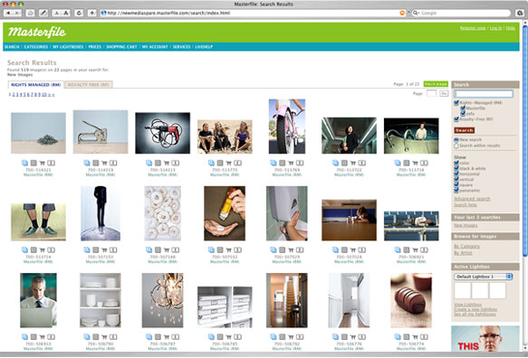
Better page structures and the removal of nearly all table-based structure allowed us to do something we think is pretty cool, and something that until the week following us presenting it to the president, no one had yet seen on a stock photo site. I nearly fell out of my chair when I saw someone had actually beaten us to it! In the time since then it appears to have vanished off that particular site (which shall remain nameless).
Floating Thumbs — Oh My!
So… what feature is this you ask? It’s a little something we like to call “floating thumbs” or “floating boxes”.
Conceptually it’s simple, and probably very obvious: floated DIVs inside a container. Stretch the contained wider and the DIVs rearrange themselves accordingly. Shrink the container and the DIVs rearrange themselves to fit the narrower space. In an attempt to keep things sane and from falling apart wherever possible, the min-width CSS property was used to restrict the content from collapsing in upon itself, at least in supported 5th generation browsers such as Safari and Firefox.
Watch a Floating Thumbs Demo Movie (Requires QuickTime)
The floating thumb technique works beautifully and consistently in officially supported browsers. During development and prototyping, the tricky part was making it work with a statically positioned sidebar that is locked to the right side of the window. I spent a few weeks prototyping this and ended up using some additional DIVs as containers to keep everything happy, but thankfully it degrades nicely and didn’t add significant weight or complexity to the code.
But why did we do this?
In visiting with clients and doing some site statistics analysis we discovered a large proportion of visitors were using large monitors with higher screen resolutions. Considering a large portion of the market Masterfile serves are creative-type people and organizations, this made perfect sense.
We looked at the UI and knew that we weren’t doing enough to help these people see as many images as possible on the screens due to the design being limited to a fixed-width column (due mostly to the previous table-based layouts). Moving towards a fluid, standards-based page layout let us offer users a better experience without needing to set preferences or without needing any complex interactions. Just resize the browser window. For users with 20-30 inch displays, the net effect of this is enormous.
Making it easy and painless was the key. Not forcing the user to have to change settings somewhere and then making it difficult to revert back if they don’t like it will aid in adoption of the feature. It’s something simple and we know users will appreciate it.