Content. It’s the thing that gives people a reason to go anywhere beyond the homepage on your site. It’s a big reason why people visit a site in the first place and it’s still amazing the number of clients that do not understand that.
Designing around the content
In starting work on the Wishingline Design Studio, Inc. site and generally any project, my own methodology starts by mapping out preliminary content which allows me to take into consideration site architecture and design elements. Aside from providing structure, and ensuring work is on-strategy, our job as designers is to make content both visually appealing and readable. Not knowing what the content will be greatly affects design decisions. It should at least.
What information does the client want to make available? How should it be organized? What parts are simple, small and fairly static (unchanging) and what parts are likely to grow and expand? Will there be long passages of text, possibly spanning multiple pages (or long individual pages)? Where will images, flash and other multimedia content be used for more than decoration? Will there be content that appears in multiple places on the site?
In organizing site content I like to start using a flat hierarchy; that is, no hierarchy and then start to tie pieces together. Are there things that belong in more than one place? Sticky notes can be a real time-saver here. Low-tech often works best at this point.
Create meaningful primary categories that will become your first level hierarchy and work your way down. Do things need to be separated out further? For example, if you’re maintaining a news archive, does it make sense to organize the archived content by year? By month? Some other way? At all? Some sections may be flat (no sub-categories) and others may result in multiple levels. This is where you should start thinking long-term about maintenance and future redesigns.
When structuring your content, try to keep in mind what the user will have to do to actually find and get to the content. Make it as easy as possible. Complex hierarchies are often a deterrent for less savvy users because it’s easy to get lost. Typically I refer to Microsoft’s site as an example of this. I always get lost myself anytime I need to look for information there.
Determining such things before putting pencil to paper or fingers to keys can save you in the long run. What I mean is, try to avoid writing or designing anything until you know how content will be organized and fit together.
Cut from the same cloth?
In general I’ve found most designer or agency sites follow a fairly common structure in terms of content. There are things that a site must have along with others that could fall under the nice to have banner. There should be information on the business itself — what it does, who is behind the business, philosophies and strategies along with a portfolio of work, or case studies. Exactly what content is needed is up to you, the designer and the client. Thankfully this is easier if you’re your own client ;-)
More and more agencies and freelancers are also adding blogs to their sites to better communicate to clients, peers and attract new potential clients. A blog can also act as a great marketing tool to get your name out into the world. Just look at a high-profile agency such as Coudal Partners who does just that. In my case, I started backwards — starting with the blog and working out, building the informational side of the site second. My mother’s always said I was a little backwards. Hi mom!
Taxonomy
Another often overlooked component of the content process is taxonomy. What are things going to be called? Are you going to use consistent labelling throughout the site? Are labels clear and understandable by the user? For many users it’s unsettling to look at unusual site taxonomies and know what to do.
Unusual labelling can lead to users shaking their heads, getting frustrated and giving up, probably never to return. That’s bad for business. All is not lost though. An unusual taxonomy can be made usable but providing users with additional hints in the HTML using title attributes, alt tags, or rollovers whenever possible. Make icons clear and easily identifiable. Some visual icons are easily recognizable (eg. print — usually a printer icon) while some may be more abstract or difficult to instantly recognize.
As an example — labelling your design portfolio as just that, you’re less likely to confuse a user than if you were to label it “catalogue”. Some users will explore but many do not have the time, patience or willingness to learn your taxonomy and explore. Clarity is often better for the user experience than simply being clever. Generally the idea is not to confuse or confound the user but rather to engage and delight them.
Depending on the needs of your site or a project, creating a taxonomy guide could be a helpful document to ensure consistent and easily identifiable labelling.
Know your audience
When mapping out content it’s also good practice to begin with a reasonable understanding of your target audience. Who are you trying to communicate with? What is important to them? What information do they want and expect from you? What tone should the writing use? Funny? Serious? Playful and creative?
Content is just one of the hooks that gets people coming back to your site, but if the content is boring or not on strategy, you may miss the boat. This means speaking to your audience (and not speaking down to them). It means engaging them and giving them a reason to return.
The most universal hook is humour. Make people laugh or chuckle and they’re more likely to stay interested than if you take the dry and uninteresting corporate-speak route. In many cases that is what is required though; but there are still ways to keep content lively and interesting.
Mapping and architecture
Mapping out the content may mean putting together a rudimentary sitemap diagram or perhaps a more complex one showing how pages interrelate to each other or by indicating where different types of content fit into page layouts. It can also be useful to indicate where modular code such as “includes” are used by creating page schematics.
Why would you want to map out your site and content? Planning up front will save you time in the end; trust me. If you’ve thought through the problem, the solution will be easier to manage and implement and you’ll be less likely to second-guess yourself. Second-guessing means re-work, and no one likes re-work. Not me anyway.
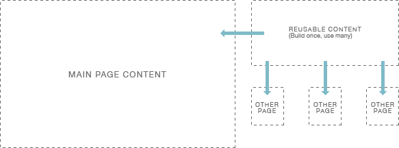
A good example of this would be writing a contact form more than once if you’re going to potentially re-use the same code in a number of different places. The key here is finding those bits and reusing them as “includes”. Consider how the final pages will be structured. This will allow you to develop code in a way that makes using these include files easy and in a way that can accomodate subtle differences in different contexts throughout a site. Don’t repeat yourself.
A simple, real-world example is the calendar displayed in the sidebar of this site (at is exists today). This is a single index template in Movable Type which is included in other templates where required. The code is not repeated in multiple places. Instead a single line of code adds that external template code into others which makes maintenance and troubleshooting easy.
Wrapping Up
Hopefully by this point you’ve got a few ideas on how to get organized and think about site organization and structure. The key for much of this is to put yourself in the shoes of the user and look at things from their perspective. It’s about the experience. Make it a good one.