One of the challenges with any design project is selecting an appropriate colour palette. It’s often overlooked; an afterthought for web projects when perhaps it should be one of numerous driving forces.
Colours each have their own meanings or associations, and the options for choosing the right ones to use — past experience and colour knowledge, sampling photographs/illustrations, colour swatches, magazines, visits to local paint stores, going for a walk in the park, or even using one of the myriad of web-based colour tools such as the Behr’s EXPLORE Colour Tool are virtually unlimited. The method of selection isn’t important, but the output is.
Colour choices can be equally as important as the visual aspects of a design itself. Poor colour choices can destroy beautiful designs causing viewers to move on rather than take valuable time to absorb the content or message. In the same vein as using the wrong colours, too much or too little colour may have the same effect.
For example, if you were looking to evoke feelings of calm, serenity and a sense of something being “classic”, you wouldn’t necessarily choose red as your primary colour. Instead you might look at greens, blues and whites since green traditionally symbolizes nature, freshness, harmony and safety. Blue is stability, depth, trust, and wisdom. White is light, goodness, purity and is considered to be the colour of perfection.
Most sites start with primary and secondary colours, often drawn from a company identity or set of visual brand guidelines. Tertiary colours are often used to add complexity to the colour palette — as accents or to draw attention to parts of the site. Well thought out choices can pull viewers in, grab attention and trigger the desired emotional response. Throw in some good typography and you’ll really be on your way.
Choosing colours for the web
In the early days of the web (mid-to-late 90’s) designers were more restricted with regard to colour choices due to limitations in what could be expected on the viewer’s end. Large displays capable of rendering millions of colours was not the norm as they are now. Today the majority of users have more powerful computers with larger, brighter displays capable of moving the industry beyond imagery restricted to the Web colour palette. The internet, like the real world can be a colourful place.
At this point in time, millions of colours and 1024×768 resolution are taken to be the lowest common denominator though there’s still reason to take into account users with smaller, lower resolution display capabilities. It’s safe to export GIF images using the Adaptive colour palette, along with a trend towards using 24 bit PNG images which also support full alpha transparency and improved colour fidelity despite a lack of full support in Internet Explorer 6.
When selecting colours to use, bear in mind the gamma differences between Windows and the Mac. Colours typically look darker on Windows-based computers than they do on the Mac. There’s a option in Photoshop that help you get a better idea of what your images and colour selections will look like on a PC and I highly recommend making use of it.
Complexity By Design
The thing which typically separates small-frys from the bigwigs in terms of colour decisions really comes down to complexity. This means selecting a palette which is both complementary but also offers a degree of contrast and variety. This means not using only blue and orange or red and green — it may mean adding magenta, brown, yellow or some other colour to provide additional visual interest.
A handful of good examples of this in my opinion can be seen on sites such as Terminus 1525, Masterfile, Basecamp and of course Apple, just to name a few. Doug Bowman’s Stopdesign site another great example of the use of colour complexity in design. Doug is consistent in his colour choices but with adds complexity with his use of accent and highlight colours to divide content and provide a sense of navigational space.
Using The Colour Palette
Colours can be used to liven up otherwise stark designs, to call attention to items, or may be the focal point of the design itself. The use of colour is dependent on the needs of the design and the intentions of the designer. Do the colour choices add to or detract from the underlying message? For example, photography sites are often stark in terms of their use of colour because of the affect it can have on the photographs themselves. In such cases, neutral (white, black or shade of gray) is usually better.
Web designers need to be concerned about colour for a number of reasons, but one of the more notable ones is that colour can be used to instruct users about how a site is structured or how it works. Link colours are a perfect example. Links can change colours when the user mouses over them, clicks on them or has visited a link. Interactions such as this subtly tell users something about how the site works, sets expectations and aids in learning.
Colour can be used to create logical sections for sites — use red as a primary colour for the ‘news’ section and ‘blue’ for the company info section for example. Wired used to do this on their site but recently removed the feature. See Stopdesign for an example of this in use.
But colour should not be used in a vacuum. Considerations should also be made to accomodate people who are colour blind or who may not be able to see all colours.
Making Intelligent Colour Choices
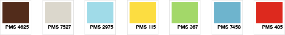
Although I haven’t talked much about what I’m planning for the Wishingline site throughout this article, but you can infer some ideas based on the colour swatches above (not finalized and may change dramatically). I’m still tinkering with the site’s primary and secondary colours; making sure everything is happy, harmonious and has the right balance of complexity and appeal.
Colour choices can be based on current trends, mood, meaning and on existing branding information, but whatever the case they should complement the design rather than detract from it. This means do not use a red background with blue type on it!
Start by picking one or two colours that complement each other then spread out from there choosing secondary and tertiary colours. Remember not to go overboard though — too many colours is somehow worse than not enough. I tend not to count shades of a base colour as colours in the palette, but whether you do is personal preference.
Serious Colour
If you’re really serious about colour, I can’t more highly recommend getting yourself a set of Pantone Colour Books — it’s one thing to see colours on screen, but it’s another entirely to see them on paper they way they’re often intended. Pantone offers a set which is both affordable and an excellent investment.
As an aside, do yourself a favour and read Dave Shea’s piece on CMYK for RGB designers if you haven’t already. It’s a good primer on CMYK, Spot and RGB colours, their differences and uses.
So say you…
hey, this post on colour couldn’t have come at a better time! as a photographer and programmer who is dabbling in design i really appreciated this review of how to approach colour in web design.
only thing, the link on the CMYK for RGB designers appears wrong?
thanks.
It was kind of odd timing, wasn’t it. I had one of Apple’s marketing e-mails last night which was also very much about colour. Must be spring coming along or something…
Oh, and thanks for the note on the broken link Alex. Should be fixed now. Sorry, must have missed that one during editing!
Hey great write up. I’ve been reading your site for some time now, mainly your Mac posts but this was great.
The Pantone colour books cost quite a bit a few years back and it looks like they have dropped the price for that reason. I’ll have a good look through the site. Fun Fact: Did you know the colour blue is an appetite suppressant?
Thanks, great post.
Thanks Ian. Glad you enjoyed the post. I did not know that blue was an appetite suppressant, but I will have to keep that in mind. I wonder if it’s all blues or just a particular range of shades. I would think darker blues would be more suppressive than lighter shades.
I read that’s the case because little to no food is actually blue thus your brain isn’t interested in it.