Back in early May I talked about what I dubbed ‘Sliding Door Buttons’. I’ve continued to evolve this technique to the point where it’s now behaving consistently across browsers and platforms.
The essence of the technique and the reasons behind its usefulness remain the same, but there are now some additional enhancements that I think add to the implementation and provide basic design features that might otherwise be difficult to achieve using other methods.
Code Structure
The HTML code required is slightly rearranged and helps work around some basic problems in the previous implementation. But before we talk about any specific changes to the CSS, let’s look at the basic structure of a sliding door button.
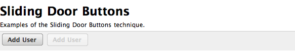
<div class="buttons">
  <a href="#" title="Add a new user" class="btn"><span>Add User</span></a>
</div>

<div class="buttons">
  <a href="#" title="Cancel" class="btn-disabled"><span>Cancel</span></a>
</div>
The surrounding div element with the class “buttons” is not necessary, it’s simply included as part of this illustration. The basic code is an anchor with a span element inside it. Simple? Yes. Clean. Yes. Do we have the hooks we need to style it? Yes.
The only real difference between this version and the previous one is that I’ve reversed the order of the span and anchor and which element has the button class applied to it.
The CSS
As mentioned in the first part, the basic idea behind these buttons builds on Doug Bowman’s Sliding Doors of CSS technique but rather than being focused on site navigation, we’re instead focusing on a common UI element, the button. The approach is essentially the same: use simple HTML elements, two images (one for the left side and another for the right) and allow the button to expand as necessary to accommodate longer text.
  * {margin: 0; padding: 0;}
  body {
    background: #fff;
    font-family: "Lucida Grande", Helvetica, Arial, sans-serif;
    font-size: 12px;
    line-height: 1.2;
    margin: 16px;
    text-align: left;
  }
  p {margin: 0.5em 0;}
  .buttons {
    background-color: #efefef;
    border-top: 1px solid #ccc;
    padding: 4px;
  }
  .btn, .btn-disabled {
    background-color: transparent;
    background-position: 0 0;
    background-repeat: no-repeat;
    font-size: 12px;
    font-weight: bold;
    padding: 5px 0 6px 8px;
  }
  .btn {background-image: url(images/btn_dark_left.gif);}
  .btn-disabled {background-image: url(images/btn_light_left.gif);}
  .btn span, .btn-disabled spam {
    background-color: transparent;
    background-position: top right;
    background-repeat: no-repeat;
    margin-left: -5px;
    margin-right: 8px;
    padding: 5px 12px 5px 8px;
  }
  .btn span {
    background-image: url(images/btn_dark_right.gif);
  }
  .btn-disabled span {
    background-image: url(images/btn_light_right.gif);
  }
  a.btn:link, a.btn:visited {
    color: #333;
    text-decoration: none;
  }
  a.btn:hover {color: #666; text-decoration: none;}
  a.btn:active {color: 001999; text-decoration: none;}
  .btn-disabled {color: #ccc; text-decoration: none;}
  a.btn, a.btn-disabled {
    display: table-cell;
    vertical-align: middle;
  }
The big change that helps resolve the consistency problem in the earlier implementation turned out to be very simple: use display: table-cell on the anchor element. For Windows IE, note that you’ll have to use display: inline-block since it’s the only browser to really support it (so far). You can do that simply with a conditional comment.
Following the example here, we could create as many variants as necessary with fairly minimal additions to the CSS code. To take it one step further, you could also add an inline image inside the space to add a simple icon to the button.
How To Create Disabled Buttons
The one real missing piece of the puzzle in terms of making the behaviour closer to a traditional input button is that we have no real way of disabling the button. It’s a link. It’ll always be a link. What we can do is use a bit of JavaScript magic to swap our sliding door button with a nulled button. In this case for the nulled button we remove the anchor and replace it with another span element (another inline element in HTML).
Here’s a quick example of this technique in action. I’m not demonstrating the JS swapping here. My suggestion there would be to look at Prototype for that sort of interactivity since it makes it very easy.
As before, I welcome your questions, comments and critiques. Simply drop a note in the comments.