Scott Boms

Our September 2009 Back Catalogue

Not the Same

I’ve always been a sucker for good cover songs. It might be that it’s a great way to learn about writing songs since it forces you to think about structure and how the nuances of a song sometimes really hold it together. They’re also just fun.

Not the Same cover artwork
Not the Same mixtape cover artwork

Most of the time covers follow the originals pretty closely, but on occasion they end up barely recognizable. It was with that in mind that I tossed together another digital mixed tape.

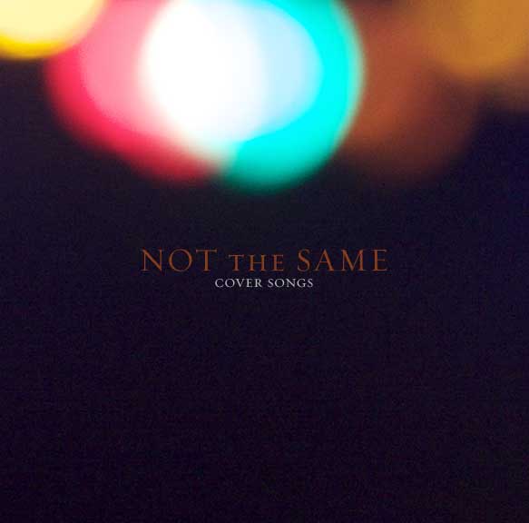
Download ‘Not the Same’ (83.9MB m4a bookmarked format)

  1. Power To The People - The Minus 5 (original by John Lennon) - A beefy, bouncy feedback-laden cover featuring R.E.M. guitarist Peter Buck.
  2. Raindrops Keep Falling On My Head - Ben Folds Five (original by Burt Bacharach) - Still as catchy as you remember — just wait for the fuzz bass and the crazy ending!
  3. Cortez The Killer - Matthew Sweet (original by Neil Young and Crazy Horse) - A resonably obscure live cover which I’ve had kicking around for years and that I still prefer over the original.
  4. I Want a New Drug - Apostle of Hustle (original by Huey Lewis and the News) - Probably the most oddball pick of the lot. A weird, groovy ride. The bridge solo guitar lick is worth the price of admission alone.
  5. Sister I’m a Poet - Colin Meloy (original by Morrissey) - Acoustic studio version from a rare 5 song EP released as part of a solo tour by the Decemberists frontman.
  6. Gouge Away - Hayden (original by The Pixies) - A very raw, growly 1996 B-side.
  7. Christmas Card from a Hooker in Minneapolis - Neko Case (original by Tom Waits) - I think the first time I heard this was in an extra curricular philosophy class I took in high school. The teacher had a thing for existentialism and Tom Waits.
  8. Please, Please, Please Let Me Get What I Want - She & Him (original by The Smiths) - A Smiths tunes plus indie darlings Zooey Deschanel and M. Ward is a combination that can’t go wrong.
  9. A Forest - Josh Rouse (original by The Cure) - A very odd song but a good one nonetheless. There’s at least one recording of my old band covering this floating around the internet too.
  10. Bad Time To Be Poor - The Weakerthans (original by The Rheostatics) - Let’s just call this my attempt at squeezing in a double shot of Canadian rock.
  11. One More Dollar - Glen Phillips (original by Gillian Welch) - A stripped down solo acoustic cover of a little folk tune by Gillian Welch and her partner David Rawlings.
  12. For What Reason - Emm Gryner (original by Death Cab for Cutie) - I forget when I clued in to what song this was but there’s something gripping about the sparseness of hearing it with a female voice and played entirely on piano.
  13. History Never Repeats - Eddie Vedder (original by Split Enz) - Lucky number 13. I suppose this is really only half a cover since both Neil and Tim Finn who wrote the song sing on it along with Eddie Vedder from Pearl Jam. It’s from a Pearl Jam fan club single in case you were wondering.

Bonus points if you can identify all the songs in medley of track 14 (unlisted — it’s a surprise).

Left on the cutting room floor were covers of David Bowie, Dolly Parton, Vic Chesnutt, The Beach Boys, The Flaming Lips, Rush, The Beatles, The Band, Richard Thompson and more — which perhaps suggests a Part Deux?

Any Other Type

For the last few weeks or so I’ve had the opportunity to tinker with the technology preview (beta) of Typekit. It’s been quietly in use on this site since the end of August.

Designers such as myself have wanted the ability to use real fonts on the web for years without the hair-pulling, potential accessibility and licensing issues of image replacement, sIFR, Cufon or other “hacks” (however clever, they’re still hacks — deal with it). We’ve also wanted to ensure type designers and distributors get paid appropriately so they can keep creating and making available great typefaces.

Typekit, as with other upcoming services such as Kernest and those from Ascender and Typoteque make this possible now by essentially levelling the playing field across browsers, providing pain-free implementation mechanisms and protecting designers from the messy business of licensing issues and ethical ramifications of distributing raw font files to browsers.

Typekit Kit Editor screenshot
A preview of the Typekit kit editor

So, what’s so good about Typekit? Why should designers care?

The Good

  • More fonts Specify fonts in CSS font stacks beyond the most commonly available fonts. Yay!
  • Creating Kits is easy Creating a “kit” — a selection of fonts, is simple and for the most part feels familiar; not unlike using a desktop font manager.
  • Easy to implement If you’ve used sIFR or had to deal with image-replacement techniques, you know how frustrating they can be. With Typekit, just add the Javascript code provided as part of a kit to your pages. The rest is just a matter or specifying fonts in your CSS as you would normally.
  • Browser support Through a little bit of magic Typekit works across platforms and browsers — even IE6. Personally I would be totally Ok if Typekit didn’t suppose IE6 (or even IE7) but it does so they get bonus points from me for being comprehensive.
  • Is a good Javascript citizen The Javascript used by Typekit, at least in my experience so far behaves well and doesn’t inadvertently stomp on other Javascript events.
  • Reliable The service itself seems like it was designed to scale from the start. By using a Content Delivery Network (CDN) instead of a centralized server, the service should be able to withstand very high loads, provide low latency and easily maintain 100% uptime which is appropriate for such a service.

The Less Good

Even though Typekit is a great service that will only get better with time, and although my experience using it has been flawless, there’s still room for improvements. The following would be on my list.

  • Even more fonts This is a no-brainer obviously. There’s a huge minefield of licensing and IP issues to sort out and understandably that takes time. The biggest issue with the fonts available now — which are largely from smaller foundries and independent type designers is probably that most designers don’t already have their own personal licences to use in comps or outside a browser.
  • Browsing is awkward Finding the right font to add to a kit can be tedious. Right now the only options for locating fonts is browsing the paginated listings or using the classification/tag filters. Adding the ability to browse alphabetical pages, additional categorizations or a more traditional search interface might help.
  • Weights and styles It’s not obvious what weights and styles are available for a given font unless you view the detail page for the font or add it to a kit and look at the Weights & Styles tab. Indicating the number of weights and styles in the listings would be a good place to start.
  • New additions Right now if new fonts are added to Typekit, there’s no obvious way for users to find them other than by browsing through the listings or perhaps by a mention in the Typekit newsletter. Without any inside knowledge it’s hard to speculate how often new fonts will be added to the service but I think it’s safe to assume new fonts will be added with some degree of regularity.
  • Requires Javascript This really isn’t a big issue in my opinion because for anyone that’s disabled Javascript in their browser likely wouldn’t know what they’re missing anyway.

My gut feeling is that Typekit will ultimately be a stop-gap solution, but one that will keep up with the current momentum of browser vendors, distributors, and type designers who are ready to start licensing fonts to be used on the web so long as everything is licensed properly and intellectual property rights are protected. If they can make it easy, affordable and reliable, I have no doubt it’ll do well and be around for a long time.

Additional Reading/Listening

For some background and detailed context on the concerns from both sides of the fence (type users, type designers/distributors), I highly recommend checking out the recording of the Web Fonts Panel from the ‘09 TypeCon conference.

Get Your ‘Kit On

I’ve got 5 beta invitations for Typekit and if you’d like to get your hot little hands on one, send an email to typekit@ this domain and I’ll hook you up.

Reconnected

It seems for many friends, 2009 has been a year of change. Some expected, some perhaps not, but in the end — all good. I certainly didn’t expect the year to play out as it has so far.

It’s been several months now since I shook things up and, to a large extent, I’ve stayed quiet since. But it’s time to drop the cone of silence. If nothing else, a chance to write a bit wouldn’t hurt me since I haven’t done much of that lately. Even my Twittering has (mostly) been kept to a minimum.

Like Brand New

Although the decision I made back in March was difficult (hello, understatement!), my state of mind and attitude since solidifies that it was the right decision for me. My stress levels are manageable and daily routines are starting to feel “routine” again.

A break along with taking some of my own medicine has allowed me to assess and reconnect with the things I love to do, find out what’s truly important to me, and identify how to balance my working life with my “real” life based on those findings. In effect — a second chance; a clean slate.

The summer — what I’ve been affectionately referring to as my own Summer of George has found me reading, thinking, exploring, planning, and trying harder to live more in the moment. The things outside of “work” are fun again and the parts that have been largely absent are starting to trickle back in. I’ve also been cautiously getting back into the rhythm of project work.

The last two months have found me contributing design work to a few projects (none of which have gone live yet) and I’m beginning to schedule and prioritize others — with a clearer focus on “design”, not development. I’ve said before that I’m not a developer despite appearances to the contrary and now I really mean it.

Looking Sideways

One of the things taking a break has allowed me the flexibility to do is examine how I was doing things in the past from a new angle. What was working? Where was I making mistakes? What could I do better? Hindsight is 20/20 after all.

What I unearthed, aside from the need to spend more time evaluating projects for suitability and more strictly enforcing my own rules of engagement with clients, has been the opportunity to adapt or aport methodologies that have since proven to keep me focused, avoid falling into old traps and prioritize the work so that it contributes to a stable work-life balance instead of running ramshackle. The frustrating part being why I wasn’t able to crack that particular nut sooner…

It’s (almost) annoying how smoothly the latest projects have gone (compared to how prior projects on occasion went off the rails in their own ways) but I hope it continues — I’ll certainly do my part to ensure it does.

What’s Next?

The next obvious question of course is — what’s next?

For starters I’m taking on new design projects in a freelance capacity again. Specifically, I’m interested in projects where there’s the opportunity to develop mutually beneficial relationships and take a more strategic approach to design and producing great user experiences; not “cake decorating” projects as I like to call them. Please don’t waste my time with those.

The internet is nothing without people (users, visitors, customers — they’re all still “people”). The job of a designer focused on the web is more than just making something “pretty”. It’s about “doing the right thing” for people; to somehow bring a degree of humanity to something that’s inherently inhumane. To make things usable universally; to surprise and delight. To pay attention to the parts that most people will never notice. That’s where I fit in.

Of course I’m also still interested in front-end code — HTML, CSS and Javascript (primarily jQuery) which I consider part of wearing my designer hat and to ensure the best possible experiences are delivered. If past project work has taught me anything it’s that far too often when I’m not involved in the markup and styling of something I designed, the end result suffers. That might just be the perfectionist in me talking though.

Aside from being back in the design saddle, I’ll be in Chicago in October for An Event Apart and am bringing the family along for the ride. We’re taking the opportunity for a mini-vacation and will be arriving the Saturday before the conference starts to explore and enjoy some deep-dish pizza and Cheezborgers.

Lastly, there’s the cache of long-ignored pet projects that I finally feel ready to tackle and which I expect will start to trickle out before the end of the year along with maybe a surprise or two along the way.

Summer’s over and it’s time to get back to business.

« August 2009November 2009 »