Nearly four years in the making, last week saw the official launch and start of pre-orders for the debut issue of Codex, a limited run quarterly journal of typography by I Love Typography and We Love Typography founder and confessed typomaniac John Boardley, along with Editor-in-Chief and unflappable LL&S cohort, Carolyn Wood.
From Codex’s about page:
Codex is a hybrid of magazine and journal. Beautifully designed, visually appealing, an immersive experience with a lively voice, it is also serious about its subject: authoritative, scholarly at times, but not dry in tone. It’s serious, but not stuffy. It loves the people, tools, and type associated with this craft, from the man carving beautiful cherubim into wood blocks in the 1400s to brilliantly formed modern interpretations and departures. It embraces the web and is watchful for the future’s classics.
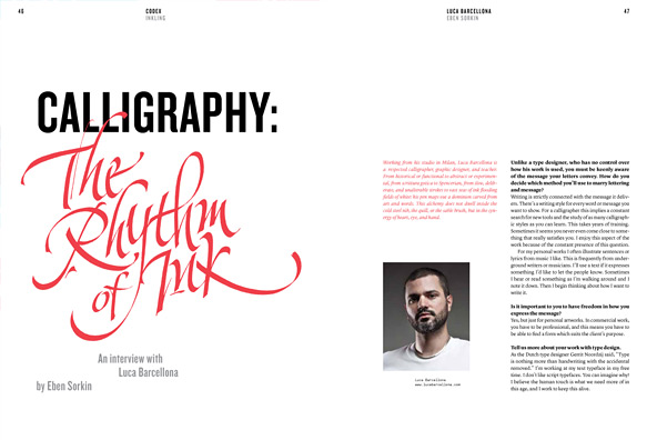
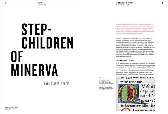
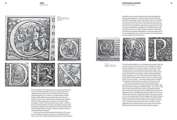
It’s immediately apparent by looking at the sample spreads first teased out by Mark Boulton (along with one new one here), and the incredible roster of authors lined up for the debut issue — Erik Spiekermann, Christian Schwartz and Paul Barnes, Paul Shaw, Stephen Coles, Dr Paul Dijstelberge, Craig Mod, Luca Barcellona, et al. along with those on deck for future issues, that this will be as much a beautiful physical artifact as it will a practical and inspirational guide through the universe of typography. Not coincidentally I think Codex also happens to beautifully fill a challenging void left by other publications.
Typography and design are both complex and multifaceted subjects in a world where everything is expected to fit metaphorically into neat little boxes. As a believer that broad interests and experiences are a mark of great designers, we need publications like Codex, that will not only paint those broad strokes but also shine a light on the full breadth and depth of such important subjects.
And while the Codex team is still putting the finishing touches on the first issue, I feel confident suggesting that Codex will be a publication that deserves to be on the bookshelf of any serious designer. Pre-orders are open and if you haven’t yet, do yourself, a friend or a fellow typomaniac a favour and order a copy right now.
Over the weekend, I posed a few questions to John about the roots of Codex and to get a picture of where it’s headed. The first issue is a stake in the ground, an arrival, not the final word. Here’s what he had to say:
Who did you have in mind when you created Codex?
I have a life-long fascination with type. I Love Typography is gratifyingly popular and requires an enormous amount of work, but I wasn’t fully satisfied. I guess you could say that I am the first person I had in mind when I envisioned Codex. I wanted to exercise creative muscles on projects that just weren’t right for the website, and long dreamed of making a print magazine that was not only beautiful but also took people to places in the endlessly wide and deep field that typography is.
As for readership, I first had in mind people who live immersed in type: type designers and typographers. They love, as I do, to read pieces on subjects such as its history and practice in specific eras, the work of true innovators of typography, the evolution of type in many languages, and other subjects that have rarely, if ever, been collected and written about in depth—including periods during the 20th century. I’m also fascinated by the process of designing typefaces, the thoughts and lives of brilliant men and women in our field, and the minutia about both incunabula and contemporary work. I wanted serious studies that are certainly scholarly, yet at the same time not dry.
But as I worked and spoke with talented graphic designers and people who specialize in the web and related media, I realized that this meaty magazine, that I expected would attract only the more serious people working with type, might have much broader appeal than I originally thought. So many more people want a solid foundation (or continuing education) and are willing to read what was first intended for people with a thorough education in typography. They are budding type nerds, some might say, and this includes accomplished designers. I’m very happy to see their increasing interest in the vast history behind what we do, in getting things right, and in knowing how and when to wisely and skillfully break “rules.”
What would you say Codex offers for younger designers?
Not to know what has been transacted in former times is to be always a child. If no use is made of the labors of past ages, the world must remain always in the infancy of knowledge.
— Cicero
Codex, in addition to covering modern design practices and applications, takes a closer look at the history of typography (and of graphic design, for the two are inseparable). I’m hoping that students and graduates alike will discover through reading Codex that the internet doesn’t have all the answers. We need to learn to study again, to research. Not all knowledge is to be found at the end of a Wikipedia or Google search term.
But more than anything I hope they will remember that typography was born of paper and ink. When they hold Codex, they hold an artifact — in the artifact itself there is much to be learned. I want them to ask questions. Why, even in the 21st century, do we still have such an affinity for print; and perhaps more importantly, which of those magic ingredients can we successfully transpose to the screen? What can we do to elicit those same reactions, those feelings in typography for the screen? And we need to explore concepts such as the fact that technological “advances” don’t always mean “better.” Of course, for both students and those long in the field, Codex offers beautiful and interesting design that is enriching and enjoyable and thought-provoking.
When the idea for Codex came about, did you have any specific creative goals in mind when producing it as a physical artifact? How have those changed since then?
Yes, absolutely. I had a very clear picture of how it should look and feel. I don’t mean I had a vision. It wasn’t quite Saul on the road to Damascus, but I had in mind very clear and distinct ideas about how it should look, its weight in the hands, the stiffness of the paper stock (too thick makes flipping through the magazine awkward; too thin and there’s too much “show through”). I also gave a lot of thought to the size: comfortable to hold in the hands, large enough to permit ample use of white space.
Is there anyone in particular who is on your wishlist for contributors?
I have such a wishlist in a black book (well, actually a Field Notes notebook). I have a list of more than 100 names. So, yes. I’d like Spiekermann and other Issue One authors to write again. Jonathan Hoefler, Louise Fili, Roger Black, Martin Majoor, James Mosley — perhaps I should just scan the pages of my notebook for you! The lineup for the second issue is amazing and we’ve already started to talk to people about the third issue of this quarterly. You’ll find names that typographers already know are extraordinary experts, and that those newer to the subject will be quite happy to discover.
What do you see as the future for Codex beyond Issue One?
Issue Two is already bursting at the seams. You’ll see an even broader group of people writing for and contributing to the magazine. Each issue of the magazine will be a surprise. I want to alert people, though, that this isn’t a magazine of tips and tricks and basic tutorials. In fact, it will rarely contain a tutorial. The lessons are found in the lives and work of type designers, typographers, and graphic designers, and others such as book designers, and associated fields.
There are other magazines for other aspects of design. Mine is built for experienced people, yet we eagerly open our pages to submissions from people on the way up, or those who are experimenting at the furthest edges. In terms of audience, we want to build up and support and celebrate the field and bring in readers who have just recently begun to fall in love with type, who aren’t shy about tackling complex or historical articles, mixed with articles by and about brilliant contemporary people.
I can only imagine that there’s been some interest in yearly subscriptions or digital editions — what’s your take on those at this point?
I had aimed to run subscriptions from the first issue, but dropped it last minute. I want to be sure that I can secure good shipping rates. Shipping and distribution is very expensive, and I want to pass on as little of that as possible to subscribers. In fact, depending on volume, international shipping plus distribution costs me about $15 per issue. We charge only $8. So, as soon as I can secure better shipping and distribution rates, subscriptions will be offered. I hope from issue 2 in July, but we’ll see. People should list their name on the newsletter signup on our home page if they want to be notified of important developments and releases, or they should follow the Codex blog.
I don’t have plans to release a digital version. I’m not ruling out ever releasing a digital version, but this is a paper and ink artifact for many reasons.
I want people to love type, but not just because it’s pretty or trendy. I, along with our great authors, want our readers to love type because they truly understand it and its foundations, principles, and evolution, as well. When you’ve learned all that, its beauty is all the more profound.