Just as TypeCon was kicking into gear last week, I flipped the switch on a new limited edition print from Ligature, Loop & Stem. Unlike previous releases though, this one has a special mission — to raise much needed money to assist those affected by the devastating earthquakes and tsunamis which first rocked Japan in March and again just a week ago.
The SOGO Japan project, designed and beautifully lettered in Kanji by type designer and lettering artist Neil Summerour, whose typeface Epic graced both editions of the Typographic Lesson Plan print, has deep personal meaning for him, having amassed many friends and adopted family there since first visiting the country as a teenager, and we’re extremely honoured that he asked us to be involved.
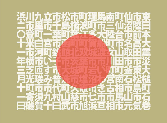
Each 18” × 24” print is individually signed and numbered by Neil, and features the names of all the cities affected by these tragedies. Additionally, each includes a smaller secondary print showing the matching English translations for the city names.
In keeping with the spirit of the SOGO Japan charitable organization established by Neil, and because we want to ensure as much money as possible will reach the people of Japan, LL&S is taking measures to ensure our impact on the funds raised are negligible. All money raised will feed directly into organizations on the front lines in Japan — groups that know the landscape, the people, and their actual needs.
That said — we realize this is not an inexpensive piece of art. On the other hand though, it’s an opportunity to do good and support a country whose exports enrich the lives of so many around the globe.
We hope you’ll help positively impact those who desperately need your support, whether by purchasing a print, or simply getting the word out about the project and the SOGO Japan organization. Thank you.