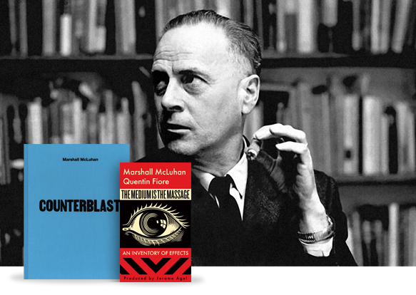
Although he died on the last day of 1980 and has therefore missed further pursuing so many of the technological advances and societal changes he foresaw, July 21st, 2011 marks the centennial of the birth of Marshall McLuhan.
Photo of Marshall McLuhan and Centennial Edition Book Covers (Photographer unknown)
While there have already been “many events”:events this year celebrating McLuhan’s centennial, this week in particular has been the one so many have been waiting for — to properly re-examine, reflect on, and otherwise celebrate McLuhan’s life and still hotly debated body of work.
Even if you’re not familiar with the man or his writing, if you work in the digital realm, you owe it to yourself to at least dip a toe into his observations and ideas — you may be surprised what you find and how it affects you.
Tonight, during a free to the public McLuhan Festival Celebration event, author John Ralston Saul will be awarded the first Gutenberg Galaxy Award for Literature “for his career achievements in literature and his contribution to the culture of Canada.” I also happen to know there’s at least one more surprise in store for someone else close to McLuhan during the evening…
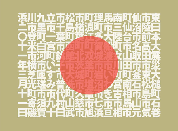
Just as TypeCon was kicking into gear last week, I flipped the switch on a new limited edition print from Ligature, Loop & Stem. Unlike previous releases though, this one has a special mission — to raise much needed money to assist those affected by the devastating earthquakes and tsunamis which first rocked Japan in March and again just a week ago.
Limited Edition SOGO Japan print design by Neil Summerour (Positype)
The SOGO Japan project, designed and beautifully lettered in Kanji by type designer and lettering artist Neil Summerour, whose typeface Epic graced both editions of the Typographic Lesson Plan print, has deep personal meaning for him, having amassed many friends and adopted family there since first visiting the country as a teenager, and we’re extremely honoured that he asked us to be involved.
Each 18” × 24” print is individually signed and numbered by Neil, and features the names of all the cities affected by these tragedies. Additionally, each includes a smaller secondary print showing the matching English translations for the city names.
In keeping with the spirit of the SOGO Japan charitable organization established by Neil, and because we want to ensure as much money as possible will reach the people of Japan, LL&S is taking measures to ensure our impact on the funds raised are negligible. All money raised will feed directly into organizations on the front lines in Japan — groups that know the landscape, the people, and their actual needs.
That said — we realize this is not an inexpensive piece of art. On the other hand though, it’s an opportunity to do good and support a country whose exports enrich the lives of so many around the globe.
We hope you’ll help positively impact those who desperately need your support, whether by purchasing a print, or simply getting the word out about the project and the SOGO Japan organization. Thank you.
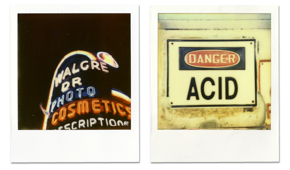
Monday marked the start of Polaroid Week and I’m taking part for the first time this year (despite missing the first day due to travel). As I’ve done the last couple years when travelling, I had my trusty SX-70 with me in New Orleans and was shooting a mix of older expired 600 film that my bud Brian Warren had brought down for us to use along with a range of film from The Impossible Project including the new PX-70 Color Shade which is easily their best yet.
A pair of PX-70 ColorShade photos I took during Typecon 2011 in New Orleans
I’ve owned a Polaroid camera of one type or another for probably longer than I remember though it’s only been during the last couple years that I’ve started to find myself interested in the medium again and excited about what the The Impossible Project is doing, particularly Annie and Dave who I had the opportunity to meet last year while in NYC on my way to Connecticut.
Annie and Dave and the rest of the Impossible team get customer service like few companies. They frequently going above and beyond to take care of customers. They’ve certainly helped me on more than one occasion — and have my utmost gratitude and respect for being so constantly wonderful. I can’t think of another company who would ship me something overnight and keep an eye on the order themselves to ensure it got to me. There’s just not enough nice things I can about them.
As an aside, if I can offer one simple piece of advice — do yourself a favour if you ever plan on visiting the Impossible Project Space in New York — take the elevator!
This past Saturday, after several weeks of email, IM, and conference calls, my Butter Label cohorts Luke Dorny, Brian Warren and I, otherwise dubbed “three guys with hats,” gave a brief talk at TypeCon in New Orleans on what web fonts means to designers.
As we discovered, the narrative on the topic of web fonts weaved its way into even more presentations than previously at TypeCon. This meant editing and rehearsing up until the last minute to ensure our spin on the topic was sufficiently unique. And while we somewhat ended up winging it, all three of us came away feeling good and have had great discussions with other speakers and attendees since.
The premise of the talk revolved around the idea that web designers have all along wanted the same typographic control as print has historically enjoyed. In that same vein, now that fine-grained control over type using CSS is becoming a reality, there’s a greater need to educate web designers on how to sensibly select and pair type, evaluate web fonts, and to know when to use advanced typographic features such as those found in newer OpenType fonts.
During the talk we also briefly covered the history of workarounds and hacks that have been invented to bridge the gap between what’s available and what’s really possible.
Additionally, we’ve made the complete anonymous source data from the unscientific, yet (we think) still relevant and interesting survey we ran not long ago to help prepare for the talk. The way to best explore the data is to put it through the lens of early adopters. It’s reasonably safe to assume that’s who the majority of the respondents were.
From Brian, Luke and myself — a big thank you to the TypeCon and SOTA board, staff and volunteers on hand during the conference — especially Michelle, JP, and Grant who helped get us there and made presenting painless. And of course everyone in the audience too.