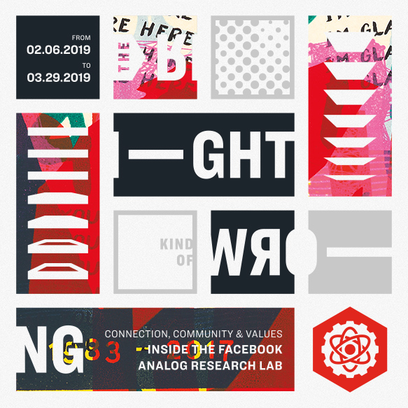
February 6, 2019 marks the opening night of The Right Kind of Wrong, a special public exhibition of printed matter — posters, prints, books, zines, and more from the Analog Research Lab and our Designer in Residence program at the Type Directors Club in New York.
The exhibit and accompanying salon will chart the evolution of the Analog Lab since 2010 and its role at Facebook. This will be an opportunity to not just see this collection of work from the likes of Ben Barry, Tim Belonax, Jez Burrows, Elana Schlenker, Fuchsia MacAree, Eddie Perrote, Heather Hardison, Mario Wagner, Hannah K. Lee, Trevor Finnegan, Joseph Alessio, Frances McLeod, and myself in person — but to also understand the context and conditions in which it was created, and how this important element of the culture of the company has evolved over the years.
The exhibition (free) opens February 6 and runs through March 29, 2019 at the Type Directors Club. Full details and tickets for the opening salon are available from the TDC — $5 for members, $15 for students, and $30 for non-TDC-members.
Community is something that’s been on my mind recently, particularly since last year after my friend Jenny Wilkson from the School of Visual Concepts presented at TypeCon about building community around analog things in the center of a growing digital environment.
This sparked an idea that I’ve been mulling about since then, but which will hopefully be crystalized when I’m back on stage at TypeCon this August for a talk about design, type, community and a somewhat magical machine called the Risograph.
It’s a machine that you may never have heard of though you might have seen something produced with it. And there’s a really interesting community that’s been forming around it over the last few years — in the US but even more perhaps elsewhere across the globe.
Here’s the abstract for the talk which is scheduled for 3:25pm on the Friday afternoon of the conference.
As new technologies continue to blur the lines between our real and digital worlds and we lose the edges of traditional mediums, obsolete technologies like letterpress or vinyl records become desired objects of art. But can type be art, and how do obsolete technologies transform and elevate type in unexpected and curious ways?
This brief talk will look at how the Risograph, an unusual, effectively obsolete, and inherently imperfect machine can add value and desirability to letterforms and design, and what their increasing popularity has done to bring creative expressions of typography and design to new audiences.
I may have a few Riso goodies available for conference attendees too.
The second Swash and Serif show kicks off next Thursday evening in Toronto at the Black Cat Artspace. A piece I painted earlier this year is currently winging it’s way to Toronto and will be on display (and potentially for sale) throughout the show’s run.
The particular piece I submitted for the show, titled “Best Served…”, happens to be a personal favorite and it’s a treat to make it available for others to enjoy. Better than it sitting in my studio space here in California. Credit for the concept belongs to fellow sign painter John Barrick from San Jose, california.
The Swash and Serif show runs from October 1st at 7:30pm to October 7th. The Black Cat Artspace is located at 2186 Dundas Street West, Toronto, Ontario.
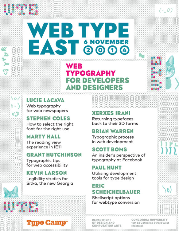
Update: Unfortunately the Web Type East event has been cancelled. Anyone who purchased a ticket should contact TypeCamp for a full refund.
Although I missed the Web Type West event earlier this year, I’m making up for it at the Web Type East event at Concordia University in Montreal, Quebec on November 6th. The conference features a pretty stellar lineup of speakers including Grant Hutchinson, Brian Warren, Xerxes Irani, Paul Hunt and Stephen Coles and more.
The title/descriptions of each of the talks tell me there’s going to be information that even for me is fresh and interesting. My own talk will be a considerably updated and expanded version of the one I gave originally at Typecon this past August.
Montreal is a fabulous city and I’d love to see you there.
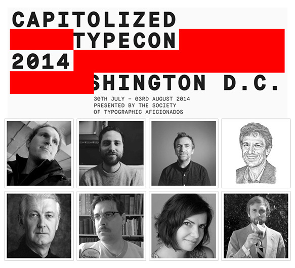
Apparently I’ve been busy since I last posted here over six months ago… Once again I’m excited to be sharing the Typecon stage with an always impressive lineup of speakers and friends such illuminaries as Matthew Carter, John Downer, Tobias Frere Jones (!), Jackson Cavanaugh, Silas Dilworth, Mark Simonson, Nick Sherman, Dustin Senos and of course my good pal and Butter cohort, Brian Warren.
This year during my talk on Saturday, August 2nd, I’ll be lifting the curtain a bit behind the challenges and opportunities of scaling typography services across over a hundred languages, vastly different types of connectivity and thousands of different devices for over a billion people. If the goal is to put beautiful type at the center of web services such as Facebook, I’ll be aiming to answer questions on how typography decisions are made and the impact those decisions have on people who use such services.
For a change this year I’m not planning on attending any of the workshops and will instead of taking the opportunity to spend some time in museums and galleries, taking in some of the cultural history that’s so prevalent in Washington, DC.
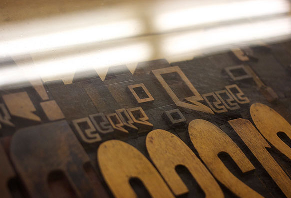
While I was in Millwaukee in August for Typecon, I had the opportunity to spend a wonderful day at the Hamilton Wood Type Museum in nearby Two Rivers with good friends and fellow typomaniacs.
What’s special about the Hamilton — aside from simply housing one of the largest and most impressive collections of wood type anywhere, is that it’s a working museum. Visitors can work with a large portion of their collection of more than 1.5 million pieces of wood type, and if you’ve lucky as we were, also get a glimpse behind the scenes to see how wood type has been produced for decades by one of the last pantograph operators in the United States.
Recently the Hamilton was notified that they must move out of the original Hamilton building which dates back to 1927. And so the staff is now tasked with the difficult challenge of raising the $250,000 they need to preserve this important historical collection and locate a new home for the museum and workshop by mid-February — a daunting task and timeline.
Even after only a short visit, it’s easy to see why the Hamilton captures the imagination of designers — and it would be truly tragic for such a magical place to disappear.
I encourage you to join me as a member of the museum or to make a dontation of any size to help ensure that no part of the great history of the Hamilton is lost.
The other day I was invited to take a peek behind the curtain at a new web font related technology that’s nearly ready to hit the streets from the fine folks at Extensis. Needless to say I was very interested and excited by what they’ve been up to.
But first a bit of context…
How (Most) Web Designers Work Today
During TypeCon in New Orleans this past July, one of the things Brian, Luke and I covered during our talk on web fonts was process — exactly how (most) web designers work, and what happens to the particular artifacts we produce as a result of that work. In particular, design mockups, and most importantly though, how those relate to a web designer’s somewhat contentious relationship with fonts.
Web designers have wanted the same control over typography print designers have taken for granted for decades, including being able to use the same variety of typefaces. Hacks such as sIFR and Cufon aside, it’s really only during the last two years, thanks to the encouraging work of type designers, foundries and browser makers, that the tide has really turned and we’re inching closer to that reality.
Unlike print though, where designers create final artwork files that are the final output of the design phase of a project (a newspaper advertisement, a book layout, product packaging), the large majority of web designers create mockups, a transitional artifact created for the benefit of clients and others involved in producing the actual end product — a functioning website.
Mockups are not the end result, and so purchasing desktop font licenses for what is effectively a throwaway product is counter-intuitive. Web fonts are part of the real end product of a web designer’s work, not their desktop equivalents. But that’s not the way we’ve had to work.
And it’s certainly not that web designers don’t want to pay for fonts — quite the opposite in fact. Web designers have flocked to web font services such as FontDeck, Typekit, and WebINK, and more will come as these services are more readily adopted by those beyond the early adopters.
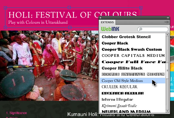
During our talk at TypeCon, we further explored a suggestion which originated from Elliot Jay Stocks illustrating how web fonts might be integrated into a desktop design application such as Photoshop. In July no such thing existed; it was just an idea. And while the software is not available quite yet, I can happily say that it does now thanks to the team behind WebINK, Extensis’ web font service.
Introducing the Web Font Plugin for Photoshop
To address this disconnect in how web designers work, Extensis has created a piece of software that bridges their WebINK web font service and Photoshop, thus allowing web designers to use web fonts as though they were traditional desktop fonts in the popular design tool.
The WebINK Web Font plugin for Photoshop CS5
The web font plugin for Photoshop will be included with Suitcase Fusion 3 and available in beta in the coming weeks. Most importantly, it will continue to function beyond the software’s 30 day trial. There’s no requirement to purchase or use Suitcase — it’s simply the delivery mechanism for the plugin itself and assists in integrating the plugin with their WebINK web font service.
At the moment the functionality is simple and straightforward. Once the software is installed, open the Panel in Photoshop, sign in to your account and start working with their library of web fonts.
Transferring PSD files to others is seamless too, provided they have a WebINK account and the plugin installed. Designers will also be free to create JPEG, PNG and PDF files without watermarks or licensing restrictions beyond anything they’re already used to. Of course, there are still a few unanswered questions such as what happens without a network connection, but it’s a very promising start and raises the bar for competing web font services. Nudge, nudge Typekit and FontDeck.
Update (September 12, 2011)
Extensis has soft-launched the software’s microsite and you can download a 30 day free trial of Suitcase Fusion 3 and the Web Font plugin for Photoshop at webfontplugin.com. Go. Download. Create.
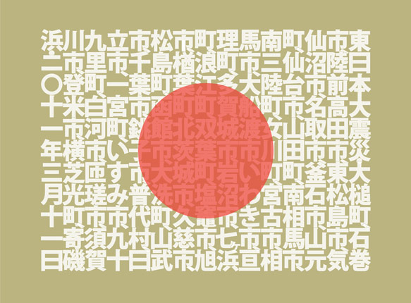
Just as TypeCon was kicking into gear last week, I flipped the switch on a new limited edition print from Ligature, Loop & Stem. Unlike previous releases though, this one has a special mission — to raise much needed money to assist those affected by the devastating earthquakes and tsunamis which first rocked Japan in March and again just a week ago.
Limited Edition SOGO Japan print design by Neil Summerour (Positype)
The SOGO Japan project, designed and beautifully lettered in Kanji by type designer and lettering artist Neil Summerour, whose typeface Epic graced both editions of the Typographic Lesson Plan print, has deep personal meaning for him, having amassed many friends and adopted family there since first visiting the country as a teenager, and we’re extremely honoured that he asked us to be involved.
Each 18” × 24” print is individually signed and numbered by Neil, and features the names of all the cities affected by these tragedies. Additionally, each includes a smaller secondary print showing the matching English translations for the city names.
In keeping with the spirit of the SOGO Japan charitable organization established by Neil, and because we want to ensure as much money as possible will reach the people of Japan, LL&S is taking measures to ensure our impact on the funds raised are negligible. All money raised will feed directly into organizations on the front lines in Japan — groups that know the landscape, the people, and their actual needs.
That said — we realize this is not an inexpensive piece of art. On the other hand though, it’s an opportunity to do good and support a country whose exports enrich the lives of so many around the globe.
We hope you’ll help positively impact those who desperately need your support, whether by purchasing a print, or simply getting the word out about the project and the SOGO Japan organization. Thank you.
This past Saturday, after several weeks of email, IM, and conference calls, my Butter Label cohorts Luke Dorny, Brian Warren and I, otherwise dubbed “three guys with hats,” gave a brief talk at TypeCon in New Orleans on what web fonts means to designers.
As we discovered, the narrative on the topic of web fonts weaved its way into even more presentations than previously at TypeCon. This meant editing and rehearsing up until the last minute to ensure our spin on the topic was sufficiently unique. And while we somewhat ended up winging it, all three of us came away feeling good and have had great discussions with other speakers and attendees since.
The premise of the talk revolved around the idea that web designers have all along wanted the same typographic control as print has historically enjoyed. In that same vein, now that fine-grained control over type using CSS is becoming a reality, there’s a greater need to educate web designers on how to sensibly select and pair type, evaluate web fonts, and to know when to use advanced typographic features such as those found in newer OpenType fonts.
During the talk we also briefly covered the history of workarounds and hacks that have been invented to bridge the gap between what’s available and what’s really possible.
Additionally, we’ve made the complete anonymous source data from the unscientific, yet (we think) still relevant and interesting survey we ran not long ago to help prepare for the talk. The way to best explore the data is to put it through the lens of early adopters. It’s reasonably safe to assume that’s who the majority of the respondents were.
From Brian, Luke and myself — a big thank you to the TypeCon and SOTA board, staff and volunteers on hand during the conference — especially Michelle, JP, and Grant who helped get us there and made presenting painless. And of course everyone in the audience too.
The last two years have seen enormous strides in the advancement and adoption of web fonts. Like any new technology though, designers and developers need time to push and pull it to understand how it works, where there are gaps and to come up with new or unexpected uses.
Access to real fonts on the web means a familiarity and understanding of 400+ years of typographic history is even more urgently needed by web designers to suitably pay respect to the typefaces and type designers whose work we now have greater access to. Or as Jason Santa Maria so succinctly put it during Ampersand in Brighton, UK earlier this week:
If your type is bad, the design fails
In just over two weeks, Brian Warren, Luke Dorny and I will be giving a talk titled “Where the Rubber Meets the Road: Where are Designers Going with Web Fonts?” at TypeCon 2011 in New Orleans. In finalizing our outline we felt it would be helpful to find out how other designers are using web fonts. To do so, we’ve put together a brief anonymous survey to help us identify common behaviours, patterns and gaps.
The survey should take less than 5 minutes to complete. We greatly appreciate all those who take the time to help us out with this and we promise to share the results along with our slide deck after the conference.
Typography continues to be an important facet of the work I do, whether online or in print, so joining type designers and those from related disciplines at TypeCon is an obvious extension of that line of thought. Although last year’s conference in Los Angeles was my first, I’ll be back again this July in New Orleans but with a twist.
Our talk will look at web typography from a different angle than in previous years by focusing on how type is being used on the web and what web designers are looking for in web fonts. At the same time we’ll cover the unique challenges that face the medium and where we need help from type designers to bring typography in the web and mobile landscape to the next level.
We hope you’ll join us in New Orleans between July 5 - 10th along Ed Benguiat, David Berlow, John D. Berry, Veronika Burian, John Downer, Jessica Hische, Akira Kobayashi, Erin McLaughlin, Thomas Phinney, Neil Summerour and everyone else on the incredible lineup of speakers.
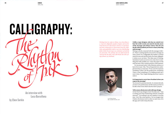
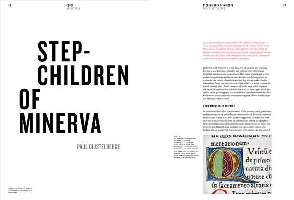
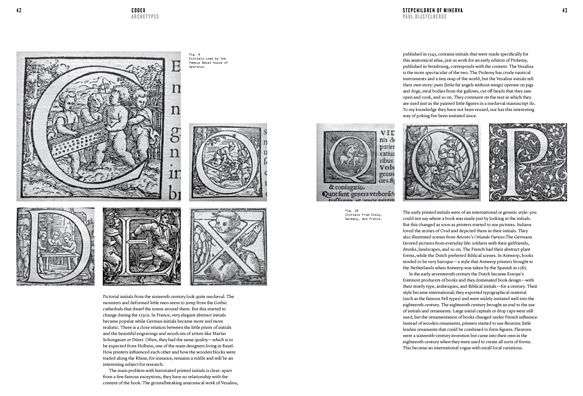
Nearly four years in the making, last week saw the official launch and start of pre-orders for the debut issue of Codex, a limited run quarterly journal of typography by I Love Typography and We Love Typography founder and confessed typomaniac John Boardley, along with Editor-in-Chief and unflappable LL&S cohort, Carolyn Wood.
Codex is a hybrid of magazine and journal. Beautifully designed, visually appealing, an immersive experience with a lively voice, it is also serious about its subject: authoritative, scholarly at times, but not dry in tone. It’s serious, but not stuffy. It loves the people, tools, and type associated with this craft, from the man carving beautiful cherubim into wood blocks in the 1400s to brilliantly formed modern interpretations and departures. It embraces the web and is watchful for the future’s classics.
It’s immediately apparent by looking at the sample spreads first teased out by Mark Boulton (along with one new one here), and the incredible roster of authors lined up for the debut issue — Erik Spiekermann, Christian Schwartz and Paul Barnes, Paul Shaw, Stephen Coles, Dr Paul Dijstelberge, Craig Mod, Luca Barcellona, et al. along with those on deck for future issues, that this will be as much a beautiful physical artifact as it will a practical and inspirational guide through the universe of typography. Not coincidentally I think Codex also happens to beautifully fill a challenging void left by other publications.
Step-Children of Minerva by Paul Dijstelberge
Typography and design are both complex and multifaceted subjects in a world where everything is expected to fit metaphorically into neat little boxes. As a believer that broad interests and experiences are a mark of great designers, we need publications like Codex, that will not only paint those broad strokes but also shine a light on the full breadth and depth of such important subjects.
And while the Codex team is still putting the finishing touches on the first issue, I feel confident suggesting that Codex will be a publication that deserves to be on the bookshelf of any serious designer. Pre-orders are open and if you haven’t yet, do yourself, a friend or a fellow typomaniac a favour and order a copy right now.
Over the weekend, I posed a few questions to John about the roots of Codex and to get a picture of where it’s headed. The first issue is a stake in the ground, an arrival, not the final word. Here’s what he had to say:
Another spread from Codex issue 1
Who did you have in mind when you created Codex?
I have a life-long fascination with type. I Love Typography is gratifyingly popular and requires an enormous amount of work, but I wasn’t fully satisfied. I guess you could say that I am the first person I had in mind when I envisioned Codex. I wanted to exercise creative muscles on projects that just weren’t right for the website, and long dreamed of making a print magazine that was not only beautiful but also took people to places in the endlessly wide and deep field that typography is.
As for readership, I first had in mind people who live immersed in type: type designers and typographers. They love, as I do, to read pieces on subjects such as its history and practice in specific eras, the work of true innovators of typography, the evolution of type in many languages, and other subjects that have rarely, if ever, been collected and written about in depth—including periods during the 20th century. I’m also fascinated by the process of designing typefaces, the thoughts and lives of brilliant men and women in our field, and the minutia about both incunabula and contemporary work. I wanted serious studies that are certainly scholarly, yet at the same time not dry.
But as I worked and spoke with talented graphic designers and people who specialize in the web and related media, I realized that this meaty magazine, that I expected would attract only the more serious people working with type, might have much broader appeal than I originally thought. So many more people want a solid foundation (or continuing education) and are willing to read what was first intended for people with a thorough education in typography. They are budding type nerds, some might say, and this includes accomplished designers. I’m very happy to see their increasing interest in the vast history behind what we do, in getting things right, and in knowing how and when to wisely and skillfully break “rules.”
What would you say Codex offers for younger designers?
Not to know what has been transacted in former times is to be always a child. If no use is made of the labors of past ages, the world must remain always in the infancy of knowledge.
— Cicero
Codex, in addition to covering modern design practices and applications, takes a closer look at the history of typography (and of graphic design, for the two are inseparable). I’m hoping that students and graduates alike will discover through reading Codex that the internet doesn’t have all the answers. We need to learn to study again, to research. Not all knowledge is to be found at the end of a Wikipedia or Google search term.
But more than anything I hope they will remember that typography was born of paper and ink. When they hold Codex, they hold an artifact — in the artifact itself there is much to be learned. I want them to ask questions. Why, even in the 21st century, do we still have such an affinity for print; and perhaps more importantly, which of those magic ingredients can we successfully transpose to the screen? What can we do to elicit those same reactions, those feelings in typography for the screen? And we need to explore concepts such as the fact that technological “advances” don’t always mean “better.” Of course, for both students and those long in the field, Codex offers beautiful and interesting design that is enriching and enjoyable and thought-provoking.
When the idea for Codex came about, did you have any specific creative goals in mind when producing it as a physical artifact? How have those changed since then?
Yes, absolutely. I had a very clear picture of how it should look and feel. I don’t mean I had a vision. It wasn’t quite Saul on the road to Damascus, but I had in mind very clear and distinct ideas about how it should look, its weight in the hands, the stiffness of the paper stock (too thick makes flipping through the magazine awkward; too thin and there’s too much “show through”). I also gave a lot of thought to the size: comfortable to hold in the hands, large enough to permit ample use of white space.
Is there anyone in particular who is on your wishlist for contributors?
I have such a wishlist in a black book (well, actually a Field Notes notebook). I have a list of more than 100 names. So, yes. I’d like Spiekermann and other Issue One authors to write again. Jonathan Hoefler, Louise Fili, Roger Black, Martin Majoor, James Mosley — perhaps I should just scan the pages of my notebook for you! The lineup for the second issue is amazing and we’ve already started to talk to people about the third issue of this quarterly. You’ll find names that typographers already know are extraordinary experts, and that those newer to the subject will be quite happy to discover.
What do you see as the future for Codex beyond Issue One?
Issue Two is already bursting at the seams. You’ll see an even broader group of people writing for and contributing to the magazine. Each issue of the magazine will be a surprise. I want to alert people, though, that this isn’t a magazine of tips and tricks and basic tutorials. In fact, it will rarely contain a tutorial. The lessons are found in the lives and work of type designers, typographers, and graphic designers, and others such as book designers, and associated fields.
There are other magazines for other aspects of design. Mine is built for experienced people, yet we eagerly open our pages to submissions from people on the way up, or those who are experimenting at the furthest edges. In terms of audience, we want to build up and support and celebrate the field and bring in readers who have just recently begun to fall in love with type, who aren’t shy about tackling complex or historical articles, mixed with articles by and about brilliant contemporary people.
I can only imagine that there’s been some interest in yearly subscriptions or digital editions — what’s your take on those at this point?
I had aimed to run subscriptions from the first issue, but dropped it last minute. I want to be sure that I can secure good shipping rates. Shipping and distribution is very expensive, and I want to pass on as little of that as possible to subscribers. In fact, depending on volume, international shipping plus distribution costs me about $15 per issue. We charge only $8. So, as soon as I can secure better shipping and distribution rates, subscriptions will be offered. I hope from issue 2 in July, but we’ll see. People should list their name on the newsletter signup on our home page if they want to be notified of important developments and releases, or they should follow the Codex blog.
I don’t have plans to release a digital version. I’m not ruling out ever releasing a digital version, but this is a paper and ink artifact for many reasons.
I want people to love type, but not just because it’s pretty or trendy. I, along with our great authors, want our readers to love type because they truly understand it and its foundations, principles, and evolution, as well. When you’ve learned all that, its beauty is all the more profound.
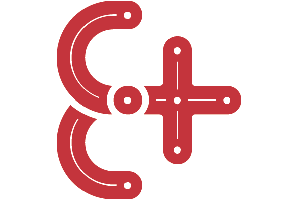
Continuing on a somewhat typographic theme, I’d be remiss to mention that Ligature, Loop & Stem has joined the sponsor ranks for the first Ampersand: The Web Typography Conference, a one day event held in Brighton, UK on June 17th, 2011 and focused on typography on the web.
The 2011 Ampersand conference logo
On top of providing a few of the long sold-out limited edition LL&S prints as prizes for Ampersand attendees, we’ll also be putting together an exclusive for the event. I can’t promise we won’t keep it a surprise until then, but we’ll see…
And if that weren’t enough, LL&S will also be sponsoring TypeCon 2011: Surge in New Orleans this year. We’re still working out exactly what we might do for that event, but needless to say, as was the case last year, the entire Butter Label crew will again be on hand.
The devastating earthquakes and tsunami that recently ravaged Japan ushered a call to arms for designers to contribute to worldwide relief efforts, and for the fifth time, the Society of Typography Aficionados (SOTA) leapt into action to launch Font Aid V: Made for Japan — to collaboratively create a font whose sales proceeds will go directly to the relief efforts in Japan.
The money raised through the sale of this font will be distributed to organizations such as AMDA International and is being facilitated by SOGO Japan, led by type designer Neil Summerour who has a long, personal connection with the country.
My contribution (in red) and several others to Font Aid V: Made in Japan
More than 300 designers from 44 countries submitted the over 500 glyphs which will comprise the font, now dutifully being assembled in FontLab by Neil Summerour and Grant Hutchinson. Once completed, the OpenType font will be for sale through several distributors for a mere $20. SOTA also hopes to produce a printed specimen booklet which could accompany the font and which will include additional information about each participating designer and their glyph(s).
As was the case last year, it was an honor to design a glyph (in red above) for inclusion among such illustrious company. And while Ligature, Loop & Stem is working out what we’re able to donate in addition to supporting SOTA, I whole heartedly ask that you share this with your friends, co-workers and fellow designers. Buy a license for yourself, buy one for a friend, and encourage others to do the same as soon as it’s available.
After an unexpectedly long hiatus, Luke, Grant and I are back at work on some new stuff for Ligature, Loop & Stem and over the last few days I’ve shared a couple peeks at one of the pieces we’re finishing up on Dribbble.
A preview of the Typographic Lesson Plan on Dribbble
The big news, aside from that we’re doing something new is that we might do things differently this time based on the frankly overwhelming reaction to the Ampersand print. This could go a few ways:
A first limited edition letterpress run. Possibly at an extra-large size as we now have a line on a printer than can handle letterpress work up to 28” × 38” (I know — wow!)
An in-person only conference exclusive (Hint: Typecon) since Luke, Grant and I will all be in attendance to sign and number the prints and pose for glamour shots
A second general run based on a smaller print size and possibly different inks and stock
We haven’t finalized anything yet but will shortly. While we don’t want to give the game away too soon, we’ll no doubt toss a few Tweets out and provide some sort of early info via either Twitter and/or Dribbble.
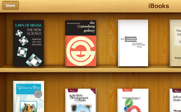
Now that Joe and I have wrapped our talk about “Structure and Typography” at BookCamp Toronto 2010 and the aforementioned announcement has been publicly made in front of living, breathing human beings, here’s the scoop — I, along with members of the Estate of Marshall McLuhan will be publishing the first official (read: legitimate) digital editions of Marshall’s work.
Laws of Media and The Gutenberg Galaxy in Apple iBooks (not yet available)
We’ll be starting with Laws of Media written with his eldest son, Eric, along with The Gutenberg Galaxy with the goal of releasing both either towards the end of 2010 or the beginning of 2011 in order to coincide with Marshall’s centenary. Not coincidentally, a much needed new site for the McLuhan Estate will also launch around the same time.
What about his other books? The answer is complicated, but ultimately “we don’t know… yet.” We’ve started necessary conversations and hope those will be available in due course.
That said, as was discussed today during our talk, and subsequently, some books may demand a physical artifact. They may not be ‘translatable’. Art books or highly art directed books for example; at least not in the open-source ePub format which is how we’d like to see these digital editions released.
This is arguably an experiment and will not be easy for many reasons — sorting out electronic publication rights (in at least one instance), editorial and design challenges, as well as handling divergent digital formats.
If important books such as McLuhan’s are going to make the jump to digital successfully, they deserve to have the same care and attention put into them as their printed counterparts — and we’re in the best position to ensure that happens.
A few weeks back, shortly after the devastating earthquake that forever changed the lives of the people of Haiti, the Society of Typographic Aficionados (SOTA) put out a call for participation in the creation of a collaborative font, the proceeds from the sale of which would go directly to providing aid through international medical humanitarian organization Doctors without Borders.
This is the fourth time SOTA has undertaken such an effort (hence the title ‘FontAid IV’), this time using ampersands to represent the idea of “people coming together to help one another”. Who says celebrities, musicians and actors are the only ones who can make a difference?
My contribution to FontAid IV, dubbed “The Anchor”
Personally, this was an opportunity to be part of something significant, and over the course of an evening, I sketched out and refined an idea that eventually became my submission to the project. More time would have allowed me to submit another if for no other reason than to keep my pal Grant, who donated his time toward the work in assembling the final font, even busier.
Where to Buy
The resulting font, dubbed “Coming Together”, which includes more than 400 glyphs from designers, typographers and artists around the world is now available in cross-platform OpenType format for a mere $20 from several popular font distributors with more being added later this week.
When Luke, Carolyn and I launched Ligature, Loop & Stem last November we really had no idea what to expect. Throughout October I teased a bit of early interest out of friends and such on Dribbble (yes, the extra “b” is on purpose) and during An Event Apart in Chicago.
Although the feedback was all extremely positive and validated that we were on to something interesting, I tend to guage expectations with at least one foot in reality. In the end though, the response completely blew my expecations out of the water with that first collection of products selling out in under 3 days.
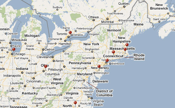
When we finished shipping everything I gave myself a little project — to map the orders. The reason was simply to put a little visual context around what we just did. The end result looks something like the preview below.
A map of Ligature, Loop and Stem print orders — Click the preview above to view more
Due to other committments and even though this has been sitting on the server for a few weeks I just haven’t had the time or energy to talk about it, not that there’s really that much that’s not self-explanatory… For me it was a fun little diversion and a good chance to tinker with version 3 of the Google Maps API. If it’s interesting to anyone else, that’s a nice bonus.
For those wondering what’s next — I’ll have a bit more to say about LL&S and some other things soon.
We didn’t exactly plan it this way, but Zeldman declaring this past Tuesday, November 16th World Type Day was fortuitous. Perhaps serendipitous even.
Luke and I, along with the incomparable assistance of Carolyn Wood originally planned to launch our new little experimental venture, Ligature, Loop & Stem the previous week but enough pieces weren’t quite ready for prime-time that we pushed it back a week.
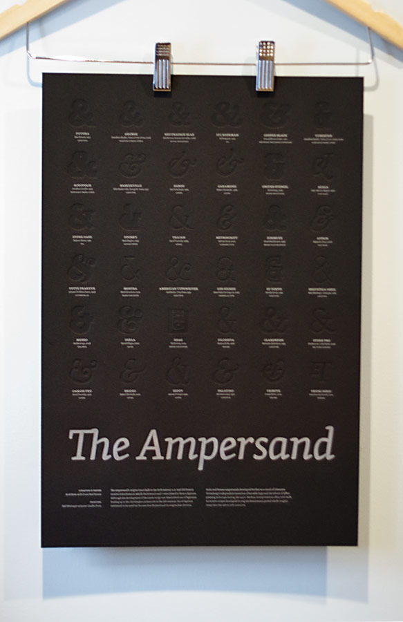
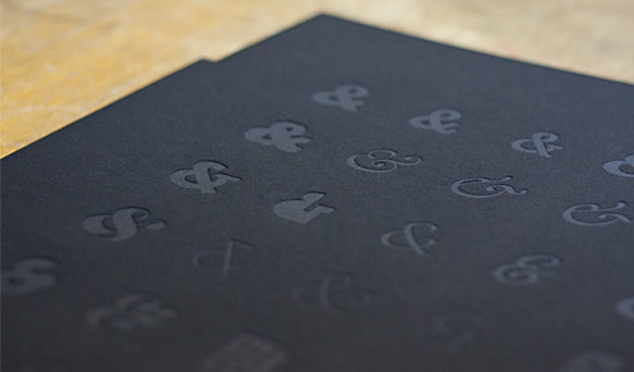
Hanging Ampersands from Ligature, Loop and Stem
Based on the immensely positive responses we received throughout the week — it seems we did something right and are sincerely humbled, excited and frankly a bit overwhelmed. Selling out the initialcollection less than 72 hours after launching the site was… at least a little unexpected (by me anyway).
Of course there’s still some lovely (and free)ampersand wallpapers available for your iPhone or iPod touch to tide you over until the next limited edition pieces are ready to go — which we expect will be sooner than later.
Setting LL&S
In a lot of ways, the idea for LL&S came out of nowhere. At the same time, it’s at the core of what I’ve felt has been missing from my work over the last couple years; the genesis of it has been biding it’s time on pages in one of my Moleskines in some form for nearly as long.
When I mentioned my initial ideas behind LL&S to Luke I knew he’d be on board, the same with Carolyn, who I’ve searched for a good opportunity to work with for as long as I can remember and who put in 150% the whole way through. Luke and I had been talking for a little while about teaming up in some fashion and this became the perfect vehicle to get the ball rolling.
LL&S mixes Luke’s and my design sensibilities, love of the web, typography and design history while allowing us to explore ideas that don’t fit the constraints of typical client projects such as non-traditional navigation, interactions that mirror the real world, and hiding little inside jokes in and around the site — you did find all of them right?
Letterpress-printed ampersand glyphs
Unfortunately the web isn’t widely recognized for stellar typographic design. Advances in CSS, services like Typekit, and some inventive web designers experimenting with type to more closely connect it to the message of a site as print designers are more apt to do will slowly change that perception.
We wanted something that could bridge the gap between the possibilities of print and the web, with a little industrial design thrown in for good measure. To do our bit in changing perceptions and that essentially gave us complete creative freedom.
Perhaps the larger vision behind LL&S is that we wanted to experiment with making stuff we’d want for ourselves just as much as we hoped other would too — ampersands seemed like a good place to start as any. That said, we’re not restricting ourselves to just producing print pieces. The sky’s the limit. Exactly how some of the ideas we’re already exploring materialize is anyone’s guess.
We think we’ve got some interesting stuff in the works. If we can continue to surprise and delight then in my books, we’ve accomplished what we set out to do.
Credit
Luke and I would be remiss to not explicitly thank our good friend and walking encyclopaedia of all things typographic, Grant Hutchinson who I asked to help curate the Ampersand print with me. Also, writer, editor, idea generator and all-around whip cracker Carolyn Wood, without whom we might still be waiting at the gate because the copy on the web site would have been, well… nowhere near as good as we think it is now, which is pretty damn awesome.
For everyone else, close to home and around the world (the internet sure makes the world a small place) — thank you as well. Thank you for the kind words, retweets, links and for simply making the launch a resounding success by buying up everything so quickly!
Next Up
Part of the point of LL&S is just us following our instincts. We know there’s room to improve the site, particularly around navigation and little bits of the overall user experience. Thankfully we’ve got some ideas that don’t compromise our original vision and should improve the situation.
Even before we get to that though, we need to get the first collection of products in the wind and on their way while pushing ahead with the next collection (which we promise will not feature ampersands).
I’m crossing T’s and dotting i’s, but that thing will be launching any minute now. Follow along on Twitter for the inside scoop though I’ll have more to say about it later today once I catch my breath and have a nap or something…
Hmmm—that should probably be crossing my i’s and dotting my… oh, nevermind.
For the last several weeks I’ve been conspiring with my good friend and man of the internets, Luke Dorny on an idea that’s been kicking around in my head and scattered across sketchbooks for some time; something that holds a lot of interest for both of us, and we know many others too.
Although thanks to Dribbble, a few fine folks of the internet have had a look behind the curtain at the design and as ideas were refined, we’re now just about ready to take the wraps off this little experiment. And so a little tease to, err, stroke your serif.
A sneak peek at an upcoming project
Look for more info and an official announcement shortly.
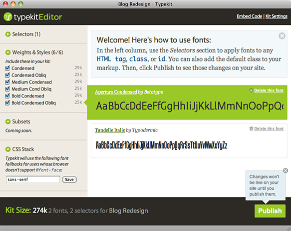
For the last few weeks or so I’ve had the opportunity to tinker with the technology preview (beta) of Typekit. It’s been quietly in use on this site since the end of August.
Designers such as myself have wanted the ability to use real fonts on the web for years without the hair-pulling, potential accessibility and licensing issues of image replacement, sIFR, Cufon or other “hacks” (however clever, they’re still hacks — deal with it). We’ve also wanted to ensure type designers and distributors get paid appropriately so they can keep creating and making available greattypefaces.
Typekit, as with other upcoming services such as Kernest and those from Ascender and Typoteque make this possible now by essentially levelling the playing field across browsers, providing pain-free implementation mechanisms and protecting designers from the messy business of licensing issues and ethical ramifications of distributing raw font files to browsers.
A preview of the Typekit kit editor
So, what’s so good about Typekit? Why should designers care?
The Good
More fonts Specify fonts in CSS font stacks beyond the most commonly available fonts. Yay!
Creating Kits is easy Creating a “kit” — a selection of fonts, is simple and for the most part feels familiar; not unlike using a desktop font manager.
Easy to implement If you’ve used sIFR or had to deal with image-replacement techniques, you know how frustrating they can be. With Typekit, just add the Javascript code provided as part of a kit to your pages. The rest is just a matter or specifying fonts in your CSS as you would normally.
Browser support Through a little bit of magic Typekit works across platforms and browsers — even IE6. Personally I would be totally Ok if Typekit didn’t suppose IE6 (or even IE7) but it does so they get bonus points from me for being comprehensive.
Is a good Javascript citizen The Javascript used by Typekit, at least in my experience so far behaves well and doesn’t inadvertently stomp on other Javascript events.
Reliable The service itself seems like it was designed to scale from the start. By using a Content Delivery Network (CDN) instead of a centralized server, the service should be able to withstand very high loads, provide low latency and easily maintain 100% uptime which is appropriate for such a service.
The Less Good
Even though Typekit is a great service that will only get better with time, and although my experience using it has been flawless, there’s still room for improvements. The following would be on my list.
Even more fonts This is a no-brainer obviously. There’s a huge minefield of licensing and IP issues to sort out and understandably that takes time. The biggest issue with the fonts available now — which are largely from smaller foundries and independent type designers is probably that most designers don’t already have their own personal licences to use in comps or outside a browser.
Browsing is awkward Finding the right font to add to a kit can be tedious. Right now the only options for locating fonts is browsing the paginated listings or using the classification/tag filters. Adding the ability to browse alphabetical pages, additional categorizations or a more traditional search interface might help.
Weights and styles It’s not obvious what weights and styles are available for a given font unless you view the detail page for the font or add it to a kit and look at the Weights & Styles tab. Indicating the number of weights and styles in the listings would be a good place to start.
New additions Right now if new fonts are added to Typekit, there’s no obvious way for users to find them other than by browsing through the listings or perhaps by a mention in the Typekit newsletter. Without any inside knowledge it’s hard to speculate how often new fonts will be added to the service but I think it’s safe to assume new fonts will be added with some degree of regularity.
Requires Javascript This really isn’t a big issue in my opinion because for anyone that’s disabled Javascript in their browser likely wouldn’t know what they’re missing anyway.
My gut feeling is that Typekit will ultimately be a stop-gap solution, but one that will keep up with the current momentum of browser vendors, distributors, and type designers who are ready to start licensing fonts to be used on the web so long as everything is licensed properly and intellectual property rights are protected. If they can make it easy, affordable and reliable, I have no doubt it’ll do well and be around for a long time.
Additional Reading/Listening
For some background and detailed context on the concerns from both sides of the fence (type users, type designers/distributors), I highly recommend checking out the recording of the Web Fonts Panel from the ‘09 TypeCon conference.
Get Your ‘Kit On
I’ve got 5 beta invitations for Typekit and if you’d like to get your hot little hands on one, send an email to typekit@ this domain and I’ll hook you up.