January 26, 2020 will mark the public premiere of the documentary film “An Impossible Project” as part of the Rotterdam Film Festival.
It’s been well over a year since director Jens Meurer and protagonist Florian “Doc” Kaps, most notable for his work to save Polaroid film from extinction, first visited my colleages and I in the Analog Lab in Menlo Park to be part of this film.
At the end of 2018 we found ourselves together again in Menlo Park, and shortly thereafter in Vienna to capture additional footage which would ultimately comprise the final sequences needed to complete the film. This also included an incredible once-in-a-lifetime gathering that brought together many of the world’s most important Analog Superheroes at Sudbahnhotel in Semmering outside Vienna.
The following April, together once again, we publicly screened the first footage from the film to a packed room during Offset in Dublin.
For Jens, Doc, and the entire crew involved, this has been a six year journey to finish the film. It marks an important moment, and comes at a time when the world needs to hear its message. Personally, I can’t wait to see the finished film for the first time in all its analog glory. Especially as the film is going to be screened in using the same medium as it was captured: 35mm.
Things might look a little different and possibly (likely) broken around here for the next little while. After much humming and hawing for far too long, I’m forcing the drastic step of redesigning this site live before I pursue the larger step of (finally!) moving it off of the Movable Type installation that’s kept it running since around 2003.
I don’t have a timeline for how long I expect things to be like this, but I’m hoping this will light the fire under me to work quickly to implement the things that have been on my mind while also encouraging me to write and share new ideas at a more regular clip than has been the case for a couple years now.
It’s funny how not touching HTML or CSS in a meaningful way for a few years turns you back into a beginner again. Do I need to bother trying to support old versions of IE anymore?
In early December I spent a few days in Europe — in Vienna and Berlin specifically. I was there as part of a documentary film which at this point is known as “An Impossible Project” though I’m not sure if that’s what the film will ultimately be called when it’s released.
I was there representing the Analog Lab along with Florian “Doc” Kaps, who founded the Impossible Project, now Polaroid Originals. Although Doc is no longer involved, he’s moved on to new ventures under the Supersense name including rescuing a Linotype machine and giving a second chance to peel-apart pack film and a lot more. He’s an inspiring guy and I’m very lucky to call him a friend now after working with him and director Jens Meurer for the better part of a year to make possible the reason I was there in Vienna.
Although I could go on about the details of that weekend, instead, I want to share a bit of an unexpected result of the trip: a music video.
The song, an original by American singer/songwriter Haley Reinhart, was one of several recorded for the film’s soundtrack at Sudbahnhotel about 45 minutes outside Vienna in Semmering. Hayley is backed by a 42-piece orchestra conducted by Sascha Peres. The songs were recorded live to vinyl and tape and the footage in the video was all captured to 35mm film. It’s a real analog affair, hence one clue to our involvement.
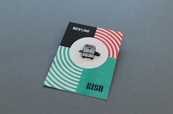
Since first being introduced to it in 2012, the Risograph has been a staple in my creative toolbelt in the Analog Research Lab. In the years since, the number of Risos we’ve acquired has multiplied. The first of the two color models (an ME 9450U) added back in 2016 was given the nickname “Rex” and joined little brother RZA, the lab’s trusty Risograph EZ 591U single color machine. We’ve since added a second with at least one more of these on deck. How many is too many right?
In advance of an upcoming appearance later this year at Magical Riso 2018 at the Van Eyck Academie in the Netherlands, I thought I’d create and share a tribute to this trusty creative companion. He’s also much more portable, less surly, and never mucks up your color registration.
Rex the Riso the enamel pin is available now in very limited quantities and with a handy 20% discount just for you!
I’ve had the immense pleasure over the last couple years helping lead the invitation-based Designer in Residence program in the Analog Research Lab. This program has provided a meaningful path to open our doors to different design and creative communities, giving designers access to various processes and offering them opportunities to experiment, explore, and push the boundaries of ideas and work into new territory.
Simply put, new designers = fresh and diverse ideas and observations about us and the world.
Designer and illustrator Steve McCarthy is no exception. During his residency in Dublin, Steve thoughtfully and gorgeously illuminated the often hidden or ignored movements and motions of individuals and teams whose work makes them some of the real unsung heroes at Facebook.
The end of 2017 saw a reboot of the Designer in Residence program we started in the Analog Lab at the beginning of 2016 but with a new twists — we opened the program beyond its roots in California to our New York and Dublin studios.
Along with extending the reach of this unique invitation-only program, we’ve restructured and simplified how it works to allow us to do things we’ve been unable to do previously such as producing a series of short films to document the work and process of the designers we invite into the Analog Lab.
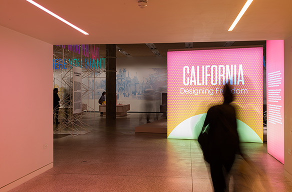
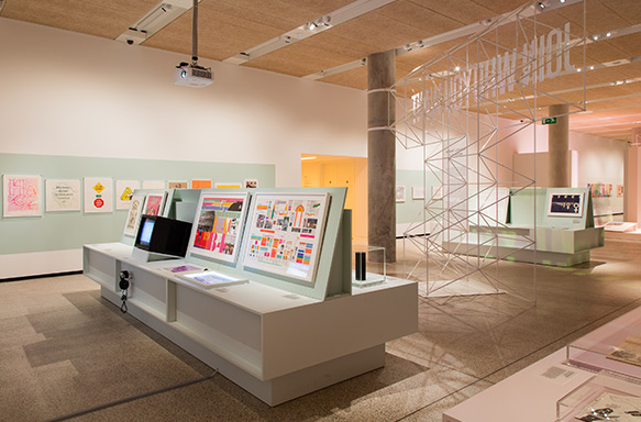
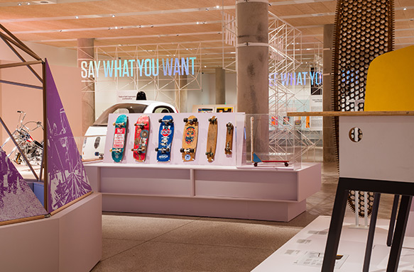
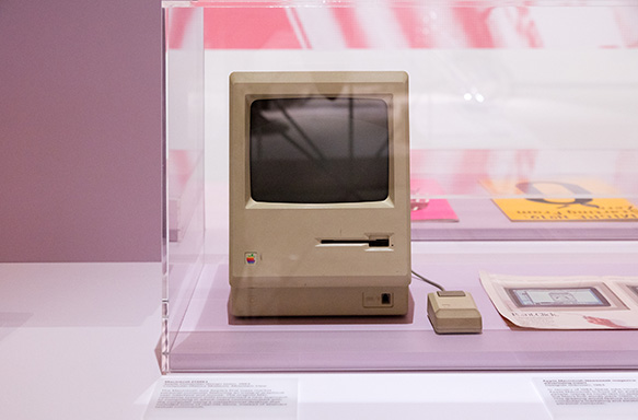
California: Designing Freedom is a new exhibition and an extensive survey of design and design thinking originating in California beginning in the 1960’s through political posters, personal computers, and more modern digital devices which have transformed daily life around the globe. “The central premise is that California has pioneered tools of personal liberation, from LSD to surfboards and iPhones.”
The exhibition, which I’m thrilled to say features work from myself and other colleagues from the Analog Research Lab runs until October 15th before traveling to the Design Museum in Helsinki through March 2018. I’m looking forward to seeing it myself in person in July.
Photographs by Luke Hayes, courtesy of the Design Museum.
It’s amazing how quickly time flies by, how little things will quickly fill in the empty spaces between larger moments. The truth is — accelleration is accelerating.Now here we are at the end of 2016, more than a year since the last time I posted. I’ve been… ahem… occupied.
This brief snapshot of work from the Analog Lab in 2016 doesn’t cover everything — missing are the murals, installations, stickers, buttons, and other pieces of work that augmented projects. It also doesn’t represent all the events, classes, and workshops we coordinated, nor the many hundreds of people we interacted with or that became active participants in our endeavors.
My hope for 2017 is greater structure and focus — for which I’ve already started to lay the groundwork. More space for writing, making, experimenting and pushing myself further and into new territory while also brushing up on a few things that I’ve let slide due to other priorities.
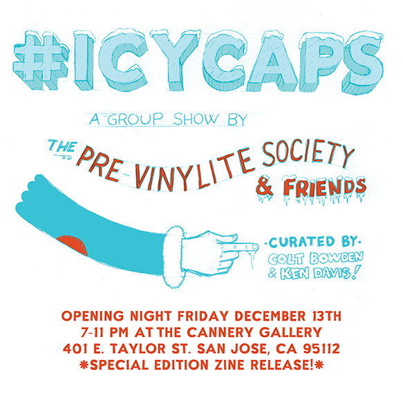
If you like type and lettering and just happen to be in the Bay area mid-December, I’ll be participating in a group exhibition show being assembled by the Pre-Vinylite Society and curated by Colt Bowden and Ken Davis.
I’m seriously excited and honoured to participate among a who’s who of the sign painting and lettering worlds. The theme for the show is #icycaps — you know, fun snow capped type often found on the side of ice cream trucks and grocery store ice boxes. A perfect theme and just in time for the holidays.
The show opens on December 13th (between 7-11 PM for the opening) and will run until late December at The Cannery gallery at 401 E. Taylor Ste. 150 in San Jose, CA. Individual hand painted signs and other pieces will be available for sale during the run of the show.
In addition, a special issue of the fabulous How to Paint Signs and Influence People zine will also be launching at the event. Previous issues are still available from Colt’s Etsy site. Highly recommended!
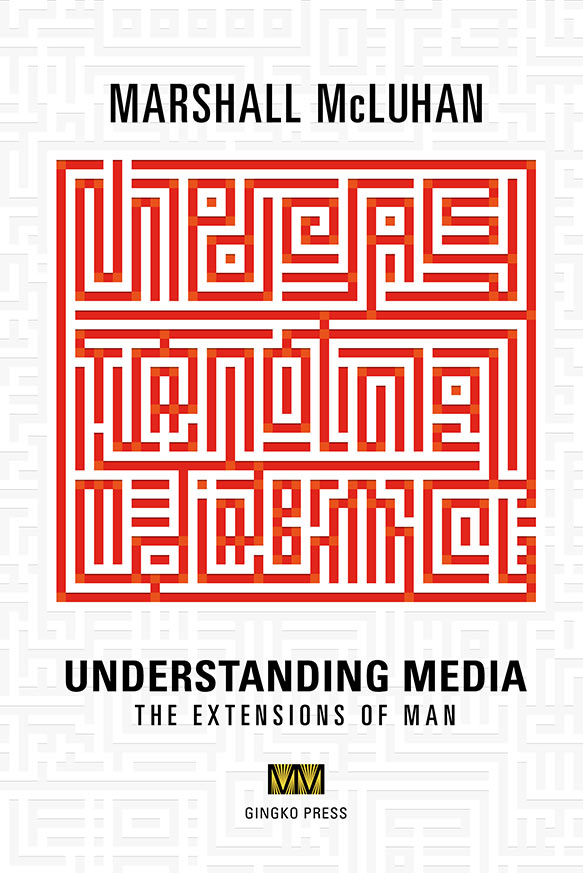
It is with immense pleasure that I can finally announce the availability of the first ever digital edition of Marshall McLuhan’s Understanding Media: The Extensions of Man, a book decades ahead of its time and many of its critics.
In 1965, following Understanding Media’s original publication, Tom Wolfe wrote (in the New York Herald Tribune):
Suppose he is what he sounds like, the most important thinker since Newton, Darwin, Freud, Einstein, and Pavlov. What if he is right? — Tom Wolfe
While McLuhan may not have always been correct, that was never his aim. His intent was to probe, to ask more questions than provide answers, to encourage others to ask questions and not take anything for granted — to open their eyes to what was happening all around them. 50 years later, Understanding Media continues to give the world a lens through which to recognize patterns, to see the effects of our world and our technologies; to activate our survival instincts.
For me personally, this release occupies a particularly long journey prior to the 100th anniversary of McLuhan’s birth in the summer of 2011 and carries significant weight. It’s been months of patient encouragement and discussions between myself, the McLuhan Estate and publisher Gingko Press. It’s really only during the last six or so months that the stars aligned and the pieces came together.
Bringing such an important piece of writing to the digital world was something I insisted had to be done right. Many commercial eBooks have historically been assembled haphazardly through automated processes where quality is frequently sacrificed. Understanding Media deserved better, and in this case, the entire conversion process, starting from the digital files provided by Gingko Press, was completed carefully by hand for both ePub and Kindle (.mobi and KF8) formats.
Understanding Media: The Extensions of Man is now available for Kindle. The ePub edition for iBooks, Kobo, and Nook platforms will be available (we think) in about a week’s time.
Several weeks ago a gray fox and her kits took up residence on the Facebook campus and have since garnered quite a lot of attention amongst employees and thepress. Despite not actually having seen them “in the flesh” myself, the foxes are one of those special moments that show up in my News Feed and put a smile on my face.
The photos and videos of the little fox family have also captured the interest of my kids — they gush every time I share the latest with them. And because my daughter is currently quite enchanted with LEGO, the foxes are an opportunity to unleash my own inner child (read: dork) to make something special for her.
So with that in mind, the other night I put together a custom LEGO fox kit using the free LEGO Digital Designer app and I’m making it available to anyone who wants to build their own. The kit contains the complete parts list with piece IDs for LEGO’s Pick-a-Brick service along with detailed step-by-step visual assembly instructions.
One of the highlights for me in 2012 was the opportunity to spend a weekend at New Bohemia Signs in San Francisco learning the basics of brush-based sign painting with my pal Naz Hamid and new friends Tyler McGowan and Erin Ellis.
Sign painting is an attractive activity not just because I’m a type nut, but also because I’ve always enjoyed the satisfaction that comes with making physical things as much as digital ones made of ones and zeros. But let’s be clear — sign painting is not an easy pursuit — it can be physically challenging and incredibly difficult to do well, but it’s fairly low-tech and therefore approachable.
The above is a photo from my workshop. I completed the sign on the bench this past weekend. It’s far from perfect, and while I could have cheated and used stripping tape to mask the various shapes of the chromatic letters, I did this one freehand to work on two essential skills — improving my muscle memory with a brush, and speed. Ultimately, the lesson for me coming out of that project is: chromatic type is really hard to paint. Unless perhaps you happen to be John Downer.
Next up — practice, more practice, and then more practice. After that I’ve got an ammo case I picked up at the Alameda Antiques Faire that needs sprucing up.
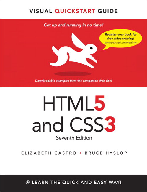
Towards the end of October, the opportunity presented itself (thanks to the handsome and charming Brian Warren) to contribute to the upcoming 7th edition of Peachpit’s seminal HTML and CSS Visual Quickstart Guide book which will be released on December 27th, 2011. Although the majority of the heavy lifting of updating the book was handled by Bruce Hyslop, Brian and I each contribued wholly new chapters to the book.
HTML5 and CSS3 Visual QuickStart Guide (7th edition) from Peachpit Press
In those new chapters, Brian provides an introduction to the use of the CSS @font-face syntax, and I cover a handful of the new(-ish) CSS properties such as border-radius, box-shadow, text-shadow, multiple backgrounds, and background gradients.
Because this book is aimed at newbies, it was an interesting challenge in restraint, and also my ability to distill some complicated properties, along with the use of vendor prefixes down to something a mere mortal can comprehend. If you’ve ever spent any time with the background gradient syntax for example, it’s… um, complicated. That I managed to write something which makes learning the basics of CSS3 gradients simple, I consider that a win.
Aside from some minor aches and pains writing and editing in Word, the process was both a great learning experience and fun. And I, of course, would be remiss to not mention the expert editorial guidance provided by Bruce and our editors Cliff and Robyn.
I was hopeful that Yahoo! selling off Delicious to the former founders of YouTube would be a smooth transition and that whatever they had planned to reinvigorate the service would pay off (reasonably) quickly. Now that the initial switch is complete — I’m not so sure.
Perhaps it was just a matter of time before I came to my senses, but I have, and last night I quickly (and painlessly) made the jump over to Pinboard.
While I plan on keep my old Delicious account active, it’s reached the end of the line and I need to find a way to flag it as inactive. In the meantime though, the Elsewhere links that either linked out to Delicious or pulled data from there have already been transitioned over to use Pinboard instead. Easy peasy. You did know that’s what all that was about right?
And of course that just reminded me of the one thing I did forget to switch. Be right back…
Just as TypeCon was kicking into gear last week, I flipped the switch on a new limited edition print from Ligature, Loop & Stem. Unlike previous releases though, this one has a special mission — to raise much needed money to assist those affected by the devastating earthquakes and tsunamis which first rocked Japan in March and again just a week ago.
Limited Edition SOGO Japan print design by Neil Summerour (Positype)
The SOGO Japan project, designed and beautifully lettered in Kanji by type designer and lettering artist Neil Summerour, whose typeface Epic graced both editions of the Typographic Lesson Plan print, has deep personal meaning for him, having amassed many friends and adopted family there since first visiting the country as a teenager, and we’re extremely honoured that he asked us to be involved.
Each 18” × 24” print is individually signed and numbered by Neil, and features the names of all the cities affected by these tragedies. Additionally, each includes a smaller secondary print showing the matching English translations for the city names.
In keeping with the spirit of the SOGO Japan charitable organization established by Neil, and because we want to ensure as much money as possible will reach the people of Japan, LL&S is taking measures to ensure our impact on the funds raised are negligible. All money raised will feed directly into organizations on the front lines in Japan — groups that know the landscape, the people, and their actual needs.
That said — we realize this is not an inexpensive piece of art. On the other hand though, it’s an opportunity to do good and support a country whose exports enrich the lives of so many around the globe.
We hope you’ll help positively impact those who desperately need your support, whether by purchasing a print, or simply getting the word out about the project and the SOGO Japan organization. Thank you.
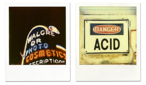
Monday marked the start of Polaroid Week and I’m taking part for the first time this year (despite missing the first day due to travel). As I’ve done the last couple years when travelling, I had my trusty SX-70 with me in New Orleans and was shooting a mix of older expired 600 film that my bud Brian Warren had brought down for us to use along with a range of film from The Impossible Project including the new PX-70 Color Shade which is easily their best yet.
A pair of PX-70 ColorShade photos I took during Typecon 2011 in New Orleans
I’ve owned a Polaroid camera of one type or another for probably longer than I remember though it’s only been during the last couple years that I’ve started to find myself interested in the medium again and excited about what the The Impossible Project is doing, particularly Annie and Dave who I had the opportunity to meet last year while in NYC on my way to Connecticut.
Annie and Dave and the rest of the Impossible team get customer service like few companies. They frequently going above and beyond to take care of customers. They’ve certainly helped me on more than one occasion — and have my utmost gratitude and respect for being so constantly wonderful. I can’t think of another company who would ship me something overnight and keep an eye on the order themselves to ensure it got to me. There’s just not enough nice things I can about them.
As an aside, if I can offer one simple piece of advice — do yourself a favour if you ever plan on visiting the Impossible Project Space in New York — take the elevator!
A few months back the video team from stillmotion paid a visit to Mike and Bianca who run Kid Icarus (formerly Studio 19) in Toronto’s Kensington Market neighbourhood. In a confluence of perfect timing, this coincided with the start of print production on the sold out Second Flight Typographic Lesson Plan print.
Although I knew the film crew had shot Mike and Bianca working on the prints, it had slipped my mind until Bianca sent me a note the other day to say the video was finished. And so here it is…
As anyone that’s been following me on Dribbble over the last year or so knows, I’ve been quietly chipping away at revitalizing the online historical presence of renowned media and communications theorist, and former patron saint of Wired magazine, Marshall McLuhan along with McLuhan’s youngest son Michael and several other members of the McLuhan family.
From my perspective, the scale and importance of the project is incomparable to anything else I’ve worked on. It’s a challenge unlike anything I’ve experienced and it though it’s taking considerably longer than I’d like, it’s more important that we get it right than get it done fast. That said, I can’t wait to be able to share some of the amazing, largely unseen photographs that have been unearthed.
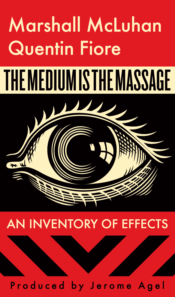
Though he passed away in 1980, the year 2011 marks McLuhan’s centennial, and as such, there are a myriad of events and activities happening around Toronto and the world to both celebrate the man and his work. Additionally, some of McLuhan’s most important and prescient writing is being republished.
The Medium is the Massage, 2011 Centennial Edition featuring a new cover by Shepard Fairey
The Medium is the Massage: An Inventory of Effects (Amazon US / Canada) is the second of such new releases from the McLuhan catalogue in 2011 and unquestionably a seminal text on modern culture, having sold over a million copies worldwide. The Medium is the Massage is also arguably his most accessible book, and belongs equally on the shelves of those studying media and communications as it does graphic designers.
All media work us over completely. They are so pervasive in their personal, political, economic, aesthetic, psychological, moral, ethical, and social consequences that they leave no part of us untouched, unaffected, unaltered.
The prescience of The Medium is the Massage continues to be as relevant today as it was in 1967 and the addition of a new iconic cover by artist/provocateur, Shepard Fairey will hopefully shine a new light on it and allow a new generation to benefit from its insights.
Continuing on a somewhat typographic theme, I’d be remiss to mention that Ligature, Loop & Stem has joined the sponsor ranks for the first Ampersand: The Web Typography Conference, a one day event held in Brighton, UK on June 17th, 2011 and focused on typography on the web.
The 2011 Ampersand conference logo
On top of providing a few of the long sold-out limited edition LL&S prints as prizes for Ampersand attendees, we’ll also be putting together an exclusive for the event. I can’t promise we won’t keep it a surprise until then, but we’ll see…
And if that weren’t enough, LL&S will also be sponsoring TypeCon 2011: Surge in New Orleans this year. We’re still working out exactly what we might do for that event, but needless to say, as was the case last year, the entire Butter Label crew will again be on hand.
The devastating earthquakes and tsunami that recently ravaged Japan ushered a call to arms for designers to contribute to worldwide relief efforts, and for the fifth time, the Society of Typography Aficionados (SOTA) leapt into action to launch Font Aid V: Made for Japan — to collaboratively create a font whose sales proceeds will go directly to the relief efforts in Japan.
The money raised through the sale of this font will be distributed to organizations such as AMDA International and is being facilitated by SOGO Japan, led by type designer Neil Summerour who has a long, personal connection with the country.
My contribution (in red) and several others to Font Aid V: Made in Japan
More than 300 designers from 44 countries submitted the over 500 glyphs which will comprise the font, now dutifully being assembled in FontLab by Neil Summerour and Grant Hutchinson. Once completed, the OpenType font will be for sale through several distributors for a mere $20. SOTA also hopes to produce a printed specimen booklet which could accompany the font and which will include additional information about each participating designer and their glyph(s).
As was the case last year, it was an honor to design a glyph (in red above) for inclusion among such illustrious company. And while Ligature, Loop & Stem is working out what we’re able to donate in addition to supporting SOTA, I whole heartedly ask that you share this with your friends, co-workers and fellow designers. Buy a license for yourself, buy one for a friend, and encourage others to do the same as soon as it’s available.
Letting something you’ve created go free into the great unknown of the world is scary. Anything could happen. Nothing could happen. The latter often being the worse of the two options. Today was one of those days. One of those great days — and there are a lot of people responsible for making it that way.
Today saw the start of pre-orders for the second flight of the popular (and sold out first edition) Typographic Lesson Plan by my LL&S cohorts and I, and the ceremonial letting go of a new thing into the world.
Now available - the Second Flight Typographic Lesson Plan from LL&S
Flipping that switch from “coming soon” to “available” is scary. Every time. Nothing’s real until it’s out there, until we’re really on the hook for something other than to ourselves. That people are there each time, waiting, is still surprising and amazing. It’s equal parts exhilarating and humbling.
This particular piece is a milestone for us, in part because the first edition was so popular and sold out as quickly as it did, but more importantly because it’s given us a chance to come full circle on something we talked about when the original letterpress edition was released — to set some aside for educators.
From day one, we’ve tried to imbue an educational angle on the various pieces we’ve produced, however simple. Whether it’s adding historical context — knowing not only the name of a typeface but also who designed it, who distributed it, and when, but also in producing artifacts that can help pass on knowledge for the benefit of anyone who comes in contact with them.
And so, after what’s been a whirlwind day, I want to take a moment to say thank you.
Thank you to everyone who purchased a print today, tomorrow and may sometime in the future. Thank you to the educators who’ve put in a request for one of the special unnumbered prints that are being set aside just for them — we’ll be getting back to you about those soon. Thank you to everyone who tweeted and retweeted about the launch. And of course, thank you to the dapper, steadfast, and bloody amazing and indispensible LL&S crew — Grant, Luke and Carolyn.
Ads are not something I would normally gravitate to. They’re usually ugly, irritating or simply get in the way of the content I’m actually going to a website to locate or explore. So until recently, any serious thoughts of putting them on my own site was extremely foreign.
To date I haven’t put any measureable amount of consideration into somehow financing the ongoing costs of hosting, domains and server management, but a recent invitation by the lovely folks at Carbon Ads to join their ad network piqued my interest.
I knew who they were — I’d seen their ads on sites I frequent and so immediately knew there was an opportunity for a good fit. I also knew enough about their angle — one single small, non-animated ad per page, allowing more than a sufficient degree of flexibility with regards to layout and integration. So I said “yes” and have been happily running these ads on the site for a few days now.
The beauty is that the ads are largely for products and services I would likely, or already use and endorse, meaning there’s no guilt. It’s an experiment on one hand, but one with no real downside. And there’s an oppotunity to learn — from the ads themselves, but also by clicking through to see where they take you.
My expectation at this point is minimal, though (obvously) the long-term goal is to increase traffic and impressions by writing more — to share ideas and opinions that I’ve largely kept to myself or saved for a more private dialogue with my close peers and colleagues. To that end, the queue of half-finished ideas, articles that have been building up should start to creep out a little more frequently.
Aside from any potential monetary benefit, however small, this opportunity with Carbon Ads has also lit a small fire under plans that have been smouldering for a while now — to finally leave Movable Type behind and move to a new publishing platform (no, not Tumblr or Wordpress) with a refreshed design that better reflects where I am professionaly across the board.
There really isn’t just one true source for personal publishing anymore, be it on Twitter, Flickr, or Delicious (yes, still) and to that end, the initial work on aggregating these and other sources into a unified whole has been started though likely won’t come to the light until I finish up one last major undertaking.
It’s hard to believe it’s been about 6 months since the original Typographic Lesson Plan letterpress print by myself and my Ligature, Loop & Stem cohorts was released and started shipping to nearly every corner of the globe.
That the print sold out within 2 days was unbelievable, and the continuous stream of requests for more forced us to consider something that wasn’t really even on our radar: How do we reprint a limited edition poster?
Where in the World is the new Lesson Plan?
After some careful consideration, holidays, and dragging of feet, we came up with a plan and Grant came up with a fancy little description — the “second flight.”
More recently, the wonderful people who previously signed up for the (reasonably) new mailing list got an early peek at that plan and a tease of what was coming. Today I’m happy to finally tease out all the details.
When finished, the second flight print will look something like the above mockup
In order to not trample all over the original limited edition, we started from scratch and this “second flight” print has been re-imagined in a number of ways:
Numbered edition of 250
New typeface selections and overall design
New or revised terminology (with alternate terms where applicable)
Significantly larger 22×30 in. print size
Silkscreen printed in three colours on archival quality Somerset 250gsm newsprint grey velvet stock
Lower price point and (we hope) also reduced shipping rates
Prints will be $35 each, less than half the price of the original edition. Pre-orders will start on at 12PM EST on Monday, March 7th with prints shipping as of March 21st (to coincide with the LL&S crew’s safe return from SXSW in Austin, TX).
One last, and very special note is that we’re going to make 50 un-numbered prints of the “second flight” series available exclusively to educational institutions. A more formal announcement and details on exactly what that means will be coming soon.
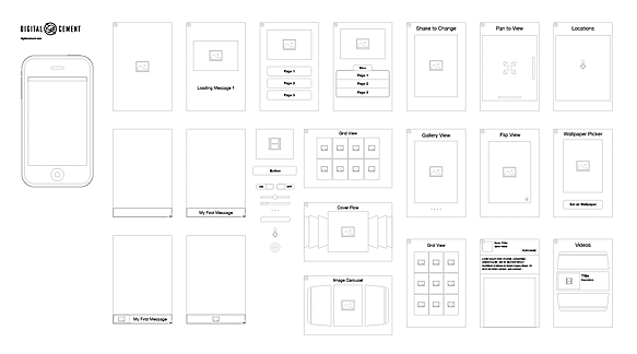
Yesterday I finished up some work on a little pet project I started via the day job back in December ‘10 just before the holidays. Apple had recently released iAd Producer and after spending a bit of time tinkering with it, I thought it would be a fun little project (read: distraction), but potentially useful down the line for myself or others, to produce a set of wireframe objects based on the iAd platform and some of the default widgets and templates included in the iAd Producer software to make designing iAds — from an experience point of view, just a little bit easier.
Preview of the iAd Wireframe stencils for OmniGraffle
The stencils/templates come in two flavours currently — either OmniGraffle and Adobe Illustrator for your wireframing and experience planning pleasure.
If you find them useful, I’d love to know. Same goes for any improvement suggestions, additional elements worth including, etc. For example, is it worth creating a complementary iPad-sized version of these now that iAds have started to be opened up on that platform as well?
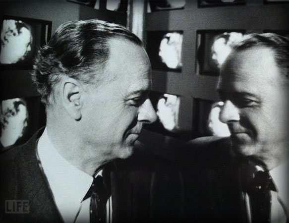
For the last several weeks and months during whatever time I’ve been able to carve out, I’ve been absorbing the life and times of Marshall McLuhan and photographing books, several of his personal possessions such as one of his hats and his Order of Canada medal.
Today I took temporary possession of a box of amazing, almost entirely never-before-seen photos of Marshall. I say almost since a few are alternates of already well-known shots. The photos, such as the one shown above, taken at the CBC on January 27th, 1966 are expected to be a part of the significant design effort I’m leading to update the official McLuhan Estate website, the first phase of which will launch in early 2011 to coincide with celebrations surrounding his centenary.
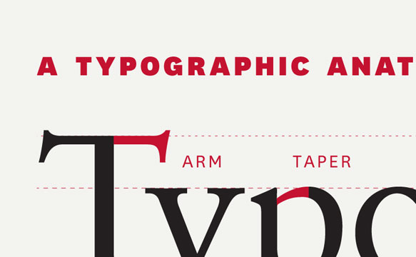
The last couple weeks have been a bit of an unexpectedly wild ride for Grant, Luke and I after our “Typographic Anatomy Lesson Plan” print was showcased on the always inspiring Under Consideration FPO (For Print Only) site, promptly followed by an unexpected appearance as the Infographic of the Day on Fast Company’s Design site.
Had I not been so damn occupied with other things until now, I would have written something about this all sooner, a few tweets notwithstanding.
Sites that have recently featured the LL&S Typographic Lesson Plan print
It’s all a bit funny since this has come long enough after the prints sold out and were shipped off to anxious recipients around the world; but it’s forced us to start considering whether we should, or want to produce a new edition. If a new edition was to be created, it would have to be significantly different and would definitely not be a simple reprint.
Given the deluge of emails I’ve received requesting either more copies of the existing “Lesson Plan” or a second edition — we’re not making any promises at this point, but it’s on the table. It’s likely we’ll have one or two other things that’ll come before either way.
Late last week, Armin Vit, who runs Under Consideration with his wife Bryony Gomez-Palacio, shared a little statistical nugget that just floored me:
Just thought you would like to know that this poster has been one of our most popular posts all year. Doubled the traffic. Just in case you were thinking about reprinting, there is clearly appreciation for it!
Wow. What else can I say? I’m humbled more than I can find the words for.
So — if you’re interested in finding out exactly when something new from LL&S will drop (before the world at large; along with a possible discount code), then I suggest signing up for our newly minted email list. We’re going to be very judicious about sending people email because we all get more than enough as it is.
On Monday, August 30th at 11AM, after the well-received launch during Typecon 2010 in Los Angeles, my Ligature, Loop & Stem cohorts and I opened the doors to the general public for our latest labour of loveaffectionately known as the “Typographic Anatomy Lesson” — or more simply — “Lesson Plan”, a new letterpress print designed by myself, Grant Hutchinson and Luke Dorny.
As much as I like to think Grant, Luke, Carolyn and I were all humbled by the overwhelmingly positive reaction last November to the launch of the LL&S site and the now award winning Ampersand print, this time it feels even more gratifying. This one feels like a grand slam.
The amazing (crazy?) part is that we’re basically doing this without a plan. We’re just following our gut, and having a great time with it. This is a good thing and also means we’ll keep at it.
But, before I say any more — I’d like to thank everyone for their time, attention, support, kind words, referrals and of course, purchases.
A very special thanks also to these fine sites whose support is enormous in our eyes.
Their support, along with that of somanyotherwonderfulpeople on Twitter and elsewhere across the internets, contributed greatly to this print selling out as quickly as it did.
Sold Out. Again.
Yup, you heard right — as of 8:23PM on Friday, September 3rd, all 100 prints are gone.
One of the takeaways from the production of the Ampersand print was to simply make more. So we did. Four times as many actually. Apparently that still wasn’t enough though.
Unfortunately, “limited edition” means just that — no second runs. Definitely no third runs. Not unless it was somehow significantly different. Fortunately, plans are afoot already on the next “thing” (or three).
Signed or Not — That is the Question…
The original plan was to sign each and every print, but logistics make that challenging since I’m in Toronto, Grant’s in Calgary and Luke’s in Los Angeles. Two countries. Three timezones. A shipping nightmare.
What ended up happening was that since we were all attending Typecon, I brought half the prints to be signed. Just half because they were, frankly, very heavy, and it would have been even more risky to squeeze them all into my suitcase. As we got ready for the start of the conference, we ran out of wax after stamping 32 prints, couldn’t get more in time, and so it was decided those first ones would be a slightly more special edition. Did I mention we’re winging it?
But after chatting with Grant and Luke yesterday afternoon about whether or not we should just sign the remaining prints, we sent an email to everyone who ordered one up to that point and asked their opinion. The overwhelming majority said “yes”, but there were a few folks on the fence. So… to keep everyone happy, here’s what we’re going to do:
The remaining signed prints from the first 32 initially available at Typecon will be shipped as quickly as we can package them up and get them on their way.
For the handful of folks that wanted their prints sooner rather than later and without worrying about it being signed by Grant and I, those will be on their way next.
For everyone else who did want their prints signed, those will be carefully packaged, shipped off to Grant to sign, returned, the wax seals applied, carefully packaged and then shipped out to their final destinations around the world.
Our expectation is that the delay from shipping prints from Toronto to Calgary and back shouldn’t take too much more than a week or so but we’ll keep everyone posted if that changes significantly.
Next?
As much as we’d love to just hop on the next things right this second, our priority is to get prints out the door as quickly as possible. And so if you’ll please excuse me, I have to go print a stack of shipping labels. Err, right after bed.
After an unexpectedly long hiatus, Luke, Grant and I are back at work on some new stuff for Ligature, Loop & Stem and over the last few days I’ve shared a couple peeks at one of the pieces we’re finishing up on Dribbble.
A preview of the Typographic Lesson Plan on Dribbble
The big news, aside from that we’re doing something new is that we might do things differently this time based on the frankly overwhelming reaction to the Ampersand print. This could go a few ways:
A first limited edition letterpress run. Possibly at an extra-large size as we now have a line on a printer than can handle letterpress work up to 28” × 38” (I know — wow!)
An in-person only conference exclusive (Hint: Typecon) since Luke, Grant and I will all be in attendance to sign and number the prints and pose for glamour shots
A second general run based on a smaller print size and possibly different inks and stock
We haven’t finalized anything yet but will shortly. While we don’t want to give the game away too soon, we’ll no doubt toss a few Tweets out and provide some sort of early info via either Twitter and/or Dribbble.
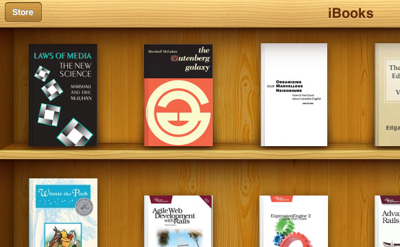
Now that Joe and I have wrapped our talk about “Structure and Typography” at BookCamp Toronto 2010 and the aforementioned announcement has been publicly made in front of living, breathing human beings, here’s the scoop — I, along with members of the Estate of Marshall McLuhan will be publishing the first official (read: legitimate) digital editions of Marshall’s work.
Laws of Media and The Gutenberg Galaxy in Apple iBooks (not yet available)
We’ll be starting with Laws of Media written with his eldest son, Eric, along with The Gutenberg Galaxy with the goal of releasing both either towards the end of 2010 or the beginning of 2011 in order to coincide with Marshall’s centenary. Not coincidentally, a much needed new site for the McLuhan Estate will also launch around the same time.
What about his other books? The answer is complicated, but ultimately “we don’t know… yet.” We’ve started necessary conversations and hope those will be available in due course.
That said, as was discussed today during our talk, and subsequently, some books may demand a physical artifact. They may not be ‘translatable’. Art books or highly art directed books for example; at least not in the open-source ePub format which is how we’d like to see these digital editions released.
This is arguably an experiment and will not be easy for many reasons — sorting out electronic publication rights (in at least one instance), editorial and design challenges, as well as handling divergent digital formats.
If important books such as McLuhan’s are going to make the jump to digital successfully, they deserve to have the same care and attention put into them as their printed counterparts — and we’re in the best position to ensure that happens.
This coming Saturday, May 15th is the second annual BookCamp Torontounconference. As one might expect, as someone who’ll be speaking at said event, I’ll be talking books — but not alone. I’m lucky to be sharing the desk/podium/stage/whatever with my friend Joe Clark to pontificate specifically about electronic books, publishing models and everything that’s right, but perhaps more importantly about what’s wrong in those worlds with a particular focus on independent publishing.
The 2010 BookCamp Toronto logo
The event is being held at the University of Toronto iSchool, which is appropriate given the timing and content of my portion which will be both relevant to the institution itself (and/or may tick some people off in the process) as well as recent exhibitions from the Scotiabank Contact Photography festival. Our session will be at 2pm in room #2 in case you were wondering.
During my bit, I’ll be making the official public announcement about a couple projects that will be occupying a significant portion of my time throughout the next year or so.
One of these has been in the works for some time, but the stars have finally aligned to do something about it. The other one might ruffle a few feathers at U of T. Enough about that for now. I’m sure there’ll be more to say in a few days time.
BookCamp 2010 is sold out but there’s still a waiting list up at EventBrite if you’re interested in attending. I haven’t done this type of public speaking in a long time — it’s not quite the same as design presentations to clients, so if you’ll be in attendance, please be gentle with me.
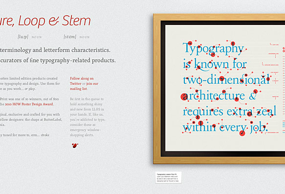
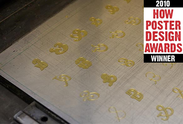
It’s hard to believe it’s been about six month’s since Luke, Carolyn and I launched Ligature, Loop & Stem (and of course with help from our good pal Grant). It’s also hard o believe how busy we’ve all been since then and how guilty I feel that there’s been almost no time at all to dedicate to any of the long list of ideas I’ve got for the next LL&S releases.
LL&S Ampersand print polymer letterpress plate
But that’s slowly changing and things will get back on track. That said, we were all pleasantly surprised to find out the other day that the Ampersand Print was selected as one of the 10 winners (out of about 800 submissions) of a 2010 HOW Poster Design Award.
I’d say the award is further validation that we’re on the right track with the idea in the first place. We’re in good company with the other winners too — a hearty congratulations to each of them as well.
To quote competition judge Steve Hartman,
Overall, I was impressed by the posters I was given to review. In the end, I picked posters that met three criteria: What did it do for the overall brand of the organization (if applicable)? Was it something I wish I had designed? Would I hang it on my wall? I have to say that what I chose fits all three. Really nice work, all around.
Thanks to Steve and the fine folks from HOW from all of us involved in LL&S.
A few weeks back, shortly after the devastating earthquake that forever changed the lives of the people of Haiti, the Society of Typographic Aficionados (SOTA) put out a call for participation in the creation of a collaborative font, the proceeds from the sale of which would go directly to providing aid through international medical humanitarian organization Doctors without Borders.
This is the fourth time SOTA has undertaken such an effort (hence the title ‘FontAid IV’), this time using ampersands to represent the idea of “people coming together to help one another”. Who says celebrities, musicians and actors are the only ones who can make a difference?
My contribution to FontAid IV, dubbed “The Anchor”
Personally, this was an opportunity to be part of something significant, and over the course of an evening, I sketched out and refined an idea that eventually became my submission to the project. More time would have allowed me to submit another if for no other reason than to keep my pal Grant, who donated his time toward the work in assembling the final font, even busier.
Where to Buy
The resulting font, dubbed “Coming Together”, which includes more than 400 glyphs from designers, typographers and artists around the world is now available in cross-platform OpenType format for a mere $20 from several popular font distributors with more being added later this week.
When Luke, Carolyn and I launched Ligature, Loop & Stem last November we really had no idea what to expect. Throughout October I teased a bit of early interest out of friends and such on Dribbble (yes, the extra “b” is on purpose) and during An Event Apart in Chicago.
Although the feedback was all extremely positive and validated that we were on to something interesting, I tend to guage expectations with at least one foot in reality. In the end though, the response completely blew my expecations out of the water with that first collection of products selling out in under 3 days.
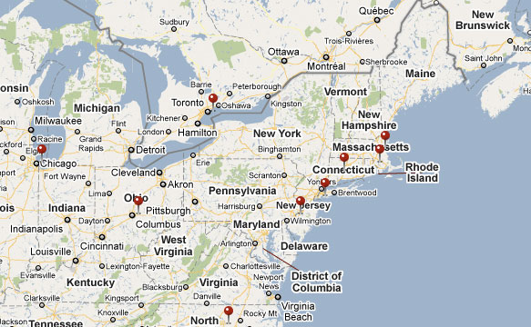
When we finished shipping everything I gave myself a little project — to map the orders. The reason was simply to put a little visual context around what we just did. The end result looks something like the preview below.
A map of Ligature, Loop and Stem print orders — Click the preview above to view more
Due to other committments and even though this has been sitting on the server for a few weeks I just haven’t had the time or energy to talk about it, not that there’s really that much that’s not self-explanatory… For me it was a fun little diversion and a good chance to tinker with version 3 of the Google Maps API. If it’s interesting to anyone else, that’s a nice bonus.
For those wondering what’s next — I’ll have a bit more to say about LL&S and some other things soon.
We didn’t exactly plan it this way, but Zeldman declaring this past Tuesday, November 16th World Type Day was fortuitous. Perhaps serendipitous even.
Luke and I, along with the incomparable assistance of Carolyn Wood originally planned to launch our new little experimental venture, Ligature, Loop & Stem the previous week but enough pieces weren’t quite ready for prime-time that we pushed it back a week.
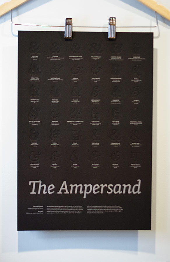
Hanging Ampersands from Ligature, Loop and Stem
Based on the immensely positive responses we received throughout the week — it seems we did something right and are sincerely humbled, excited and frankly a bit overwhelmed. Selling out the initialcollection less than 72 hours after launching the site was… at least a little unexpected (by me anyway).
Of course there’s still some lovely (and free)ampersand wallpapers available for your iPhone or iPod touch to tide you over until the next limited edition pieces are ready to go — which we expect will be sooner than later.
Setting LL&S
In a lot of ways, the idea for LL&S came out of nowhere. At the same time, it’s at the core of what I’ve felt has been missing from my work over the last couple years; the genesis of it has been biding it’s time on pages in one of my Moleskines in some form for nearly as long.
When I mentioned my initial ideas behind LL&S to Luke I knew he’d be on board, the same with Carolyn, who I’ve searched for a good opportunity to work with for as long as I can remember and who put in 150% the whole way through. Luke and I had been talking for a little while about teaming up in some fashion and this became the perfect vehicle to get the ball rolling.
LL&S mixes Luke’s and my design sensibilities, love of the web, typography and design history while allowing us to explore ideas that don’t fit the constraints of typical client projects such as non-traditional navigation, interactions that mirror the real world, and hiding little inside jokes in and around the site — you did find all of them right?
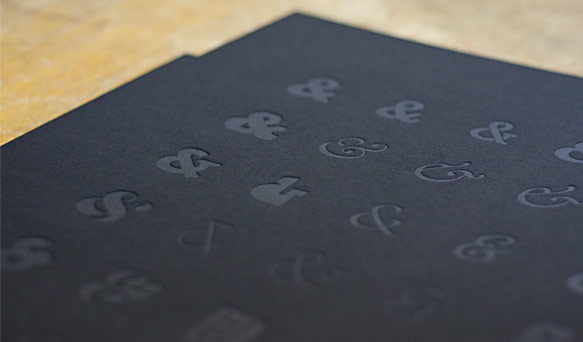
Letterpress-printed ampersand glyphs
Unfortunately the web isn’t widely recognized for stellar typographic design. Advances in CSS, services like Typekit, and some inventive web designers experimenting with type to more closely connect it to the message of a site as print designers are more apt to do will slowly change that perception.
We wanted something that could bridge the gap between the possibilities of print and the web, with a little industrial design thrown in for good measure. To do our bit in changing perceptions and that essentially gave us complete creative freedom.
Perhaps the larger vision behind LL&S is that we wanted to experiment with making stuff we’d want for ourselves just as much as we hoped other would too — ampersands seemed like a good place to start as any. That said, we’re not restricting ourselves to just producing print pieces. The sky’s the limit. Exactly how some of the ideas we’re already exploring materialize is anyone’s guess.
We think we’ve got some interesting stuff in the works. If we can continue to surprise and delight then in my books, we’ve accomplished what we set out to do.
Credit
Luke and I would be remiss to not explicitly thank our good friend and walking encyclopaedia of all things typographic, Grant Hutchinson who I asked to help curate the Ampersand print with me. Also, writer, editor, idea generator and all-around whip cracker Carolyn Wood, without whom we might still be waiting at the gate because the copy on the web site would have been, well… nowhere near as good as we think it is now, which is pretty damn awesome.
For everyone else, close to home and around the world (the internet sure makes the world a small place) — thank you as well. Thank you for the kind words, retweets, links and for simply making the launch a resounding success by buying up everything so quickly!
Next Up
Part of the point of LL&S is just us following our instincts. We know there’s room to improve the site, particularly around navigation and little bits of the overall user experience. Thankfully we’ve got some ideas that don’t compromise our original vision and should improve the situation.
Even before we get to that though, we need to get the first collection of products in the wind and on their way while pushing ahead with the next collection (which we promise will not feature ampersands).
I’m crossing T’s and dotting i’s, but that thing will be launching any minute now. Follow along on Twitter for the inside scoop though I’ll have more to say about it later today once I catch my breath and have a nap or something…
Hmmm—that should probably be crossing my i’s and dotting my… oh, nevermind.
For the last several weeks I’ve been conspiring with my good friend and man of the internets, Luke Dorny on an idea that’s been kicking around in my head and scattered across sketchbooks for some time; something that holds a lot of interest for both of us, and we know many others too.
Although thanks to Dribbble, a few fine folks of the internet have had a look behind the curtain at the design and as ideas were refined, we’re now just about ready to take the wraps off this little experiment. And so a little tease to, err, stroke your serif.
A sneak peek at an upcoming project
Look for more info and an official announcement shortly.
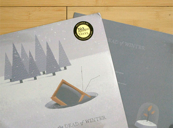
It’s amazing how long it can take to put out a record. It’s amazing how long it took to get this one out considering it was in the can (to use some old school industry lingo) months ago. We’ve been quietly sitting on it since while artwork was created, manufacturing was sourced, distribution was discussed, small details clarified and the final products finally arrived at our door. Oh, and building a little website to allow the band to sell the darn things too!
George — Life in the Dead of Winter record sleeves
Did We Mention It’s an Actual Record?
Even if the quality of digital audio is technically better, there’s something magical and innately satisfying about the vinyl medium, particularly 180g (heavy duty) vinyl. The larger canvas for artwork is more impressive and simply more “fun”. Ultimately, The band (of which I happen to also be a member) decided to go the vinyl route for this recording for two main reasons:
The characteristics of the medium fit well with the songs themselves. They’re loose, a little raw and were largely recorded live off the floor in the studio
It was a challenge — it was a totally different experience than producing a CD
To put it another way and to take a page from Radiohead’s playbook, the band wanted a real artifact despite the recognition that most people would experience the music in a digital format such as on an iPod or their computer. Analog simply has more character than digital in pretty much every respect.
About the Packaging
The sleeve was illustrated by our good friend and exceptionally talented illustrator John Martz under direction from the band and Wishingline. The fine details in John’s illustrations, such as the subtle textures and hand lettering that might otherwise be lost if printed at CD size shine through and are further enhanced by the “reverse board” process suggested by our new friends at Vinyl Record Guru who were fantastic in guiding us through the entire production process.
Tidbits Learned Along the Way
This was a good learning project for us and even if it wasn’t all practical learning, we certainly picked up a few tidbits of vinyl trivia. For example — there are no vinyl pressing plants in Canada anymore. The last one closed down in early 2008. Now everything is handled out of a few locations in the US or Europe.
We also learned that vinyl sales roughly doubled in 2008 over 2007 (1.88 million vs 990,000 units) in Canada whereas CD sales slid a further 20%. Although still a niche market, that tidbit validated the band’s decision to produce the record on vinyl only.
Where Can I Get One?
Limited to a mere 300 copies, you can pick up one direct from the band at ournameisgeorge.com for the low, low price of $20 + shipping. Each copy will be individually numbered and will include a special code that can be used to download a digital version of the record in lossless AAC format. Sorry — no MP3s, but anyone who purchases a copy will of course be free to convert the AAC files to MP3 or any other audio format they want.
So, what are you waiting for — get ‘em while they’re hot!
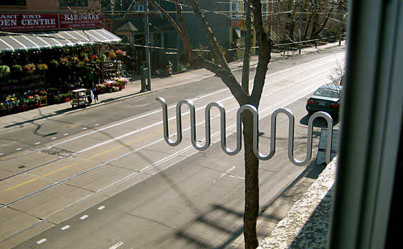
Yesterday afternoon we made it even more official than it already was as the new sign outside the Wishingline office was installed.
The new Wishingline “squiggle” has been installed outside our Leslieville office
The sign was produced locally in Toronto by British Metalcraft and was laser-cut from a piece of stainless steel using the vector artwork we had sent to them to illustrate how we wanted the sign to be mounted on the outside of the building. Using the supplied vector art meant that the sign could be cut exactly to the dimensions of the logo and not as an approximation.
Needless to say, we’re thrilled with the end product.
Way back in February 2006 I put together a pair of Mac folder icons for Rails developers consisting of one to use for Rails projects and another for the Lighttpd server folder. Due to the recent release of Leopard which completely changed the standard folder design used throughout the system (for better or worse depending on your point of view on the obvious accessibility problems this introduced), I’ve revised the icons so they’ll blend in more naturally with their new surroundings.
512px size Ruby and Rails and Lighttpd folder icons for Leopard
The new icon set includes the whole range of sizes from 16px all the way up to the giant 512px icon size. As is the case with any downloads I make available here, please do not redistribute the icons or attempt to pass them off as your own.
In releasing Creative Suite CS3, Adobe forgot, or for whatever reason decided not to update the Flash Player icons as part of the general installation thus adding one of a few rough edges around what is otherwise a pretty good software package (truly horrible and inconsistent software updaters aside).
Replacements for missing Adobe FlashPlayer CS3 icons
Although there are a number of different sets of replacement icons for the various Creative Suite applications to be found around the net, for myself at least, I prefer having something that blends in seamlessly with the originals, at least until Adobe releases a proper update (since we know they’ve designed the icon already). Therefore I took it into my own hands to put something together and have decided to share it.
Included are resources for the Mac OS X and Windows versions (sorry, no 512 px versions yet) along with 16, 32, 48 and 128px transparent PNGs. I will not be releasing the PSD source for this, so don’t bother asking. Thx.
Taking a cue from Shaun Inman, author of the original implementation, and the fellow who wrote this handy Rails helper, I’ve put together a plugin for Mephisto providing a new text filter/tag to bring better typography to headlines, lists, and more.
In conjunction with this, I’ve created a new git repository and made the plugin available publicly so any updates are handled more easily, at least from my end. The initial release is now available by running:
I’ve given the plugin some limited testing in an existing Mephisto install (running off a now slightly out of date build of Mephisto, later than the 0.7.3 release) with no problems noted. There’s nothing special in the plugin so it should work fine in 0.7.3 and higher. Of course, YMMV.
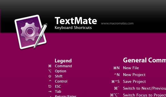
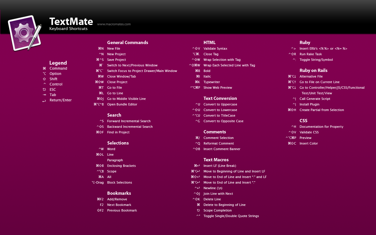
After a long transition, I’ve officially made the move over to TextMate from BBEdit during the last 6 months or so as the amount of Rails development I’ve been doing has increased. In that time though I haven’t had much opportunity to really dig into some of power features or to really even get a handle on all the keyboard shortcuts which brings us to the impetus behind creating this desktop — to help improve my (and possibly others’) TextMate skills.
I changed my mind since there’s been enough interest that I’ve put together a smaller 1280 × 800 size version for MacBook users (myself included). You can grab the smaller version here and a new, updated large version here (with a correction suggested by Wolf Rentzsch).
Comments and suggestions for improvement are welcomed.
The winter holidays are fast approaching and this year Wishingline Design Studio, Inc. is sending out some fancy holiday cards. They look like this:
The 2006 Wishingline holiday cards
If you want one, you’ll need to act quickly as supplies are very limited. Clients and certain other individuals get first dibs, but otherwise, all you need to do is shoot an e-mail over to hohoho at this domain dot com with your postal address and our elves will take care of the rest.
Even though I already have more than enough going on to keep me busy, the projects I’ve been handling lately have inspired me to get a little skunkworks project out of my mind and off the ground. So today marks the start of my what little free time I have project, remarkr.
remarkr project identity
remarkr will have nothing to do with blogs, or bookmark management, wine or web-based invoicing but will have everything to do with filling a huge hole in the graphics industry and will hopefully put the competition to shame by providing fewer features, a significantly user experience and more bang for your buck.
I’ll undoubtedly be talking to a few Rails folks at RailsConf in just over a week’s time about this to gauge interest and see if anyone else would like to come on board to lighten the load and share in the fun.
If you’re interested in participating, fire off an e-mail to whatis [at] remarkr [dot] com or sign up for the launch.
Toronto Life, a 40-year veteran of magazine racks in Toronto and across Canada launched the latest incarnation of the magazine’s companion site, torontolife.com today featuring both a whole new front-end built upon web standards.
Wishingline Design Studio, Inc. was approached in late February to assist the online team from publisher, St. Joseph Media in pulling together the new site design and implementing it using lean XHTML and CSS. The new design nicely complements the print edition of the magazine and brings a simple modern and appealing esthetic to one of the staples of life in Toronto.
Mac OS X is great in part for its flexibility and the ease at which you can get all different types of software running and working together; whether it is Unix, Cocoa, Carbon, Java, Ruby, PHP, etc. Dan, as always, did a great job at demonstrating how to get a custom Ruby on Rails environment setup on Tiger. I felt it was just that good that I used it myself recently when I spent a couple days rebuilding my primary development environment.
Lighttpd and Rails icons preview
For the coupe de grace, I decided to whip up a set of special icons — one of Lightty and another for Rails and I’m making them available for whoever wants them. Both icons included in the set contain open and closed folder states at 128, 32 and 16 pixel sizes.
Lately we’ve had the opportunity to take a break from strictly web-focused projects to work on a couple identity/logo and icon design projects. These breaks are a nice way to let the part of the brain focused on resolving Internet Explorer-related bugs to take a breather while other parts of the brain get to flex their other design and problem-solving muscles.
Both projects presented different problems to be solved based on their unique situations — one, an independent Macintosh software developer while the other, a startup technology and systems integration consultancy.
The goals and potential audiences of and for each were very different and as a result, so were the final results of our work with them.
Wishingline Design Studio, Inc. has been working with Virginia-based newcomer web hosting provider IndexCore since August to redesign their existing public facing website and give it a fresh, cohesive and contemporary facelift. During that time we have worked with them to create what we see as an approachable and user-friendly design that will lend itself well to “Web 2.0” technologies such as Ajax.
IndexCore (IC) homepage design screenshot
A total of 46 different base screens were designed using an overall visual framework along with a series of custom-designed icons, buttons and an easy-to-follow, user-friendly order process which will allow the user to see exactly where they are in the order process when signing up for a hosting account.
At this time we are pleased to announce that the site design is now complete and ready to enter the code development stages, though due to previous project commitments, Wishingline Design Studio, Inc. will not be handling that aspect of the project. The final site launch is expected sometime in October.
For more information, visit the IndexCore website.
CSS can be a really great thing for web-based application design and development. At the same time it can very restrictive, mostly due to cross-browser compatibility and standards-compliance (or lack thereof). To this point, one of my big missions at Masterfile has been to help drive the site to be more standards-compliant, getting rid of some of the not-so-hot legacy front-end code and to slim down pages wherever possible.
Steps in that direction have been taken in the last few significant releases, but probably none more than the release which we just pushed out to the real world. This is not to say it’s perfect or that it’s 100% valid code, because it’s not — but it’s substantially closer than it ever was before.
Better page structures and the removal of nearly all table-based structure allowed us to do something we think is pretty cool, and something that until the week following us presenting it to the president, no one had yet seen on a stock photo site. I nearly fell out of my chair when I saw someone had actually beaten us to it! In the time since then it appears to have vanished off that particular site (which shall remain nameless).
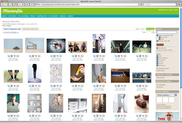
Floating Thumbs — Oh My!
So… what feature is this you ask? It’s a little something we like to call “floating thumbs” or “floating boxes”.
Conceptually it’s simple, and probably very obvious: floated DIVs inside a container. Stretch the contained wider and the DIVs rearrange themselves accordingly. Shrink the container and the DIVs rearrange themselves to fit the narrower space. In an attempt to keep things sane and from falling apart wherever possible, the min-widthCSS property was used to restrict the content from collapsing in upon itself, at least in supported 5th generation browsers such as Safari and Firefox.
The all new Masterfile search results with floating thumbnail images
The floating thumb technique works beautifully and consistently in officially supported browsers. During development and prototyping, the tricky part was making it work with a statically positioned sidebar that is locked to the right side of the window. I spent a few weeks prototyping this and ended up using some additional DIVs as containers to keep everything happy, but thankfully it degrades nicely and didn’t add significant weight or complexity to the code.
But why did we do this?
In visiting with clients and doing some site statistics analysis we discovered a large proportion of visitors were using large monitors with higher screen resolutions. Considering a large portion of the market Masterfile serves are creative-type people and organizations, this made perfect sense.
We looked at the UI and knew that we weren’t doing enough to help these people see as many images as possible on the screens due to the design being limited to a fixed-width column (due mostly to the previous table-based layouts). Moving towards a fluid, standards-based page layout let us offer users a better experience without needing to set preferences or without needing any complex interactions. Just resize the browser window. For users with 20-30 inch displays, the net effect of this is enormous.
Making it easy and painless was the key. Not forcing the user to have to change settings somewhere and then making it difficult to revert back if they don’t like it will aid in adoption of the feature. It’s something simple and we know users will appreciate it.
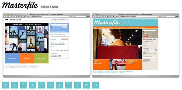
The new Masterfile.com site is live and happily purring away. All that hard work, sweat, blood and lost/gray hair was worth it. Seeing as how this was a much larger undertaking than we anticipated I think it’s worthwhile to discuss the point and the process.
Starting Points
We’ve known this was coming for some time now, but the project didn’t really hit our desks until around six or seven weeks ago when we started to get glimpses of what was coming from the designers that were hired to take care of the company identity and re-branding work. They were also given an opportunity to help re-skin the website; to give it a fresh coat of paint.
The new Masterfile wordmark by Underware
At the time they were told that they couldn’t really change anything too drastically. The site works and is respected throughout the stock industry as one of the best. I’d say it’s in the top two, but I’m a little biased.
The site also has some of the best and most intelligently implemented features. Doing any damage to that — making the site any less usable was not an option. The equation we like to use comes from Ole Eichhorn’s Critical Section site and goes like this:
W=UH
Where, W=wrongness, U=ugliness and H=hardness. In plain English, this means: “if something is ugly or hard, it’s wrong”. In the world of software development and web design, we should all hold this to be true. This is our internal mantra at least and our task has been to ensure that the site is never any less usable than in a previous incarnation. I, and numerous clients and people outside the development team who have used the new site seem to agree that we succeeded in that aim.
Overall Goals and Expectations
The site changes are just a part of the overall re-branding project previously mentioned. The first step was the introduction of the new corporate identity, new stationary, marketing collateral, magazine advertisements (see the back covers of the current issues of HOW Design, Print and other popular industry publications) and re-establishing the company culture to be more reflective of the employees. Although the official launch is not until later this week, pieces of this have started to make their way out into the world.
In discussions to get a grasp on the task of actually doing the work of re-skinning the website, we were told the point of the design changes to the website were focused around colour. The previous site was about photos and making them as prominent as possible while lessening the impact of everything else. This makes sense from a business point of view since that’s what the company sells. Getting in the way of users looking at photos is bad. This is still true, but now we’re reintroducing the idea of colour back into the site design to make the site more vibrant, to improve visibility of features and to improve usability.
The new design and identity are more representative of the company and its internal culture. Based on the old identity and site, you might think that from a culture point of view that Masterfile was a bit stuffy, old-school and took itself a little too seriously. On the contrary. The company is primarily made up of younger, creative employees who work hard and are knowledgeable and passionate about photography and design. So the new identity — which is funky, playful, and a little retro fits the bill. The web site also needs to express that same idea.
Site Changes Recap (Or The Things We Did To Make This Happen)
While this could easily be a long, drawn out and technical explanation of the things we did to get from where we were to where we are now with the site, but (for now) I’m going to keep it reasonably brief.
The Masterfile homepage before and after
One of the notable goals we had with the new site was to make it possible to re-colour the site. CSS to the rescue! The catch — nearly 30 localized languages along with a fair bit of legacy code still using nested tables and other un-semantic markup. The plan is to switch up the site colours every so often to keep it fresh and fun. If you don’t like the current colour scheme, maybe you’ll like the next one better.
Compatibility is important and we had to make sure the site worked reasonably well in as many browsers as possible. In doing this though we had to be realistic and some browser stats helped us stay focused on the particular browsers we needed to target.
Yes, there are small quirks and inconsistencies in the new design, but upgrading to new(er) browsers clears up most or all of these issues. It’s also likely a number of these quirks are font-related issues for which there’s not much we can do. Our CSS font stack was designed to help minimize these issues and was based on research, but unfortunately there’s not really a good way to accommodate every possibility and permutation. Why can’t everyone just use Firefox or Safari :)
Other things we did to help the overall site usability based on research and user testing was to automatically select the search field so it’s ready for input when the user loads the page, completely reorganizing the information pages and updating the help documentation.
We also reworked the visual hierarchy of the pages by more effectively using page header styles and providing the utility boxes (Search, Categories, Lightboxes, Last Searches, etc.) with clearly defined headings to make them more easily identifiable. They were also re-skinned to be more visually neutral and not “in your face” so that they’re visible but not in the way. This is one of my personal favourite features.
A new price icon was added below image thumbnails for North American users allowing quick access to pricing information (RM calculator or RF pricing) via the enlarged image preview. This functionality is not available for international clients since certain collections are not available in all countries.
We also looked at how we could lighten the load of the site itself by reducing the sheer number of image assets required throughout the site design. Part of this was accomplished by moving to text-based site navigation (an unordered list) and using transparent images for buttons, leaving much of the actual visual styling to the CSS instead. With roughly 30 international versions of the site, the number of images that require changes quickly grows exponentially and time is better spent improving the site or adding new features rather than modifying image assets. We expect that users would tend to agree.
Other Little Bits
Of course there were lots of little things. We’ve probably forgotten half of the them, but here’s just a few.
Link colours added (Active, Hover, Visited)
Improved text-based tabs
Simplification of the overall page layouts
General code cleanup and validation improvements (still lots of room for improvement here)
Static information pages moved to XHTML transitional from HTML 4
Improved the underlying structural hierarchy of static content
What’s Next?
At the moment we’re in bug fix mode and preparing for the inevitable 1.0.1 release sometime in the near future. I doubt we’ll get everything, but we’re working on it. The major issues will be dealt with and lingering smaller issues will be logged in the bug database.


