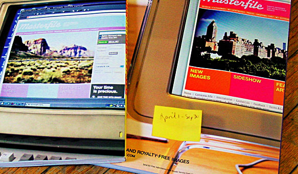
Things might look a little different and possibly (likely) broken around here for the next little while. After much humming and hawing for far too long, I’m forcing the drastic step of redesigning this site live before I pursue the larger step of (finally!) moving it off of the Movable Type installation that’s kept it running since around 2003.
I don’t have a timeline for how long I expect things to be like this, but I’m hoping this will light the fire under me to work quickly to implement the things that have been on my mind while also encouraging me to write and share new ideas at a more regular clip than has been the case for a couple years now.
It’s funny how not touching HTML or CSS in a meaningful way for a few years turns you back into a beginner again. Do I need to bother trying to support old versions of IE anymore?
As of May 10th at 5pm I’ve been on sabbatical. Technically today is Day 4 (not counting the past weekend). After more than seven years in the Facebook and Analog Research Lab maelstrom, it was time for a real break.
I’m generally not all that interested in many of the so-called perks Silicon Valley companies offer. I tried the dry cleaning once and they lost 50% of my stuff. But this is a valuable one. A meaningful one. Especially for someone who’s ran the gamut of burnout before. I wish it hadn’t taken me two extra years past the five it takes to earn the break, but here we are. Better late than never and really right on cue.
So from now until June 17th, I’m fortune to have very little to do. My TODO list is a bit in jest, but if the damn weather would cooperate, I would like to be out on my bike for at least a couple hours every day. The rest is mostly negotiable.
February 6, 2019 marks the opening night of The Right Kind of Wrong, a special public exhibition of printed matter — posters, prints, books, zines, and more from the Analog Research Lab and our Designer in Residence program at the Type Directors Club in New York.
The exhibit and accompanying salon will chart the evolution of the Analog Lab since 2010 and its role at Facebook. This will be an opportunity to not just see this collection of work from the likes of Ben Barry, Tim Belonax, Jez Burrows, Elana Schlenker, Fuchsia MacAree, Eddie Perrote, Heather Hardison, Mario Wagner, Hannah K. Lee, Trevor Finnegan, Joseph Alessio, Frances McLeod, and myself in person — but to also understand the context and conditions in which it was created, and how this important element of the culture of the company has evolved over the years.
The exhibition (free) opens February 6 and runs through March 29, 2019 at the Type Directors Club. Full details and tickets for the opening salon are available from the TDC — $5 for members, $15 for students, and $30 for non-TDC-members.
Since first being introduced to it in 2012, the Risograph has been a staple in my creative toolbelt in the Analog Research Lab. In the years since, the number of Risos we’ve acquired has multiplied. The first of the two color models (an ME 9450U) added back in 2016 was given the nickname “Rex” and joined little brother RZA, the lab’s trusty Risograph EZ 591U single color machine. We’ve since added a second with at least one more of these on deck. How many is too many right?
In advance of an upcoming appearance later this year at Magical Riso 2018 at the Van Eyck Academie in the Netherlands, I thought I’d create and share a tribute to this trusty creative companion. He’s also much more portable, less surly, and never mucks up your color registration.
Rex the Riso the enamel pin is available now in very limited quantities and with a handy 20% discount just for you!
I’ve had the immense pleasure over the last couple years helping lead the invitation-based Designer in Residence program in the Analog Research Lab. This program has provided a meaningful path to open our doors to different design and creative communities, giving designers access to various processes and offering them opportunities to experiment, explore, and push the boundaries of ideas and work into new territory.
Simply put, new designers = fresh and diverse ideas and observations about us and the world.
Designer and illustrator Steve McCarthy is no exception. During his residency in Dublin, Steve thoughtfully and gorgeously illuminated the often hidden or ignored movements and motions of individuals and teams whose work makes them some of the real unsung heroes at Facebook.
The end of 2017 saw a reboot of the Designer in Residence program we started in the Analog Lab at the beginning of 2016 but with a new twists — we opened the program beyond its roots in California to our New York and Dublin studios.
Along with extending the reach of this unique invitation-only program, we’ve restructured and simplified how it works to allow us to do things we’ve been unable to do previously such as producing a series of short films to document the work and process of the designers we invite into the Analog Lab.
Community is something that’s been on my mind recently, particularly since last year after my friend Jenny Wilkson from the School of Visual Concepts presented at TypeCon about building community around analog things in the center of a growing digital environment.
This sparked an idea that I’ve been mulling about since then, but which will hopefully be crystalized when I’m back on stage at TypeCon this August for a talk about design, type, community and a somewhat magical machine called the Risograph.
It’s a machine that you may never have heard of though you might have seen something produced with it. And there’s a really interesting community that’s been forming around it over the last few years — in the US but even more perhaps elsewhere across the globe.
Here’s the abstract for the talk which is scheduled for 3:25pm on the Friday afternoon of the conference.
As new technologies continue to blur the lines between our real and digital worlds and we lose the edges of traditional mediums, obsolete technologies like letterpress or vinyl records become desired objects of art. But can type be art, and how do obsolete technologies transform and elevate type in unexpected and curious ways?
This brief talk will look at how the Risograph, an unusual, effectively obsolete, and inherently imperfect machine can add value and desirability to letterforms and design, and what their increasing popularity has done to bring creative expressions of typography and design to new audiences.
I may have a few Riso goodies available for conference attendees too.
California: Designing Freedom is a new exhibition and an extensive survey of design and design thinking originating in California beginning in the 1960’s through political posters, personal computers, and more modern digital devices which have transformed daily life around the globe. “The central premise is that California has pioneered tools of personal liberation, from LSD to surfboards and iPhones.”
The exhibition, which I’m thrilled to say features work from myself and other colleagues from the Analog Research Lab runs until October 15th before traveling to the Design Museum in Helsinki through March 2018. I’m looking forward to seeing it myself in person in July.
Photographs by Luke Hayes, courtesy of the Design Museum.
It’s amazing how quickly time flies by, how little things will quickly fill in the empty spaces between larger moments. The truth is — accelleration is accelerating.Now here we are at the end of 2016, more than a year since the last time I posted. I’ve been… ahem… occupied.
This brief snapshot of work from the Analog Lab in 2016 doesn’t cover everything — missing are the murals, installations, stickers, buttons, and other pieces of work that augmented projects. It also doesn’t represent all the events, classes, and workshops we coordinated, nor the many hundreds of people we interacted with or that became active participants in our endeavors.
My hope for 2017 is greater structure and focus — for which I’ve already started to lay the groundwork. More space for writing, making, experimenting and pushing myself further and into new territory while also brushing up on a few things that I’ve let slide due to other priorities.
The second Swash and Serif show kicks off next Thursday evening in Toronto at the Black Cat Artspace. A piece I painted earlier this year is currently winging it’s way to Toronto and will be on display (and potentially for sale) throughout the show’s run.
The particular piece I submitted for the show, titled “Best Served…”, happens to be a personal favorite and it’s a treat to make it available for others to enjoy. Better than it sitting in my studio space here in California. Credit for the concept belongs to fellow sign painter John Barrick from San Jose, california.
The Swash and Serif show runs from October 1st at 7:30pm to October 7th. The Black Cat Artspace is located at 2186 Dundas Street West, Toronto, Ontario.
A couple weeks back I was lucky enough to have a chance to spend a few minutes with architect Frank Gehry who was visiting Facebook to talk to employees about the new building he designed for us and which is scheduled to open at the end of March.
Needless to say this was a career highlight. Equally too has been the opportunity to work with both our internal team and the team from Gehry Partners on the new building itself.
The lack of posting anything here has largely the result of my being neck deep developing and evolving signage and design systems for the new building along with a myriad of other related projects. Never a dull moment. Or apparently a lull.
Although I’d like to write more, what I’ve come to recognize is that making other things has been a much larger priority for me. But I do think I finally have a reasonable plan that will make the long-overdue process of re-imagining this site not just manageable but also more likely than it’s been the last few years.
Of course, anytime I actually try to plan something like that, things have a way of going completely off the rails so… my mileage may vary.
Apparently I’ve been busy since I last posted here over six months ago… Once again I’m excited to be sharing the Typecon stage with an always impressive lineup of speakers and friends such illuminaries as Matthew Carter, John Downer, Tobias Frere Jones (!), Jackson Cavanaugh, Silas Dilworth, Mark Simonson, Nick Sherman, Dustin Senos and of course my good pal and Butter cohort, Brian Warren.
This year during my talk on Saturday, August 2nd, I’ll be lifting the curtain a bit behind the challenges and opportunities of scaling typography services across over a hundred languages, vastly different types of connectivity and thousands of different devices for over a billion people. If the goal is to put beautiful type at the center of web services such as Facebook, I’ll be aiming to answer questions on how typography decisions are made and the impact those decisions have on people who use such services.
For a change this year I’m not planning on attending any of the workshops and will instead of taking the opportunity to spend some time in museums and galleries, taking in some of the cultural history that’s so prevalent in Washington, DC.
If you like type and lettering and just happen to be in the Bay area mid-December, I’ll be participating in a group exhibition show being assembled by the Pre-Vinylite Society and curated by Colt Bowden and Ken Davis.
I’m seriously excited and honoured to participate among a who’s who of the sign painting and lettering worlds. The theme for the show is #icycaps — you know, fun snow capped type often found on the side of ice cream trucks and grocery store ice boxes. A perfect theme and just in time for the holidays.
The show opens on December 13th (between 7-11 PM for the opening) and will run until late December at The Cannery gallery at 401 E. Taylor Ste. 150 in San Jose, CA. Individual hand painted signs and other pieces will be available for sale during the run of the show.
In addition, a special issue of the fabulous How to Paint Signs and Influence People zine will also be launching at the event. Previous issues are still available from Colt’s Etsy site. Highly recommended!
As if my photostream on Flickr and Instragram weren’t any indication, I’ve been pretty heavily imersing myself into the world of sign painting. I just sort of fell into it. I caught the bug. But whatever it is exactly, I’m running with it and honestly enjoy every minute of it. It’s bloody difficult, yet calming and meditative. Time drifts by and I hardly notice. That also might just be the paint fumes…
Today, I stumbled on the above video from Mike Chew that gives a glimpse inside the world of Josh Luke and Best Dressed Signs out of Boston, MA. I think what draws me to painting signs is simply the honesty and challenge of it — it’s a pure craft. You produce something real in the end; something you can hold in your hands or hang on your wall.
Now if you’ll pardon me, I’ve got 9000+ hours to go before I might actually start feeling comfortable painting.
It is with immense pleasure that I can finally announce the availability of the first ever digital edition of Marshall McLuhan’s Understanding Media: The Extensions of Man, a book decades ahead of its time and many of its critics.
In 1965, following Understanding Media’s original publication, Tom Wolfe wrote (in the New York Herald Tribune):
Suppose he is what he sounds like, the most important thinker since Newton, Darwin, Freud, Einstein, and Pavlov. What if he is right? — Tom Wolfe
While McLuhan may not have always been correct, that was never his aim. His intent was to probe, to ask more questions than provide answers, to encourage others to ask questions and not take anything for granted — to open their eyes to what was happening all around them. 50 years later, Understanding Media continues to give the world a lens through which to recognize patterns, to see the effects of our world and our technologies; to activate our survival instincts.
For me personally, this release occupies a particularly long journey prior to the 100th anniversary of McLuhan’s birth in the summer of 2011 and carries significant weight. It’s been months of patient encouragement and discussions between myself, the McLuhan Estate and publisher Gingko Press. It’s really only during the last six or so months that the stars aligned and the pieces came together.
Bringing such an important piece of writing to the digital world was something I insisted had to be done right. Many commercial eBooks have historically been assembled haphazardly through automated processes where quality is frequently sacrificed. Understanding Media deserved better, and in this case, the entire conversion process, starting from the digital files provided by Gingko Press, was completed carefully by hand for both ePub and Kindle (.mobi and KF8) formats.
Understanding Media: The Extensions of Man is now available for Kindle. The ePub edition for iBooks, Kobo, and Nook platforms will be available (we think) in about a week’s time.
One of the highlights for me in 2012 was the opportunity to spend a weekend at New Bohemia Signs in San Francisco learning the basics of brush-based sign painting with my pal Naz Hamid and new friends Tyler McGowan and Erin Ellis.
Sign painting is an attractive activity not just because I’m a type nut, but also because I’ve always enjoyed the satisfaction that comes with making physical things as much as digital ones made of ones and zeros. But let’s be clear — sign painting is not an easy pursuit — it can be physically challenging and incredibly difficult to do well, but it’s fairly low-tech and therefore approachable.
The above is a photo from my workshop. I completed the sign on the bench this past weekend. It’s far from perfect, and while I could have cheated and used stripping tape to mask the various shapes of the chromatic letters, I did this one freehand to work on two essential skills — improving my muscle memory with a brush, and speed. Ultimately, the lesson for me coming out of that project is: chromatic type is really hard to paint. Unless perhaps you happen to be John Downer.
Next up — practice, more practice, and then more practice. After that I’ve got an ammo case I picked up at the Alameda Antiques Faire that needs sprucing up.
Today marks the the one year anniversary of my move to northern California, my first day at Facebook and the first step in a journey that so far has never been dull.
In that time I passed quickly through orientation and hit the ground running on two projects which shipped within my first six months on the job, visited Seattle for An Event Apart, moved from my initial home base at the Sheraton in Palo Alto to a short-term apartment, walked a lot (note: cities along the California peninsula are not really designed to make walking all that easy), bought myself a new bike from Mission Bikes and started riding to and from the office 4 or 5 times a week (approx. 20 miles roundtrip), and after a difficult and tiring search, found a fabulous house in San Carlos and moved again at the beginning of May.
After getting settled (meaning: a new bed, couch, and setting up internet access and other utilities for the house), I started researching and preparing a talk I gave at Typecon in Wisconsin on Quentin Fiore’s design work with Marshall McLuhan and Buckminister Fuller and slowly getting ready for the family and all our stuff to arrive.
Immediately after returning to California, my family finally arrived and we adjusted to our new surroundings including Gillian starting first grade and turning 6. Thankfully we found a new groove without too many tears.
In September, I spent a weekend with my friend Naz at New Bohemia Signs in San Francisco learning the basics of sign painting. I haven’t had as much time to practice as I would have liked since then, but am gearing up to do more very soon.
September, October and November saw us venturing out more to explore San Francisco and the surrounding bay area — including a stop at the San Francisco Center for the Book for their annual Roadworks Steamroller Print Festival, a visit to Muir Woods, canoeing down the Russian River, a long weekend away to visit Monterey Bay and Santa Cruz. Oh, and more work for me.
By the end of the year, I had shipped a considerable number of projects across a diverse set of cross-functional teams, learned a lot, and even performed with pals Greg and Everett at the Facebook Design holiday party.
The end of the year also saw a number of departures from the team. While in pretty rapid succession, these changes and the challenges that have come with them have brought the team closer together and made us more resilient. The transition into the new year definitely hasn’t been easy but it’s definitely not been dull.
While I’m thankful for all of the fun, excitement and opportunity the last 365 days has offered, I’m honestly looking forward to a few uneventful moments in a pool with a tasty beverage real soon. Oh, and maybe soon being able to properly talk about the release of the thing I’ve been pushing for over the last couple years and which finally got greenlighted at the end of last year. Soon. I think. Then maybe I’ll even finish one of the 10 or 12 failed redesigns of this site.
While I was in Millwaukee in August for Typecon, I had the opportunity to spend a wonderful day at the Hamilton Wood Type Museum in nearby Two Rivers with good friends and fellow typomaniacs.
What’s special about the Hamilton — aside from simply housing one of the largest and most impressive collections of wood type anywhere, is that it’s a working museum. Visitors can work with a large portion of their collection of more than 1.5 million pieces of wood type, and if you’ve lucky as we were, also get a glimpse behind the scenes to see how wood type has been produced for decades by one of the last pantograph operators in the United States.
Recently the Hamilton was notified that they must move out of the original Hamilton building which dates back to 1927. And so the staff is now tasked with the difficult challenge of raising the $250,000 they need to preserve this important historical collection and locate a new home for the museum and workshop by mid-February — a daunting task and timeline.
Even after only a short visit, it’s easy to see why the Hamilton captures the imagination of designers — and it would be truly tragic for such a magical place to disappear.
I encourage you to join me as a member of the museum or to make a dontation of any size to help ensure that no part of the great history of the Hamilton is lost.
On March 26th I completed my first day as a Facebook employee. Personally and creatively, that day is a line in the sand and underscores exactly why Emily and I agreed to head off on such a grand adventure.
It reminded me that there are times when the best thing to do is to look ahead and not dwell too long on the past. To not forget how you got to where you are, but to press ahead, to pick a point somewhere off in the distance and head towards it.
As much as I’ve been cynical about social services in the past, getting to see behind the curtain at Facebook has altered my perspective and allowed me to see that there’s more to the company’s vision than just talk. Be open. Be bold. Build trust. Again, I see that point in the distance.
The warm and encouraging welcome I’ve received speaks to the quality and maturity of employees, and of the organization itself endeavoring to be transparent to all. It’s allowed me to comfortably find my rhythm, to carve a path, to have an impact, and to do meaningful work that I connect with.
Across the board, the Communications Design team is top notch. The level of insight, integrity, commitment, and carefully nurtured creativity each person contributes and that allows the team to succeed is impossible to ignore. That the same reaches out to every facet of the company — all the way to the top —makes it that much more impressive.
It’s those things that further highlight why this has been the right move. There’s a genuine effort to support one another, to allow people to move fast and iterate, but most importantly, to do things right. In my experience, that type of environment is rare.
That the organization has been equally patient and empathetic during such a long transitional period means a great deal. At this point there’s only a couple weeks before the movers show up, pack our stuff into a truck, and haul it out to California with my wife and kids not trailing far behind.
While I’ve been back to Toronto twice so far since March, being 3000+ miles away from family and close friends for four to five weeks at a time has been tough. For me, and I’m sure for them too. To say Emily has been a trooper wrangling the kids largely on her own doesn’t begin to express the effort she’s put in and sacrifices she’s made to make this work.
I could attribute how I’ve been affected by this to the change of scenery, the temperate climate, or having the unique opportunity to work alongside so many people at the peak of their careers, but whatever the case may be, the top is down, the sun is shining, the stereo is blasting, and as far as my eyes can see — the roads are clear ahead.
Except on the 101 where it’s bumper to bumper for miles.
Mike Monteiro’s new book, Design is a Job (available April 10th from A Book Apart) is one I wish existed years ago. I needed it. A lot of people needed it, and of course, many still do. It’s a book that should be required reading before being permitted entry to any design school or professional practice: period.
Think of it like this — remember that scene from Monty Python and the Holy Grail (I know, I know [groan]) where the knights must answer three questions before being allowed to cross the Bridge of Death? In this case, to cross, you must first read this book. Then take a test. Then read it again. And then maybe do it all again for good measure.
Throughout the book’s roughly 150 brief, entertaining, and no fluff pages, Mike lays all the cards on the table — face up. He provides simple, clear guidance on how to run not only a successful and profitable design practice, but also one that plays to your team’s or your individual strengths.
There are no claims that this stuff is easy. It’s not. Design is a job. Like any job, you need to work at it to be good. You need to keep working at it to be better, and you need to know when to call in the reinforcements (e.g. the lawyers) when necessary.
That means more than just improving your Photoshop skills. It means learning about business. It means being able to not just communicate and justify your decisions, but to sell them. Your job is to lead, not follow. As soon as you give up the reins on your process, or let a client walk all over you, you’re done for; and as Mike says, ultimately surrender any claim on the title “designer”.
Stop trying to get your clients to “understand design” and instead show them that you understand what they hired you to do. Explain how the choices you’ve made lead to a successful project. This isn’t magic, it’s math. Show your work. Don’t hope someone “gets it,” and don’t blame them if they don’t — convince them.
Throughout the book, Mike consistently reinforces how fear, a lack of shared trust, and misunderstanding your clients’ and your responsibilities are critical failings for so many designers — whether in-house, freelance, or part of an agency of any size. Again, these things aren’t always easy to acknowledge, but success means more than just showing up, it means stepping up. Understanding and doing something about these things are catalysts for change.
While I can relate to, or have experienced nearly everything he discusses in the book during my career, there’s one particular story that resonated with me the most. Mike talks about going to see a client one day and discovering the entire team he was working with was gone. I’ve been there, more than once. It’s not an fun problem, but still one you can both protect yourself, and recover from. Luckily, both our stories had similarly positive outcomes.
If nothing else, the fact that I haven’t stopped thinking about Mike’s book is the sign that it’s not just good, but brilliant. If you think you don’t need this book, you probably do. And if you do think you need it, you definitely need it.
Now, if you’ll excuse me, I’m going to go read it again.
If you asked me to sum up the last two or so years from a professional perspective, the simplest thing I could say would be that it’s been about reconnecting with my roots, refocusing my efforts, more thoughtfully plotting where I’m headed, and actively taking the necessary steps to get there.
If you asked me to sum up the last several months, I’d say they’ve been about evaluating, prioritizing, doing, undoing, showing, talking, thinking, considering, reconsidering, and preparing. They’ve been a convergence of opportunity, serendipity, and, I don’t know, something else. I think. Probably.
There are times when an opportunity comes knocking, when the effect would be profound, when plans, tactics, goals and values perfectly align, and when patience pays in spades.
The Facebook “Like” button
While I’ve been fortunate to have recently discussed a number of amazing, and frankly, flattering opportunities, at the end of March, I’m grabbing one by the horns and headed south-west from Toronto to California to join the Communications Design team at Facebook, with my family following in the months following (once the school year is out).
To say I’m excited for the opportunity to work with such an impressive team and to tackle new challenges would be an understatement of the highest order. Seriously, this is a bad-ass team of designers and I’m truly humbled to be included in their company.
Of course none of this is going to be easy — it’s a big deal to move, let alone move from one coast to the other, to cross borders, and to be away from your family for a signifiant stretch of time. But we’ll make it work. We’ve made it through three very intense major home renovation projects and the birth of two kids after all…
Like others (ahem, @splorp), I’ve had my share of apprehension about Facebook over the years… and frankly, just about every other “social” service, but what I’ve seen, based on the brief glimpse behind the curtain I’ve had so far has reminded me that it’s made of people. And in this case, those people are clearly trying to produce something meaningful and with lasting value to help our increasingly connected world communicate, share, and remember.
Not only do I think this is an opportunity to do some really interesting and challenging work, but also to see an immediate measurable impact. Personally, this is also an opportunity to observe some of McLuhan’s ideas and their effects from a bit of an insider’s perspective.
Although we’ll miss Toronto (sorry In-N-Out but you’re no Burgers Priest) and our families and friends — the next great adventure awaits. See you on the other side.
On a side note, I had hoped that this would be the first post on my long overdue new site, but alas, that’s had to take a back seat for a few weeks while we’ve been busy with all this business… Oh, and that Frank guy had to go make his more awesome, so back to the drawing board…
Back in 2009, I wrote a little piece on Burnout for A List Apart, which, while cathartic for me personally, also it turns out, meant a lot to many others. So it pains me to come across opinion pieces such as the one published a couple months ago by Applied Arts, which suggest that in order to succeed in the advertising/design world you have to be prepared to essentially sell your soul.
I saw and read the article the day it was posted and although I didn’t intend on commenting on it, instead just hoping it might disappear into the ether, it’s bothered me ever since, so here we are.
I’ll give the author, Stuart, a bit of a break insomuch as I’m sure he’s well-meaning and a perfectly fine fellow (we met briefly after I spoke during Typecon in New Orleans earlier this year), but it’s sending the wrong message. Frankly, I call bullshit.
And I quote:
You don’t get into advertising in order to stroll in at 9:26 and stroll out at 4:48. You don’t get into it for the balanced diets or eight-hour sleeps.
No, perhaps not. But it doesn’t mean the expectation is wrong, that it’s not possible to remain excited, to love what you do, and even thrive in the industry without sacrificing a balanced life outside that world.
Sure there are times when an early morning, late night, or spat of weekend work might be required (too often the product of someone’s poor planning or project management), but as soon as that door is opened, it’s almost impossible to close. Such behaviour should be a rare exception, not the norm. As soon as it’s a regular occurrence, you’re in trouble.
Unfortunately, those new to the industry, such as Stuart, quickly fall victim to this so-called reality which perpetuates the problem. It’s a slippery slope and a one-way ticket to burnout.
The worst part is that he knew going in. He was explicitly told to expect it. That it’s normal — be ready to give up your life so someone else can reap the real rewards.
Before I accepted the offer, I called a couple friends who were familiar with the agency, who uniformly said one thing: So long as you’re ready to work late and on weekends (if needed), Prox is a great place to work with a killer atmosphere.
A “killer atmosphere” is nice, but it’s hardly everything. It’s not enough to make up for what you’ll sacrifice in the process — something typically not apparent until it’s already too late. It’s not enough when you’re automatically nominated to be a punching bag for the agency (or their clients), or subject to someone else’s misguided sense of normalcy.
The only way to truly put an end to the problem is to say “no” to this reality. For yourself. For everyone that will follow after. Unfortunately for Stuart, he went in anyway, which meant he was already screwed.
American poet, novelist, social, and cultural commentator Charles Bukowski was perhaps best known for being what Time magazine called “a laureate of American lowlife,” whose writing focused on the most ordinary and mundane aspects of life.
An intellectual is someone who says a simple thing in a difficult way. An artist is someone who says a difficult thing in a simple way.
While considering whether or not to attend a book reading by Steve Jobs biograher Walter Isaacson tonight in Toronto, I was reminded of the above quote from Bukowski. It defines Steve for me perfectly, and equally contrasts with McLuhan, who most would say falls into the opposite camp of people who expressed simple ideas in a complex way. I like to think McLuhan just made you work a bit to understand.
The morning of October 18th (that’s today) brings not just one, but two new titles from the good people at A Book Apart — Designing for Emotion by Aarron Walter, and Mobile First by Luke Wroblewski. While both books are important in their own right, along with the previously released (and reviewed) Responsive Web Design by Ethan Marcotte, they close the loop on a larger story about transforming the thinking behind how web, interactive media, and mobile apps are designed and created.
Designing for Emotion and Mobile First books from A Book Apart
The funny thing about the opportunity to review these books in advance is that as much as I might have a lot to say about them, my inclination is to let them speak for themselves. A lengthy review feels contrary to the spirit of the books themselves.
Instead, I’d like to make or reinforce a few observations about the series and it’s overarching relevance to designers, developers, content strategists, project managers, business executives, and everyone in between.
Because I was already familiar with many of the ideas expressed throughout both books, what became evident was that I wasn’t the primary audience. Ultimately, the real readership is not the early adopters. Those people — myself included — don’t need convincing. Early adopters have already read the articles and blog posts, or heard Aarron and Luke speak on their respective topics. Nevertheless, I found myself nodding in agreement pretty much the entire way through both.
Newness of the content to early adopters aside, it’s the relevancy, timeliness, length, and quality of these books, and the time required to comfortably read them that positions them to hold the attention of clients, managers, executives, and other decision makers (and yes, your common design nerd); to convince those people to explore a new approach, to make the web more expressive, more beautiful, and more future friendly.
Should you pick up copies of one or both of these books? Yes. Should you pick up copies to share with a manager, client, or co-worker who’s less enlightened than you? Yes… yes you should.
The other day I was invited to take a peek behind the curtain at a new web font related technology that’s nearly ready to hit the streets from the fine folks at Extensis. Needless to say I was very interested and excited by what they’ve been up to.
But first a bit of context…
How (Most) Web Designers Work Today
During TypeCon in New Orleans this past July, one of the things Brian, Luke and I covered during our talk on web fonts was process — exactly how (most) web designers work, and what happens to the particular artifacts we produce as a result of that work. In particular, design mockups, and most importantly though, how those relate to a web designer’s somewhat contentious relationship with fonts.
Web designers have wanted the same control over typography print designers have taken for granted for decades, including being able to use the same variety of typefaces. Hacks such as sIFR and Cufon aside, it’s really only during the last two years, thanks to the encouraging work of type designers, foundries and browser makers, that the tide has really turned and we’re inching closer to that reality.
Unlike print though, where designers create final artwork files that are the final output of the design phase of a project (a newspaper advertisement, a book layout, product packaging), the large majority of web designers create mockups, a transitional artifact created for the benefit of clients and others involved in producing the actual end product — a functioning website.
Mockups are not the end result, and so purchasing desktop font licenses for what is effectively a throwaway product is counter-intuitive. Web fonts are part of the real end product of a web designer’s work, not their desktop equivalents. But that’s not the way we’ve had to work.
And it’s certainly not that web designers don’t want to pay for fonts — quite the opposite in fact. Web designers have flocked to web font services such as FontDeck, Typekit, and WebINK, and more will come as these services are more readily adopted by those beyond the early adopters.
During our talk at TypeCon, we further explored a suggestion which originated from Elliot Jay Stocks illustrating how web fonts might be integrated into a desktop design application such as Photoshop. In July no such thing existed; it was just an idea. And while the software is not available quite yet, I can happily say that it does now thanks to the team behind WebINK, Extensis’ web font service.
Introducing the Web Font Plugin for Photoshop
To address this disconnect in how web designers work, Extensis has created a piece of software that bridges their WebINK web font service and Photoshop, thus allowing web designers to use web fonts as though they were traditional desktop fonts in the popular design tool.
The WebINK Web Font plugin for Photoshop CS5
The web font plugin for Photoshop will be included with Suitcase Fusion 3 and available in beta in the coming weeks. Most importantly, it will continue to function beyond the software’s 30 day trial. There’s no requirement to purchase or use Suitcase — it’s simply the delivery mechanism for the plugin itself and assists in integrating the plugin with their WebINK web font service.
At the moment the functionality is simple and straightforward. Once the software is installed, open the Panel in Photoshop, sign in to your account and start working with their library of web fonts.
Transferring PSD files to others is seamless too, provided they have a WebINK account and the plugin installed. Designers will also be free to create JPEG, PNG and PDF files without watermarks or licensing restrictions beyond anything they’re already used to. Of course, there are still a few unanswered questions such as what happens without a network connection, but it’s a very promising start and raises the bar for competing web font services. Nudge, nudge Typekit and FontDeck.
Update (September 12, 2011)
Extensis has soft-launched the software’s microsite and you can download a 30 day free trial of Suitcase Fusion 3 and the Web Font plugin for Photoshop at webfontplugin.com. Go. Download. Create.
Just as TypeCon was kicking into gear last week, I flipped the switch on a new limited edition print from Ligature, Loop & Stem. Unlike previous releases though, this one has a special mission — to raise much needed money to assist those affected by the devastating earthquakes and tsunamis which first rocked Japan in March and again just a week ago.
Limited Edition SOGO Japan print design by Neil Summerour (Positype)
The SOGO Japan project, designed and beautifully lettered in Kanji by type designer and lettering artist Neil Summerour, whose typeface Epic graced both editions of the Typographic Lesson Plan print, has deep personal meaning for him, having amassed many friends and adopted family there since first visiting the country as a teenager, and we’re extremely honoured that he asked us to be involved.
Each 18” × 24” print is individually signed and numbered by Neil, and features the names of all the cities affected by these tragedies. Additionally, each includes a smaller secondary print showing the matching English translations for the city names.
In keeping with the spirit of the SOGO Japan charitable organization established by Neil, and because we want to ensure as much money as possible will reach the people of Japan, LL&S is taking measures to ensure our impact on the funds raised are negligible. All money raised will feed directly into organizations on the front lines in Japan — groups that know the landscape, the people, and their actual needs.
That said — we realize this is not an inexpensive piece of art. On the other hand though, it’s an opportunity to do good and support a country whose exports enrich the lives of so many around the globe.
We hope you’ll help positively impact those who desperately need your support, whether by purchasing a print, or simply getting the word out about the project and the SOGO Japan organization. Thank you.
The last two years have seen enormous strides in the advancement and adoption of web fonts. Like any new technology though, designers and developers need time to push and pull it to understand how it works, where there are gaps and to come up with new or unexpected uses.
Access to real fonts on the web means a familiarity and understanding of 400+ years of typographic history is even more urgently needed by web designers to suitably pay respect to the typefaces and type designers whose work we now have greater access to. Or as Jason Santa Maria so succinctly put it during Ampersand in Brighton, UK earlier this week:
If your type is bad, the design fails
In just over two weeks, Brian Warren, Luke Dorny and I will be giving a talk titled “Where the Rubber Meets the Road: Where are Designers Going with Web Fonts?” at TypeCon 2011 in New Orleans. In finalizing our outline we felt it would be helpful to find out how other designers are using web fonts. To do so, we’ve put together a brief anonymous survey to help us identify common behaviours, patterns and gaps.
The survey should take less than 5 minutes to complete. We greatly appreciate all those who take the time to help us out with this and we promise to share the results along with our slide deck after the conference.
A few months back the video team from stillmotion paid a visit to Mike and Bianca who run Kid Icarus (formerly Studio 19) in Toronto’s Kensington Market neighbourhood. In a confluence of perfect timing, this coincided with the start of print production on the sold out Second Flight Typographic Lesson Plan print.
Although I knew the film crew had shot Mike and Bianca working on the prints, it had slipped my mind until Bianca sent me a note the other day to say the video was finished. And so here it is…
The best part Ethan Marcotte’s new book, Responsive Web Design (available from the fine people at A Book Apart on June 7th) is that it’s brimming with his thoughtful ideas and unique approach. Actually, the best part of the book is the immediate and concise way he ties together everything you need to know to start practicing “responsive” design yourself. On the other hand, the best part is his hilarious self-deprecating humour that makes it almost impossible to read without hearing his voice narrating it in your head. That’s just me? Oh.
Responsive Web Design by Ethan Marcotte (published by A Book Apart)
The prescience and immediate relevancy of this book cannot and should not be understated as the world of web design is further inundated by new devices and greater uncertainty, demanding an increased need for flexibility to understand and manage it all.
And while the concept of responsive web design might not be a silver bullet (it never claimed to be), Ethan’s book does a brilliant job of wrapping what you need to know into a straightforward and accessible package — covering both the lenses through which to approach deciding whether it’s an appropriate choice for a given project, and how to go about making it happen if it is.
Responsive Web Design is 155 pages of compact insight and unquestionably one of the most important books you’ll read many, many times this year.
As anyone that’s been following me on Dribbble over the last year or so knows, I’ve been quietly chipping away at revitalizing the online historical presence of renowned media and communications theorist, and former patron saint of Wired magazine, Marshall McLuhan along with McLuhan’s youngest son Michael and several other members of the McLuhan family.
From my perspective, the scale and importance of the project is incomparable to anything else I’ve worked on. It’s a challenge unlike anything I’ve experienced and it though it’s taking considerably longer than I’d like, it’s more important that we get it right than get it done fast. That said, I can’t wait to be able to share some of the amazing, largely unseen photographs that have been unearthed.
Though he passed away in 1980, the year 2011 marks McLuhan’s centennial, and as such, there are a myriad of events and activities happening around Toronto and the world to both celebrate the man and his work. Additionally, some of McLuhan’s most important and prescient writing is being republished.
The Medium is the Massage, 2011 Centennial Edition featuring a new cover by Shepard Fairey
The Medium is the Massage: An Inventory of Effects (Amazon US / Canada) is the second of such new releases from the McLuhan catalogue in 2011 and unquestionably a seminal text on modern culture, having sold over a million copies worldwide. The Medium is the Massage is also arguably his most accessible book, and belongs equally on the shelves of those studying media and communications as it does graphic designers.
All media work us over completely. They are so pervasive in their personal, political, economic, aesthetic, psychological, moral, ethical, and social consequences that they leave no part of us untouched, unaffected, unaltered.
The prescience of The Medium is the Massage continues to be as relevant today as it was in 1967 and the addition of a new iconic cover by artist/provocateur, Shepard Fairey will hopefully shine a new light on it and allow a new generation to benefit from its insights.
Nearly four years in the making, last week saw the official launch and start of pre-orders for the debut issue of Codex, a limited run quarterly journal of typography by I Love Typography and We Love Typography founder and confessed typomaniac John Boardley, along with Editor-in-Chief and unflappable LL&S cohort, Carolyn Wood.
Codex is a hybrid of magazine and journal. Beautifully designed, visually appealing, an immersive experience with a lively voice, it is also serious about its subject: authoritative, scholarly at times, but not dry in tone. It’s serious, but not stuffy. It loves the people, tools, and type associated with this craft, from the man carving beautiful cherubim into wood blocks in the 1400s to brilliantly formed modern interpretations and departures. It embraces the web and is watchful for the future’s classics.
It’s immediately apparent by looking at the sample spreads first teased out by Mark Boulton (along with one new one here), and the incredible roster of authors lined up for the debut issue — Erik Spiekermann, Christian Schwartz and Paul Barnes, Paul Shaw, Stephen Coles, Dr Paul Dijstelberge, Craig Mod, Luca Barcellona, et al. along with those on deck for future issues, that this will be as much a beautiful physical artifact as it will a practical and inspirational guide through the universe of typography. Not coincidentally I think Codex also happens to beautifully fill a challenging void left by other publications.
Step-Children of Minerva by Paul Dijstelberge
Typography and design are both complex and multifaceted subjects in a world where everything is expected to fit metaphorically into neat little boxes. As a believer that broad interests and experiences are a mark of great designers, we need publications like Codex, that will not only paint those broad strokes but also shine a light on the full breadth and depth of such important subjects.
And while the Codex team is still putting the finishing touches on the first issue, I feel confident suggesting that Codex will be a publication that deserves to be on the bookshelf of any serious designer. Pre-orders are open and if you haven’t yet, do yourself, a friend or a fellow typomaniac a favour and order a copy right now.
Over the weekend, I posed a few questions to John about the roots of Codex and to get a picture of where it’s headed. The first issue is a stake in the ground, an arrival, not the final word. Here’s what he had to say:
Another spread from Codex issue 1
Who did you have in mind when you created Codex?
I have a life-long fascination with type. I Love Typography is gratifyingly popular and requires an enormous amount of work, but I wasn’t fully satisfied. I guess you could say that I am the first person I had in mind when I envisioned Codex. I wanted to exercise creative muscles on projects that just weren’t right for the website, and long dreamed of making a print magazine that was not only beautiful but also took people to places in the endlessly wide and deep field that typography is.
As for readership, I first had in mind people who live immersed in type: type designers and typographers. They love, as I do, to read pieces on subjects such as its history and practice in specific eras, the work of true innovators of typography, the evolution of type in many languages, and other subjects that have rarely, if ever, been collected and written about in depth—including periods during the 20th century. I’m also fascinated by the process of designing typefaces, the thoughts and lives of brilliant men and women in our field, and the minutia about both incunabula and contemporary work. I wanted serious studies that are certainly scholarly, yet at the same time not dry.
But as I worked and spoke with talented graphic designers and people who specialize in the web and related media, I realized that this meaty magazine, that I expected would attract only the more serious people working with type, might have much broader appeal than I originally thought. So many more people want a solid foundation (or continuing education) and are willing to read what was first intended for people with a thorough education in typography. They are budding type nerds, some might say, and this includes accomplished designers. I’m very happy to see their increasing interest in the vast history behind what we do, in getting things right, and in knowing how and when to wisely and skillfully break “rules.”
What would you say Codex offers for younger designers?
Not to know what has been transacted in former times is to be always a child. If no use is made of the labors of past ages, the world must remain always in the infancy of knowledge.
— Cicero
Codex, in addition to covering modern design practices and applications, takes a closer look at the history of typography (and of graphic design, for the two are inseparable). I’m hoping that students and graduates alike will discover through reading Codex that the internet doesn’t have all the answers. We need to learn to study again, to research. Not all knowledge is to be found at the end of a Wikipedia or Google search term.
But more than anything I hope they will remember that typography was born of paper and ink. When they hold Codex, they hold an artifact — in the artifact itself there is much to be learned. I want them to ask questions. Why, even in the 21st century, do we still have such an affinity for print; and perhaps more importantly, which of those magic ingredients can we successfully transpose to the screen? What can we do to elicit those same reactions, those feelings in typography for the screen? And we need to explore concepts such as the fact that technological “advances” don’t always mean “better.” Of course, for both students and those long in the field, Codex offers beautiful and interesting design that is enriching and enjoyable and thought-provoking.
When the idea for Codex came about, did you have any specific creative goals in mind when producing it as a physical artifact? How have those changed since then?
Yes, absolutely. I had a very clear picture of how it should look and feel. I don’t mean I had a vision. It wasn’t quite Saul on the road to Damascus, but I had in mind very clear and distinct ideas about how it should look, its weight in the hands, the stiffness of the paper stock (too thick makes flipping through the magazine awkward; too thin and there’s too much “show through”). I also gave a lot of thought to the size: comfortable to hold in the hands, large enough to permit ample use of white space.
Is there anyone in particular who is on your wishlist for contributors?
I have such a wishlist in a black book (well, actually a Field Notes notebook). I have a list of more than 100 names. So, yes. I’d like Spiekermann and other Issue One authors to write again. Jonathan Hoefler, Louise Fili, Roger Black, Martin Majoor, James Mosley — perhaps I should just scan the pages of my notebook for you! The lineup for the second issue is amazing and we’ve already started to talk to people about the third issue of this quarterly. You’ll find names that typographers already know are extraordinary experts, and that those newer to the subject will be quite happy to discover.
What do you see as the future for Codex beyond Issue One?
Issue Two is already bursting at the seams. You’ll see an even broader group of people writing for and contributing to the magazine. Each issue of the magazine will be a surprise. I want to alert people, though, that this isn’t a magazine of tips and tricks and basic tutorials. In fact, it will rarely contain a tutorial. The lessons are found in the lives and work of type designers, typographers, and graphic designers, and others such as book designers, and associated fields.
There are other magazines for other aspects of design. Mine is built for experienced people, yet we eagerly open our pages to submissions from people on the way up, or those who are experimenting at the furthest edges. In terms of audience, we want to build up and support and celebrate the field and bring in readers who have just recently begun to fall in love with type, who aren’t shy about tackling complex or historical articles, mixed with articles by and about brilliant contemporary people.
I can only imagine that there’s been some interest in yearly subscriptions or digital editions — what’s your take on those at this point?
I had aimed to run subscriptions from the first issue, but dropped it last minute. I want to be sure that I can secure good shipping rates. Shipping and distribution is very expensive, and I want to pass on as little of that as possible to subscribers. In fact, depending on volume, international shipping plus distribution costs me about $15 per issue. We charge only $8. So, as soon as I can secure better shipping and distribution rates, subscriptions will be offered. I hope from issue 2 in July, but we’ll see. People should list their name on the newsletter signup on our home page if they want to be notified of important developments and releases, or they should follow the Codex blog.
I don’t have plans to release a digital version. I’m not ruling out ever releasing a digital version, but this is a paper and ink artifact for many reasons.
I want people to love type, but not just because it’s pretty or trendy. I, along with our great authors, want our readers to love type because they truly understand it and its foundations, principles, and evolution, as well. When you’ve learned all that, its beauty is all the more profound.
Buckminster “Bucky” Fuller was an American engineer, designer, futurist, author of more than 30 books, and a very good friend of Marshall McLuhan, but perhaps most well known for the architectural design of the geodesic dome and popularizing the phrase “spaceship earth”.
While exploring the website of the designer (apparently) chosen to design the forthcoming new cover for McLuhan’s The Gutenberg Galaxy(sorry — it’s a secret for now), I came across this quote from Bucky.
When I am working on a problem, I never think about beauty but when I have finished, if the solution is not beautiful, I know it is wrong.
My quick take is that he’s talking about the broad strokes — ensuring an idea works before getting bogged down in the minutiae and finessing the details; the things that few notice, but are what help make something beautiful. It sounds just like something you might hear from Dieter Rams or Steve Jobs.
The devastating earthquakes and tsunami that recently ravaged Japan ushered a call to arms for designers to contribute to worldwide relief efforts, and for the fifth time, the Society of Typography Aficionados (SOTA) leapt into action to launch Font Aid V: Made for Japan — to collaboratively create a font whose sales proceeds will go directly to the relief efforts in Japan.
The money raised through the sale of this font will be distributed to organizations such as AMDA International and is being facilitated by SOGO Japan, led by type designer Neil Summerour who has a long, personal connection with the country.
My contribution (in red) and several others to Font Aid V: Made in Japan
More than 300 designers from 44 countries submitted the over 500 glyphs which will comprise the font, now dutifully being assembled in FontLab by Neil Summerour and Grant Hutchinson. Once completed, the OpenType font will be for sale through several distributors for a mere $20. SOTA also hopes to produce a printed specimen booklet which could accompany the font and which will include additional information about each participating designer and their glyph(s).
As was the case last year, it was an honor to design a glyph (in red above) for inclusion among such illustrious company. And while Ligature, Loop & Stem is working out what we’re able to donate in addition to supporting SOTA, I whole heartedly ask that you share this with your friends, co-workers and fellow designers. Buy a license for yourself, buy one for a friend, and encourage others to do the same as soon as it’s available.
There’s a lot I could say about SXSW, but others have alreadywritten pieces that echo my own sentiments about the conference this year.
Simply put, SXSW has arguably outgrown it’s effectiveness as a design and technology conference in spite of itself. It’s too big, too uneven, and perhaps, even too corporate. On the other hand, because it’s size, it’s helped foster something else entirely — what you might almost call a resistance.
Luke Dorny, Brian Warren and Richard Rutter during SXSW
The last two years have seen a growing group forsaking the official conference almost entirely, instead travelling to Austin during that same period to join friends and peers in small, usually informal gatherings, frequently at many of Austin’s popular coffee houses, pubs or restaurants to share knowledge, ideas, have a laugh, or just to catch up with each other and discuss the future.
There’s reasons why I think this is important, though Josh nails it:
I love meeting new people and connecting with old friends. I love talking about all the crazy stuff we do and what it means and why we do it and how we can do it better and how we can actually make the lives of others better by sharing our ideas and making things and being genuine and opening up to one another and buying rounds of beer for people we don’t know and getting to know them and coming up with crazy, goofy ideas that just might work and practicing a whole new type of alchemy: converting bytes and bits of virtual connectedness into actual, physical relationships that mean something.
Although I love Austin as a city, it’s those relationships and that open sharing of ideas that keeps me going back every year. Strengthening existing connections and making new ones. It’s what the web is made of. It’s what life in the real world is made of.
Letting something you’ve created go free into the great unknown of the world is scary. Anything could happen. Nothing could happen. The latter often being the worse of the two options. Today was one of those days. One of those great days — and there are a lot of people responsible for making it that way.
Today saw the start of pre-orders for the second flight of the popular (and sold out first edition) Typographic Lesson Plan by my LL&S cohorts and I, and the ceremonial letting go of a new thing into the world.
Now available - the Second Flight Typographic Lesson Plan from LL&S
Flipping that switch from “coming soon” to “available” is scary. Every time. Nothing’s real until it’s out there, until we’re really on the hook for something other than to ourselves. That people are there each time, waiting, is still surprising and amazing. It’s equal parts exhilarating and humbling.
This particular piece is a milestone for us, in part because the first edition was so popular and sold out as quickly as it did, but more importantly because it’s given us a chance to come full circle on something we talked about when the original letterpress edition was released — to set some aside for educators.
From day one, we’ve tried to imbue an educational angle on the various pieces we’ve produced, however simple. Whether it’s adding historical context — knowing not only the name of a typeface but also who designed it, who distributed it, and when, but also in producing artifacts that can help pass on knowledge for the benefit of anyone who comes in contact with them.
And so, after what’s been a whirlwind day, I want to take a moment to say thank you.
Thank you to everyone who purchased a print today, tomorrow and may sometime in the future. Thank you to the educators who’ve put in a request for one of the special unnumbered prints that are being set aside just for them — we’ll be getting back to you about those soon. Thank you to everyone who tweeted and retweeted about the launch. And of course, thank you to the dapper, steadfast, and bloody amazing and indispensible LL&S crew — Grant, Luke and Carolyn.
It’s hard to believe it’s been about 6 months since the original Typographic Lesson Plan letterpress print by myself and my Ligature, Loop & Stem cohorts was released and started shipping to nearly every corner of the globe.
That the print sold out within 2 days was unbelievable, and the continuous stream of requests for more forced us to consider something that wasn’t really even on our radar: How do we reprint a limited edition poster?
Where in the World is the new Lesson Plan?
After some careful consideration, holidays, and dragging of feet, we came up with a plan and Grant came up with a fancy little description — the “second flight.”
More recently, the wonderful people who previously signed up for the (reasonably) new mailing list got an early peek at that plan and a tease of what was coming. Today I’m happy to finally tease out all the details.
When finished, the second flight print will look something like the above mockup
In order to not trample all over the original limited edition, we started from scratch and this “second flight” print has been re-imagined in a number of ways:
Numbered edition of 250
New typeface selections and overall design
New or revised terminology (with alternate terms where applicable)
Significantly larger 22×30 in. print size
Silkscreen printed in three colours on archival quality Somerset 250gsm newsprint grey velvet stock
Lower price point and (we hope) also reduced shipping rates
Prints will be $35 each, less than half the price of the original edition. Pre-orders will start on at 12PM EST on Monday, March 7th with prints shipping as of March 21st (to coincide with the LL&S crew’s safe return from SXSW in Austin, TX).
One last, and very special note is that we’re going to make 50 un-numbered prints of the “second flight” series available exclusively to educational institutions. A more formal announcement and details on exactly what that means will be coming soon.
Kickstarter, launched in 2009, has proven to be a goldmine of interestingprojects, and has introduced what I consider a great way to assist passionate people do and create the things that fuel that passion; to help them produce things that might otherwise be out of the realm of possibility, mostly for financial reasons.
This morning saw one of those great projects, The Manual, achieve it’s funding goal. The same day it launched and without hesitation, I backed the project, knowing Andy McMillian, the fine chap at the helm would be producing something wonderful and of lasting value. And while the project has now achieved it’s initial funding goal, there’s still time to get on board yourself.
Don’t already know what the project is about? Andy and his crack production team (editor, good friend, and LL&S co-conspiritor, Carolyn Wood along with designer/illustrator Jez Burrows) have this to say:
The Manual is a new limited-run print magazine that takes a fresh look at design on the web. Published three times a year — with the first issue due this summer — each issue will have six substantial, beautifully illustrated feature articles, along with several additional pages of rich material.
The thing is — it won’t be just another design magazine. My sense is that it will feel like something different altogether. That’s exciting in itself. That each curated issue will be produced as a hardcover book, intended to deliberately look good and belong on your bookshelf is another. It’ll be something you’ll want to show off.
Find out more about The Manual and help push it further over it’s goal at Kickstarter.
Let’s be honest — over the last several years, there’s been more than a metric tonne of website and web interface design flaunted by “designers” (finger quote emphasis mine) that has been little more than pixel for pixel copies of the creative work and aesthetic that’s originated out of Cupertino. Does it actually count as original? Is it appropriate? Is there real strategy or conceptual thinking to stand behind it? Is it really that interesting — that a designer took someone else’s “style” and painted it on a layout?
I think Warren Buffet’s comments about imitators (via Liz Danzico) gets to the heart of the issue — that like spec work, it undermines the efforts of serious practitioners.
…there’s a “natural progression” to how good new ideas go badly wrong. He called this progression the “three Is.” First come the innovators, who see opportunities that others don’t and champion new ideas that create genuine value. Then come the imitators, who copy what the innovators have done. Sometimes they improve on the original idea, often they tarnish it. Last come the idiots, whose avarice undermines the very innovations they are trying to exploit. (20:45)
Perhaps it’s just perception or that I’m getting old and crotchety but the sheer amount of attention “shiny” gets over actual substance in the web world is disheartening. What happened to original thought? If someone else’s “style” is your secret sauce, you’ve failed, and your clients’ goals may not be far behind.
For the last several weeks and months during whatever time I’ve been able to carve out, I’ve been absorbing the life and times of Marshall McLuhan and photographing books, several of his personal possessions such as one of his hats and his Order of Canada medal.
Today I took temporary possession of a box of amazing, almost entirely never-before-seen photos of Marshall. I say almost since a few are alternates of already well-known shots. The photos, such as the one shown above, taken at the CBC on January 27th, 1966 are expected to be a part of the significant design effort I’m leading to update the official McLuhan Estate website, the first phase of which will launch in early 2011 to coincide with celebrations surrounding his centenary.
In my post queue, unfinished, for several weeks has been a bit of commentary from my father-in-law, Eric McLuhan on Match 4 from this past season’s edition of Layer Tennis.
Layer Tennis Match 4, Volley 5 by Scott Thomas
A day or so after the match, I shared volley 5 by Scott Thomas with him as it contained both a quote from his father, Marshall McLuhan and a particular comment from match commentator John Gruber that caught my attention:
I like to think that McLuhan would have enjoyed Layer Tennis. His quote here is an apt description of the game.
So, who better to ask whether that might be true than someone close to the man’s work, arguably one of the few living experts — his eldest son and frequent co-collaborator. Here’s what Eric had to say:
The commentator is a third-party actor. Satire on the sports announcer. His function (it IS a male voice) is to do our thinking for us—to tell us what we know and can observe.
(It is important to identify the voice: where have you heard it before? What sport or game? A dog show? Cricket? Baseball? Then the actor emerges. That’s the beginning of Practical Criticism, by the way.)
In volley 6, McLuhan flips from (private voice) commentator (as he was in 5) to co-author (stage voice). This promotion occurs via the amount of play: the large block of quote, in that colour, in that spot, that strong. It had been a much smaller voice.
I found the progression enjoyable to watch. The tennis metaphor is quite apt. I have had that kind of fun with ideas with two or three people in my life. I know that a great number of people have also had it, that some do it for a living. It is very like improv theatre, with ideas, where Tennis was with images. But not the commentator. He is scripted, that is, he writes his essay and edits it. Presumably, the tennis players do not edit themselves; they return the volley with equal gusto and dispatch. Their responses tell the story in the styles, one as riposte to the other.
Although Eric didn’t explicitly answer my original question to him, I believe it’s safe to say that, based on his commentary, Marshall would have indeed enjoyed the match.
The last couple weeks have been a bit of an unexpectedly wild ride for Grant, Luke and I after our “Typographic Anatomy Lesson Plan” print was showcased on the always inspiring Under Consideration FPO (For Print Only) site, promptly followed by an unexpected appearance as the Infographic of the Day on Fast Company’s Design site.
Had I not been so damn occupied with other things until now, I would have written something about this all sooner, a few tweets notwithstanding.
Sites that have recently featured the LL&S Typographic Lesson Plan print
It’s all a bit funny since this has come long enough after the prints sold out and were shipped off to anxious recipients around the world; but it’s forced us to start considering whether we should, or want to produce a new edition. If a new edition was to be created, it would have to be significantly different and would definitely not be a simple reprint.
Given the deluge of emails I’ve received requesting either more copies of the existing “Lesson Plan” or a second edition — we’re not making any promises at this point, but it’s on the table. It’s likely we’ll have one or two other things that’ll come before either way.
Late last week, Armin Vit, who runs Under Consideration with his wife Bryony Gomez-Palacio, shared a little statistical nugget that just floored me:
Just thought you would like to know that this poster has been one of our most popular posts all year. Doubled the traffic. Just in case you were thinking about reprinting, there is clearly appreciation for it!
Wow. What else can I say? I’m humbled more than I can find the words for.
So — if you’re interested in finding out exactly when something new from LL&S will drop (before the world at large; along with a possible discount code), then I suggest signing up for our newly minted email list. We’re going to be very judicious about sending people email because we all get more than enough as it is.
On Monday, August 30th at 11AM, after the well-received launch during Typecon 2010 in Los Angeles, my Ligature, Loop & Stem cohorts and I opened the doors to the general public for our latest labour of loveaffectionately known as the “Typographic Anatomy Lesson” — or more simply — “Lesson Plan”, a new letterpress print designed by myself, Grant Hutchinson and Luke Dorny.
As much as I like to think Grant, Luke, Carolyn and I were all humbled by the overwhelmingly positive reaction last November to the launch of the LL&S site and the now award winning Ampersand print, this time it feels even more gratifying. This one feels like a grand slam.
The amazing (crazy?) part is that we’re basically doing this without a plan. We’re just following our gut, and having a great time with it. This is a good thing and also means we’ll keep at it.
But, before I say any more — I’d like to thank everyone for their time, attention, support, kind words, referrals and of course, purchases.
A very special thanks also to these fine sites whose support is enormous in our eyes.
Their support, along with that of somanyotherwonderfulpeople on Twitter and elsewhere across the internets, contributed greatly to this print selling out as quickly as it did.
Sold Out. Again.
Yup, you heard right — as of 8:23PM on Friday, September 3rd, all 100 prints are gone.
One of the takeaways from the production of the Ampersand print was to simply make more. So we did. Four times as many actually. Apparently that still wasn’t enough though.
Unfortunately, “limited edition” means just that — no second runs. Definitely no third runs. Not unless it was somehow significantly different. Fortunately, plans are afoot already on the next “thing” (or three).
Signed or Not — That is the Question…
The original plan was to sign each and every print, but logistics make that challenging since I’m in Toronto, Grant’s in Calgary and Luke’s in Los Angeles. Two countries. Three timezones. A shipping nightmare.
What ended up happening was that since we were all attending Typecon, I brought half the prints to be signed. Just half because they were, frankly, very heavy, and it would have been even more risky to squeeze them all into my suitcase. As we got ready for the start of the conference, we ran out of wax after stamping 32 prints, couldn’t get more in time, and so it was decided those first ones would be a slightly more special edition. Did I mention we’re winging it?
But after chatting with Grant and Luke yesterday afternoon about whether or not we should just sign the remaining prints, we sent an email to everyone who ordered one up to that point and asked their opinion. The overwhelming majority said “yes”, but there were a few folks on the fence. So… to keep everyone happy, here’s what we’re going to do:
The remaining signed prints from the first 32 initially available at Typecon will be shipped as quickly as we can package them up and get them on their way.
For the handful of folks that wanted their prints sooner rather than later and without worrying about it being signed by Grant and I, those will be on their way next.
For everyone else who did want their prints signed, those will be carefully packaged, shipped off to Grant to sign, returned, the wax seals applied, carefully packaged and then shipped out to their final destinations around the world.
Our expectation is that the delay from shipping prints from Toronto to Calgary and back shouldn’t take too much more than a week or so but we’ll keep everyone posted if that changes significantly.
Next?
As much as we’d love to just hop on the next things right this second, our priority is to get prints out the door as quickly as possible. And so if you’ll please excuse me, I have to go print a stack of shipping labels. Err, right after bed.
After an unexpectedly long hiatus, Luke, Grant and I are back at work on some new stuff for Ligature, Loop & Stem and over the last few days I’ve shared a couple peeks at one of the pieces we’re finishing up on Dribbble.
A preview of the Typographic Lesson Plan on Dribbble
The big news, aside from that we’re doing something new is that we might do things differently this time based on the frankly overwhelming reaction to the Ampersand print. This could go a few ways:
A first limited edition letterpress run. Possibly at an extra-large size as we now have a line on a printer than can handle letterpress work up to 28” × 38” (I know — wow!)
An in-person only conference exclusive (Hint: Typecon) since Luke, Grant and I will all be in attendance to sign and number the prints and pose for glamour shots
A second general run based on a smaller print size and possibly different inks and stock
We haven’t finalized anything yet but will shortly. While we don’t want to give the game away too soon, we’ll no doubt toss a few Tweets out and provide some sort of early info via either Twitter and/or Dribbble.
If digital is the way of the future for (most) books, your bookshelves, or those of your children will start to look extremely barren — and the thought of this potentially happening in my lifetime gives me pause.
Illustration of an iPad alone on a bookshelf from The Atlantic
As much as I’m in favour of worthwhile new technology, the designer and anthropologist in me desperately does not want to see the physical object — the “artifact” — go the way of the dodo.
High Fidelity
Contrary to the music industry where fidelity has started decreasing — from CDs to MP3 and M4A audio formats, digital books are moving in the opposite direction and becoming higher resolution than their paper counterparts. Text on paper doesn’t scale well, but digital text does.
An important counterpoint though is the issue of photos and illustrations in books — those things will likely go the low-resolution route in the short-term.
Dots on paper require high resolution to output any semblance of quality. Pixels can be a bit more forgiving, though that is less true as displays increase in resolution and artifacts begin to become more apparent. Early HD television is a good example of this occurrence.
As technology and publishers’ familiarity with electronic format options improves, along with a bit of experimentation, this will likely change. There’s a lot of promise in digital books, but they should be handled properly now to avoid bad precedents leading the way. For example, as Wired magazine is (hopefully) learning right now, a digital publication made up entirely of JPEG images will not fly. I’m willing to give them a pass on the first attempt — because at least they’re trying something — but it’s not a viable long-term strategy.
Now that Joe and I have wrapped our talk about “Structure and Typography” at BookCamp Toronto 2010 and the aforementioned announcement has been publicly made in front of living, breathing human beings, here’s the scoop — I, along with members of the Estate of Marshall McLuhan will be publishing the first official (read: legitimate) digital editions of Marshall’s work.
Laws of Media and The Gutenberg Galaxy in Apple iBooks (not yet available)
We’ll be starting with Laws of Media written with his eldest son, Eric, along with The Gutenberg Galaxy with the goal of releasing both either towards the end of 2010 or the beginning of 2011 in order to coincide with Marshall’s centenary. Not coincidentally, a much needed new site for the McLuhan Estate will also launch around the same time.
What about his other books? The answer is complicated, but ultimately “we don’t know… yet.” We’ve started necessary conversations and hope those will be available in due course.
That said, as was discussed today during our talk, and subsequently, some books may demand a physical artifact. They may not be ‘translatable’. Art books or highly art directed books for example; at least not in the open-source ePub format which is how we’d like to see these digital editions released.
This is arguably an experiment and will not be easy for many reasons — sorting out electronic publication rights (in at least one instance), editorial and design challenges, as well as handling divergent digital formats.
If important books such as McLuhan’s are going to make the jump to digital successfully, they deserve to have the same care and attention put into them as their printed counterparts — and we’re in the best position to ensure that happens.
It’s hard to believe it’s been about six month’s since Luke, Carolyn and I launched Ligature, Loop & Stem (and of course with help from our good pal Grant). It’s also hard o believe how busy we’ve all been since then and how guilty I feel that there’s been almost no time at all to dedicate to any of the long list of ideas I’ve got for the next LL&S releases.
LL&S Ampersand print polymer letterpress plate
But that’s slowly changing and things will get back on track. That said, we were all pleasantly surprised to find out the other day that the Ampersand Print was selected as one of the 10 winners (out of about 800 submissions) of a 2010 HOW Poster Design Award.
I’d say the award is further validation that we’re on the right track with the idea in the first place. We’re in good company with the other winners too — a hearty congratulations to each of them as well.
To quote competition judge Steve Hartman,
Overall, I was impressed by the posters I was given to review. In the end, I picked posters that met three criteria: What did it do for the overall brand of the organization (if applicable)? Was it something I wish I had designed? Would I hang it on my wall? I have to say that what I chose fits all three. Really nice work, all around.
Thanks to Steve and the fine folks from HOW from all of us involved in LL&S.
A few weeks back, shortly after the devastating earthquake that forever changed the lives of the people of Haiti, the Society of Typographic Aficionados (SOTA) put out a call for participation in the creation of a collaborative font, the proceeds from the sale of which would go directly to providing aid through international medical humanitarian organization Doctors without Borders.
This is the fourth time SOTA has undertaken such an effort (hence the title ‘FontAid IV’), this time using ampersands to represent the idea of “people coming together to help one another”. Who says celebrities, musicians and actors are the only ones who can make a difference?
My contribution to FontAid IV, dubbed “The Anchor”
Personally, this was an opportunity to be part of something significant, and over the course of an evening, I sketched out and refined an idea that eventually became my submission to the project. More time would have allowed me to submit another if for no other reason than to keep my pal Grant, who donated his time toward the work in assembling the final font, even busier.
Where to Buy
The resulting font, dubbed “Coming Together”, which includes more than 400 glyphs from designers, typographers and artists around the world is now available in cross-platform OpenType format for a mere $20 from several popular font distributors with more being added later this week.
When Luke, Carolyn and I launched Ligature, Loop & Stem last November we really had no idea what to expect. Throughout October I teased a bit of early interest out of friends and such on Dribbble (yes, the extra “b” is on purpose) and during An Event Apart in Chicago.
Although the feedback was all extremely positive and validated that we were on to something interesting, I tend to guage expectations with at least one foot in reality. In the end though, the response completely blew my expecations out of the water with that first collection of products selling out in under 3 days.
When we finished shipping everything I gave myself a little project — to map the orders. The reason was simply to put a little visual context around what we just did. The end result looks something like the preview below.
A map of Ligature, Loop and Stem print orders — Click the preview above to view more
Due to other committments and even though this has been sitting on the server for a few weeks I just haven’t had the time or energy to talk about it, not that there’s really that much that’s not self-explanatory… For me it was a fun little diversion and a good chance to tinker with version 3 of the Google Maps API. If it’s interesting to anyone else, that’s a nice bonus.
For those wondering what’s next — I’ll have a bit more to say about LL&S and some other things soon.
We didn’t exactly plan it this way, but Zeldman declaring this past Tuesday, November 16th World Type Day was fortuitous. Perhaps serendipitous even.
Luke and I, along with the incomparable assistance of Carolyn Wood originally planned to launch our new little experimental venture, Ligature, Loop & Stem the previous week but enough pieces weren’t quite ready for prime-time that we pushed it back a week.
Hanging Ampersands from Ligature, Loop and Stem
Based on the immensely positive responses we received throughout the week — it seems we did something right and are sincerely humbled, excited and frankly a bit overwhelmed. Selling out the initialcollection less than 72 hours after launching the site was… at least a little unexpected (by me anyway).
Of course there’s still some lovely (and free)ampersand wallpapers available for your iPhone or iPod touch to tide you over until the next limited edition pieces are ready to go — which we expect will be sooner than later.
Setting LL&S
In a lot of ways, the idea for LL&S came out of nowhere. At the same time, it’s at the core of what I’ve felt has been missing from my work over the last couple years; the genesis of it has been biding it’s time on pages in one of my Moleskines in some form for nearly as long.
When I mentioned my initial ideas behind LL&S to Luke I knew he’d be on board, the same with Carolyn, who I’ve searched for a good opportunity to work with for as long as I can remember and who put in 150% the whole way through. Luke and I had been talking for a little while about teaming up in some fashion and this became the perfect vehicle to get the ball rolling.
LL&S mixes Luke’s and my design sensibilities, love of the web, typography and design history while allowing us to explore ideas that don’t fit the constraints of typical client projects such as non-traditional navigation, interactions that mirror the real world, and hiding little inside jokes in and around the site — you did find all of them right?
Letterpress-printed ampersand glyphs
Unfortunately the web isn’t widely recognized for stellar typographic design. Advances in CSS, services like Typekit, and some inventive web designers experimenting with type to more closely connect it to the message of a site as print designers are more apt to do will slowly change that perception.
We wanted something that could bridge the gap between the possibilities of print and the web, with a little industrial design thrown in for good measure. To do our bit in changing perceptions and that essentially gave us complete creative freedom.
Perhaps the larger vision behind LL&S is that we wanted to experiment with making stuff we’d want for ourselves just as much as we hoped other would too — ampersands seemed like a good place to start as any. That said, we’re not restricting ourselves to just producing print pieces. The sky’s the limit. Exactly how some of the ideas we’re already exploring materialize is anyone’s guess.
We think we’ve got some interesting stuff in the works. If we can continue to surprise and delight then in my books, we’ve accomplished what we set out to do.
Credit
Luke and I would be remiss to not explicitly thank our good friend and walking encyclopaedia of all things typographic, Grant Hutchinson who I asked to help curate the Ampersand print with me. Also, writer, editor, idea generator and all-around whip cracker Carolyn Wood, without whom we might still be waiting at the gate because the copy on the web site would have been, well… nowhere near as good as we think it is now, which is pretty damn awesome.
For everyone else, close to home and around the world (the internet sure makes the world a small place) — thank you as well. Thank you for the kind words, retweets, links and for simply making the launch a resounding success by buying up everything so quickly!
Next Up
Part of the point of LL&S is just us following our instincts. We know there’s room to improve the site, particularly around navigation and little bits of the overall user experience. Thankfully we’ve got some ideas that don’t compromise our original vision and should improve the situation.
Even before we get to that though, we need to get the first collection of products in the wind and on their way while pushing ahead with the next collection (which we promise will not feature ampersands).
I’m crossing T’s and dotting i’s, but that thing will be launching any minute now. Follow along on Twitter for the inside scoop though I’ll have more to say about it later today once I catch my breath and have a nap or something…
Hmmm—that should probably be crossing my i’s and dotting my… oh, nevermind.
For the last several weeks I’ve been conspiring with my good friend and man of the internets, Luke Dorny on an idea that’s been kicking around in my head and scattered across sketchbooks for some time; something that holds a lot of interest for both of us, and we know many others too.
Although thanks to Dribbble, a few fine folks of the internet have had a look behind the curtain at the design and as ideas were refined, we’re now just about ready to take the wraps off this little experiment. And so a little tease to, err, stroke your serif.
A sneak peek at an upcoming project
Look for more info and an official announcement shortly.
For the last few weeks or so I’ve had the opportunity to tinker with the technology preview (beta) of Typekit. It’s been quietly in use on this site since the end of August.
Designers such as myself have wanted the ability to use real fonts on the web for years without the hair-pulling, potential accessibility and licensing issues of image replacement, sIFR, Cufon or other “hacks” (however clever, they’re still hacks — deal with it). We’ve also wanted to ensure type designers and distributors get paid appropriately so they can keep creating and making available greattypefaces.
Typekit, as with other upcoming services such as Kernest and those from Ascender and Typoteque make this possible now by essentially levelling the playing field across browsers, providing pain-free implementation mechanisms and protecting designers from the messy business of licensing issues and ethical ramifications of distributing raw font files to browsers.
A preview of the Typekit kit editor
So, what’s so good about Typekit? Why should designers care?
The Good
More fonts Specify fonts in CSS font stacks beyond the most commonly available fonts. Yay!
Creating Kits is easy Creating a “kit” — a selection of fonts, is simple and for the most part feels familiar; not unlike using a desktop font manager.
Easy to implement If you’ve used sIFR or had to deal with image-replacement techniques, you know how frustrating they can be. With Typekit, just add the Javascript code provided as part of a kit to your pages. The rest is just a matter or specifying fonts in your CSS as you would normally.
Browser support Through a little bit of magic Typekit works across platforms and browsers — even IE6. Personally I would be totally Ok if Typekit didn’t suppose IE6 (or even IE7) but it does so they get bonus points from me for being comprehensive.
Is a good Javascript citizen The Javascript used by Typekit, at least in my experience so far behaves well and doesn’t inadvertently stomp on other Javascript events.
Reliable The service itself seems like it was designed to scale from the start. By using a Content Delivery Network (CDN) instead of a centralized server, the service should be able to withstand very high loads, provide low latency and easily maintain 100% uptime which is appropriate for such a service.
The Less Good
Even though Typekit is a great service that will only get better with time, and although my experience using it has been flawless, there’s still room for improvements. The following would be on my list.
Even more fonts This is a no-brainer obviously. There’s a huge minefield of licensing and IP issues to sort out and understandably that takes time. The biggest issue with the fonts available now — which are largely from smaller foundries and independent type designers is probably that most designers don’t already have their own personal licences to use in comps or outside a browser.
Browsing is awkward Finding the right font to add to a kit can be tedious. Right now the only options for locating fonts is browsing the paginated listings or using the classification/tag filters. Adding the ability to browse alphabetical pages, additional categorizations or a more traditional search interface might help.
Weights and styles It’s not obvious what weights and styles are available for a given font unless you view the detail page for the font or add it to a kit and look at the Weights & Styles tab. Indicating the number of weights and styles in the listings would be a good place to start.
New additions Right now if new fonts are added to Typekit, there’s no obvious way for users to find them other than by browsing through the listings or perhaps by a mention in the Typekit newsletter. Without any inside knowledge it’s hard to speculate how often new fonts will be added to the service but I think it’s safe to assume new fonts will be added with some degree of regularity.
Requires Javascript This really isn’t a big issue in my opinion because for anyone that’s disabled Javascript in their browser likely wouldn’t know what they’re missing anyway.
My gut feeling is that Typekit will ultimately be a stop-gap solution, but one that will keep up with the current momentum of browser vendors, distributors, and type designers who are ready to start licensing fonts to be used on the web so long as everything is licensed properly and intellectual property rights are protected. If they can make it easy, affordable and reliable, I have no doubt it’ll do well and be around for a long time.
Additional Reading/Listening
For some background and detailed context on the concerns from both sides of the fence (type users, type designers/distributors), I highly recommend checking out the recording of the Web Fonts Panel from the ‘09 TypeCon conference.
Get Your ‘Kit On
I’ve got 5 beta invitations for Typekit and if you’d like to get your hot little hands on one, send an email to typekit@ this domain and I’ll hook you up.
It seems formanyfriends, 2009 has been a year of change. Some expected, some perhaps not, but in the end — all good. I certainly didn’t expect the year to play out as it has so far.
It’s been several months now since I shook things up and, to a large extent, I’ve stayed quiet since. But it’s time to drop the cone of silence. If nothing else, a chance to write a bit wouldn’t hurt me since I haven’t done much of that lately. Even my Twittering has (mostly) been kept to a minimum.
Like Brand New
Although the decision I made back in March was difficult (hello, understatement!), my state of mind and attitude since solidifies that it was the right decision for me. My stress levels are manageable and daily routines are starting to feel “routine” again.
A break along with taking some of my own medicine has allowed me to assess and reconnect with the things I love to do, find out what’s truly important to me, and identify how to balance my working life with my “real” life based on those findings. In effect — a second chance; a clean slate.
The summer — what I’ve been affectionately referring to as my own Summer of George has found me reading, thinking, exploring, planning, and trying harder to live more in the moment. The things outside of “work” are fun again and the parts that have been largely absent are starting to trickle back in. I’ve also been cautiously getting back into the rhythm of project work.
The last two months have found me contributing design work to a few projects (none of which have gone live yet) and I’m beginning to schedule and prioritize others — with a clearer focus on “design”, not development. I’ve said before that I’m not a developer despite appearancestothecontrary and now I really mean it.
Looking Sideways
One of the things taking a break has allowed me the flexibility to do is examine how I was doing things in the past from a new angle. What was working? Where was I making mistakes? What could I do better? Hindsight is 20/20 after all.
What I unearthed, aside from the need to spend more time evaluating projects for suitability and more strictly enforcing my own rules of engagement with clients, has been the opportunity to adapt or aport methodologies that have since proven to keep me focused, avoid falling into old traps and prioritize the work so that it contributes to a stable work-life balance instead of running ramshackle. The frustrating part being why I wasn’t able to crack that particular nut sooner…
It’s (almost) annoying how smoothly the latest projects have gone (compared to how prior projects on occasion went off the rails in their own ways) but I hope it continues — I’ll certainly do my part to ensure it does.
What’s Next?
The next obvious question of course is — what’s next?
For starters I’m taking on new design projects in a freelance capacity again. Specifically, I’m interested in projects where there’s the opportunity to develop mutually beneficial relationships and take a more strategic approach to design and producing great user experiences; not “cake decorating” projects as I like to call them. Please don’t waste my time with those.
The internet is nothing without people (users, visitors, customers — they’re all still “people”). The job of a designer focused on the web is more than just making something “pretty”. It’s about “doing the right thing” for people; to somehow bring a degree of humanity to something that’s inherently inhumane. To make things usable universally; to surprise and delight. To pay attention to the parts that most people will never notice. That’s where I fit in.
Of course I’m also still interested in front-end code — HTML, CSS and Javascript (primarily jQuery) which I consider part of wearing my designer hat and to ensure the best possible experiences are delivered. If past project work has taught me anything it’s that far too often when I’m not involved in the markup and styling of something I designed, the end result suffers. That might just be the perfectionist in me talking though.
Aside from being back in the design saddle, I’ll be in Chicago in October for An Event Apart and am bringing the family along for the ride. We’re taking the opportunity for a mini-vacation and will be arriving the Saturday before the conference starts to explore and enjoy some deep-dish pizza and Cheezborgers.
Lastly, there’s the cache of long-ignored pet projects that I finally feel ready to tackle and which I expect will start to trickle out before the end of the year along with maybe a surprise or two along the way.
Summer’s over and it’s time to get back to business.
Over the last while it’s become apparent through recent marketing campaigns that long-time telecommunications giants Rogers and Bell are at a stalemate. Their products are the same. The customers they’re going after are the same. Their generally lousy customer service is the same.
Quality is remembered long after the price is forgotten.
The reality is that there’s nothing inherently more compelling about Bell over Rogers. The reverse is also true (aside from Rogers being the only carrier in Canada to support the iPhone — for now). All this is also true of Telus, the third big competitor in Canada.
The world of design often feels like that too. It’s a crowded market — designers (“real” or otherwise) are a dime a dozen. The unfortunate side effect of this is that in many respects, design has become a commodity where too many projects simply go to the lowest bidder or to the person who will sacrifice the most. It shows in the end results.
Perhaps I’m being an idealist but I firmly believe the above quote from the late Aldo Gucci (d. 1990) holds true. I know my life as designer would immediately be improved by being able to worry less about being nickel and dime’d to death and instead on effectively solving problems and producing great, memorable work.
This week I started reading the latest book by Marty Neumeier called The Designful Company which, simply put, should probably be required reading for all business executives or anyone who owns their own company today.
d x d = :D
Early on in the book the above equation is referenced. For me it summarizes a key problem I have with most companies and their products but also one of the problems I have with the vast myriad of “design” companies out there. I’ll elaborate on this specifically in another piece (soon).
As with his otherbooks, all of which I also highly recommend, there’s loads of keen, thoughtful advice that could help turn around companies that might be struggling in the current economy, but also help those who are thriving be even better, stronger and more mindful of their global impact.
It takes all the running you can do to keep in the same place. If you want to get somewhere else, you must run at least twice as fast as that.
In a roundabout way I think that passage perfectly sums up the state of the web industry for me in 2009 and is a perfect lead-in to mention issue number 284 of A List Apart which features an article on the topic of Burnout by yours truly.
It was a challenging article to write simply because it was so deeply rooted in my own personal experiences and I hope readers take note and are interested in continuing the discussion further because, obvious or not, the web and design industries are intrinsically ripe for extreme cases of burnout.
My thanks to Carolyn Wood, Krista Stevens, Erin Kissane, Zeldman et al.
If you thought slab serifs were hot a few months ago, then they must be on fire right now given the release this week of not one, but two smokin’ new families of slab serifs — Neutraface Slab from House Industries and Sentinel from Hoefler & Frere-Jones.
Neutraface Slab by House Industries and Sentinel from Hoefler and Frere-Jones
If anyone’s looking for me, I’ll be burying my wallet in the back yard.
I’d say this is true for just about anyone — designers, developers, musicians, architects, business executives, etc., but it’s up to you whether this turns out to be a positive or a negative.
If you do what you have always done, you’ll get what you have always got.
Never far from my thoughts since making the big announcement official last week and after reading through Snook’s announcement from a couple days ago, I realized I still have a bit more to say about why I made the decision to shake things up. If nothing else, to clarify how this all came about.
Identity Crisis
A while back we received a RFP for a project that would have lasted six months to a year if not longer. It was complicated and well beyond my comfort zone. Ultimately we declined to respond but while reviewing the project specs I realized something that I felt had been staring me in the face for some time, something I just hadn’t seen until then — Wishingline had a major identity problem.
Although recognized primarily as designers by other designers (and developers), to the outside world, Wishingline (and me by extension) were developers or some sort of hybrid. Not what I had in mind. That project RFP and the resulting conversation with the client confirmed it.
Insert panic attack here.
After walking home that night and mulling over the situation I had a pretty good idea where that perception problem came from. It turned out to be partially, if not entirely my own doing. Looking back through some of the moretechnicallymindedentries in the notebook and our previous enterprise application work made it abundantly clear.
I’m a designer first and foremost but I like to tinker. I’m innately curious and have always liked to know how things work but I’m not a developer. Building or fixing things comes naturally and I’ve always found that characteristic allowed me to be sympathetic to developers, resulting in better decisions and ultimately better sites or applications.
Development experience also meant I could bring more to the table when working with clients. What I didn’t realize at the time though was the cost of that knowledge and what it ultimately meant in relation to the type of work that showed up on our doorstep.
My involvement in the development side of the web increased out of interest and necessity but also from the type of work that Wishingline was already involved in — a considerable amount of application design (Rails, Sproutcore, iPhone, embedded web widgets, etc), rarely from the commercial website part of the business.
At this point I have about zero interest in doing any more web app design work. Those are problems I’m just not interested in trying to solve now. It’s too easy to get caught up in the minutia and technical details which can quickly suck the life and momentum out a project.
For now I’m only interested in focusing my time and effort into things I can get behind 100%. To some extent that means getting back to my roots and focusing much more on design rather than mucking about in code or someone else’s app framework.
The Intangible Web
The intangibleness and the seeming repetitiveness of the web is something I’ve struggled with for some time, leaving me feeling like the web is just too much of the “same old, same old” to be really interesting. I know that’s not really true but constantly being handed the same basic problems to solve over and over or being pigeonholed into one design aesthetic hasn’t helped bend my opinion to the other side.
Anna, Ned and I talked about this quite a bit in the office — how we could make the web more interesting (for us at least) by introducing more tangible visual elements and interaction into our work without resorting to Flash. We looked at potentially building actual “set pieces” and working more with real objects that we’d photograph and use as building blocks for site designs. Unfortunately we didn’t get the opportunity to put this into practice, but I’m not done with that idea yet.
I come from a largely traditional design background: paste-up by hand, processing my own film, print (litho, screenprinting, letterpress, flexo) and the like. I’ve used more than my fair share of Letraset and Rubylith.
I’ve always been passionate about typography but being as focused on the web for as long as I have left many of my typographic senses dulled. I’ve been chipping away at that problem for a little while now but I need to step that up, if only for myself. It’s not that I’m sick of Lucida Grande, Verdana or Georgia… Ok, maybe a little.
I also miss working with my hands instead of being glued to a desk and computer screen — whether this means sketching or working with real materials (paper, ink, film, traditional photography, etc) instead of doing everything digitally in Photoshop. Analog is where it’s at. I made a record for crying out loud.
Personal Projects
Like Jon, internal projects at Wishingline have been constantly sidelined. It’s a problem when the client vs internal/personal work division is almost always 100/0, and one which has weighed heavily on my mind for a long, long time.
A perfect example is the main Wishingline site which hasn’t been significantly updated in nearly 5 years and in desperate need of attention. There’s also a big sketchbook of creative project ideas that’s been sitting on my desk untouched for nearly as long. Paying the bills is all well and good but without a striking proper balance between client work and personal projects it can be difficult to stay engaged.
Simply put, a big part of why I started Wishingline in the first place, aside from the flexibility of being choosey about the for-hire projects I would work on, was to be free to work on these “fun” projects; to dedicate a portion of my day to reading, writing and doing whatever would allow me to stay creative, motivated and engaged so that the “work” projects don’t somehow become a burden. That hasn’t worked out quite the way it should have and in the end I’m the only one who can do something about it — and so I am.
Taking Back The Reins
Time is one of the few (only?) finite variables in life and the reality for me was that I didn’t want to look back and feel like I wasted an opportunity by trying to “tough it out” in a situation that wasn’t working. I have a wife and a young daughter and need to consider how what I do for a living affects those relationships too.
I’ve had the opportunity to work on a wide variety of projects with some smart people — many I’ve enjoyed for one reason or another, but there’s also been some real duds. There’s been times where I found myself severely overbooked and overwhelmed too. Sometimes it was my fault but other times it was entirely out of my control. Stress is ok in small doses but long-term, relentless stress is really, really bad even if you’re getting paid for the overtime. Trust me.
Perhaps naively, I almost always put client work first. That proved to be wrong. It’s important but only if it’s the right work or if it doesn’t occupy every waking moment of your life, in the office or out. Maybe that sounds selfish but personally I don’t think so. I’m honestly too close to really be objective anyway.
Let’s be totally clear — I’m not saying I’m done with the web or design in general. Far from it, but I need to redefine my place in it by better understanding what I want from it and by hopefully contributing something back to it that I (and others) think is truly interesting, engaging and worthwhile.
I’ve toyed with the idea of posting more multimedia content (ok, any) here over the last while with the thought that this Notebook should be equal parts content generated by us and content from others that we’ve discovered or been led to in our interweb travels.
To that end, this inspiring 2008 TED Talk from well-known designer Paula Scher provides food for thought by looking at how the best design work is “serious” and the implications of when work becomes “solemn”.
Nearly a year ago I started working on a simple iPhone-optimized version of the notebook. I was tinkering with this for a few days in-between other projects or late at night until I accidentally wiped out the stylesheet. Oops. It wasn’t under version control because, well, I was tinkering.
It’s taken me until this past weekend to get back to doing something about that though my approach ended up being a bit different this time around.
A preview of the current iOS optimized version of this site
This time instead of using a stylesheet-only approach, I’m employing three simple templates in Movable Type along with a customized stylesheet from Joe Hewitt’siUi (we’re not using the Javascript bits at least for now).
On the server, mod_rewrite takes care of the magic of automatically redirecting requests to the mobile site — there’s no need to visit a different URL when browsing from either an iPhone or iPod touch. I believe this will also work on an Android device though I don’t have one and have not actually seen one so I can’t confirm that.
To some degree this is a stop-gap solution, particularly since not everything that should be there is available in the mobile site yet (eg. no commenting), but it makes for a good prototype and gives us somewhere to start making improvements.
Elsewhere/Everywhere Else
Recently there’s been some chatter from other folks about amalgamating various bits and pieces of content from other sites such as Twitter, Flickr, delicious, etc into their blogs.
While the idea itself is not entirely new — I think we all like the idea of our own sites being something of a central hub where people can go to get an overview of what we’re up to wherever we happen to be at any particular point in time, this formerly supplementary content has over the last couple years grown to comprise a larger percentage of our content publishing lives.
To that end, a little while ago I quietly updated the less than prominent Elsewhere section to periodically update/cache the latest from our delicious feed along with making the Flickr photo feed refresh automatically instead of us having to manually publish changes.
The long-term plan is to eventually integrate this content into the notebook itself, giving it the same level of prominence; but we’re not there yet. We’ve got other fish to fry first.
One of the things I hoped would dominate a significant portion of my free time outside of the office in 2008 was reading. I’ve always had a real love of books, despite what anyone says about the decline of reading. Considering the sheer number of books purchased over the course of the year, I did ok, but not great. The pile of books never seemed to shrink — in fact, quite the opposite was true, though not for a lack of trying.
In order to get off on the right foot in ‘09 though, I’m going to attempt to be a bit more methodical about my reading habits. This means blocking off a specific portion of every day to get through an already growing list of books. 30 minutes to an hour a day is all I really need to make a serious dent. The books shown above, while entirely design or business focused are just a sample of those on “the list”. I’ve got a few trashy novels and the like to break things up such as The Road and the last book by High Fidelity author, Nick Hornby.
What’s on your reading list? Are there any good (design or business) books I should pick up? I’d love to hear your recommendations — just drop a note in the comments. Oh, and happy new year!
I really have no aversion to big prizes, adulation or going home with a nice trophy, so I’d appreciate your vote. You can toss one vote this way every day until March 9th when the awards are handed out. Make my mom proud!
Yesterday, SXSW announced the finalists for their annual Web Awards and guess what? The Wishingline designed and developed site for FiveRuns has made the short list under the CSS category! Needless to say I’m excited and frankly, just honored to be nominated.
Screenshot of the current FiveRuns homepage
The FiveRuns site (the one nominated) has undergone many changes since it’s inception back in 2006 — from a tiny pre-beta release site developed prior to the launch of FiveRuns’ flagship Manage product to the much more fully realized site that exists now. Of course there’s more to come in 2008.
Even though I don’t really expect to win (that’s the politically correct thing to say right?), I suppose I should write an acceptance speech just in case… :)
The Interactive Web Awards will be handed out by emcee Eugene Mirman on Sunday, March 9th at the Hilton Austin Downtown.
On Tuesday, Steve Jobs was quoted in the New York Times when commenting on Amazon’s Kindle ebook reader device as saying:
It doesn’t matter how good or bad the product is, the fact is that people don’t read anymore.
This caught my eye in particular and stopped me in my tracks as it relates to a trend I’ve noticed on Apple’s own site over, let’s say, the last year or so. Less text. More graphics. More video.
Forty percent of the people in the U.S. read one book or less last year. The whole conception is flawed at the top because people don’t read anymore.
I find these comments fascinating due to the proliferation of book stores here in Toronto and around the world — the big chains and small independents over the last 10 years. It’s completely contrary to my own experience. If I had to guess, I would say my local and extended (interweb-related) social circles read more, not less. Based on my book spending and reading habits over the last few years, I certainly wouldn’t fall into that 40%.
Whether there is any direct connection between Jobs’ feelings on the matter of reading and the amount of text content on the Apple website is not for me to say with any absolute certainty since I do not work for Apple, nor do I have any information on the inner workings of Apple’s web design/content teams, but it does strike me that such a connection could be drawn to explain what happened to all the content.
For quite some time I’ve wanted to do something with the notebook since it’s felt like I’ve been seriously neglecting it. For one reason or another that isn’t far from the truth. I haven’t been posting much throughout the last year for various reasons and much of the content was quickly becoming outdated and irrelevant, even to me. So it was time for a clean sweep and a fresh start.
I had a few goals in mind before I started to do anything though.
Get rid of most (or all) of the cruft. This quickly became about focusing more on the actual content than all the other stuff like what I’m listening to, the links feed, etc. The Flickr photos stayed because I think it’s the only way my family knows how to find them ;-) Hi mom! I have to credit Garrett Dimon for being the inspiration for de-cluttering.
Finally, finally, finally do away with the popup window comment crap which was a throwback to Movable Type 2.x which was what powered things back when I first started blogging.
Start to get back to my typographic roots which had fallen by the wayside. This manifested itself in sticking to a suitable vertical rhythm for the content and having a bit more fun using type within the entries. The perhaps slightly unusual entry titles being one such example. I also looked at specifying some of those lovely new Office for Windows/Vista fonts throughout as the primary font-family selections but unfortunately discovered that the sans-serif fonts have a really small x-height in comparison to some of the more traditional choices (Lucida Grande, Verdana, etc). But if you do happen to have those fonts installed, you should at least see Constantia being used for the entry titles. This is definitely something I’ll be tinkering more with in the future.
Be unobtrusive. Aside from a couple bits of Javascript coming from Movable Type itself, any Javascript code used throughout is completely unobtrusive and should degrade properly if Javascript is turned off. For example, turn off JS and click on the “Elsewhere” link in the left sidebar.
Do not break existing feed subscriptions but also reduce the number of feeds being produced. This means being more opinionated and picking one. RSS won in case you were wondering.
Allow room to do things with the notebook “just because”. A perfect example of this might be using the new Script.aculo.us Sound method to add a click sound to the “Elsewhere” overlay window. Totally unnecessary, but was fun to do as an experiment.
Somehow integrate Twitter into the entries. I was able to do this by hacking one of the Twitter plugins for Movable Type so that it would do what I wanted instead of the default behaviour. The plugin which I renamed TwitterSync will now create a new entry with the tweet content but also update my status on Twitter with that same content. I haven’t decided entirely what I’ll use this for yet, but I’m sure that will get sorted out shortly.
I was definitely not shooting for a revolutionary take on weblog design by any stretch with the layout itself. Instead, I wanted simplicity in keeping with my overall dump the cruft and try to focus on the content plan. In some respects, this design is intended as a placeholder for a larger update that’ll be coming for the wishingline.com site sometime in 2008. Nearly three years on the same design is more than long enough.
One thing I know for sure about the notebook redesign - permalinks to entries from the old site are busted and will probably remain so. I just can’t be bothered to write all those htaccess rules right now and hopefully the improved, clean urls will be enough of any apology for breaking them.
If you happen to be exploring and find something that doesn’t work or seems buggy, please leave a note in the comments or contact me directly so I can look into it. Unless something creeped in at the last minute, everything should be hunky dory in Safari, Firefox and IE 6 and 7.
Though nearly two months from kickoff, 2008 conference fever is already ramping up with two big ones currently marked on the calendar, tickets purchased and hotels arranged with more surely to be added as the year goes on.
First, one of too few relevant and topical Canadian-based web/design-related conferences — Web Directions North. Unfortunately due to other commitments I missed the inaugural event last year, but after speaking with both Derek Featherstone and Dave Shea during SXSW, which only shortly followed WDN, I realized I couldn’t afford to miss it a second time.
Web Directions North 2008
Given the great lineup of speakers, can you afford to miss it? I’m excited — new faces, old friends, and no dobut spectacularly organized! Plus I haven’t been to Vancouver in over 10 years which is a treat in itself.
SXSW Interactive
And then there’s old reliable — South By Southwest down in lovely Austin, Texas. Last year, oddly my first year attending, was a blast and I’m looking forward to catching up with friends, hopefully generally more interesting talks and panels than last year and just an all-around good time. I’ll be at the Hampton and staying a couple extra days at the end of the Interactive portion of the conference to visit with clients and hopefully putter around Austin a bit with anyone staying for the week of music mayhem that starts when Interactive ends.
Hope to see you there at one or both conferences. Do say “hello” — I promise I don’t bite.
For those in the web/design/interactive realm, SXSW is like Mecca. It’s this place you go every year — sometimes to hear great panel discussions, other times just to meet and hang out with your friends and contemporaries.
A few weeks back, the SXSW crew posted the 2008 panel picker giving you and anyone else who wants the chance to vote on the panels most deserving to be included in the SXSWi 08 lineup.
While it might be a bit of a popularity contest in some regards, you might be interested to know that my buds Brian Warren and Mark Bixby along with myself have an entry in there called ‘Finding a Niche vs Doing it All’ which we recommend you give high marks to.
In releasing Creative Suite CS3, Adobe forgot, or for whatever reason decided not to update the Flash Player icons as part of the general installation thus adding one of a few rough edges around what is otherwise a pretty good software package (truly horrible and inconsistent software updaters aside).
Replacements for missing Adobe FlashPlayer CS3 icons
Although there are a number of different sets of replacement icons for the various Creative Suite applications to be found around the net, for myself at least, I prefer having something that blends in seamlessly with the originals, at least until Adobe releases a proper update (since we know they’ve designed the icon already). Therefore I took it into my own hands to put something together and have decided to share it.
Included are resources for the Mac OS X and Windows versions (sorry, no 512 px versions yet) along with 16, 32, 48 and 128px transparent PNGs. I will not be releasing the PSD source for this, so don’t bother asking. Thx.
Taking a cue from Shaun Inman, author of the original implementation, and the fellow who wrote this handy Rails helper, I’ve put together a plugin for Mephisto providing a new text filter/tag to bring better typography to headlines, lists, and more.
In conjunction with this, I’ve created a new git repository and made the plugin available publicly so any updates are handled more easily, at least from my end. The initial release is now available by running:
I’ve given the plugin some limited testing in an existing Mephisto install (running off a now slightly out of date build of Mephisto, later than the 0.7.3 release) with no problems noted. There’s nothing special in the plugin so it should work fine in 0.7.3 and higher. Of course, YMMV.
I just finished the first annual A List Apart 2007 Web Design Survey and you should too. The survey took less than 5 minutes to complete and you’ll be offered a chance to win tickets to an upcoming An Event Apart conference or a 30 GB iPod provided you pass along your e-mail address at the end.
For freelance designers, as with larger agencies, clients are our bread and butter. Without them there’s really not much point. Without them we’d all be queued up in the unemployment lines.
Design is this big unknown to people. They can usually recognize it or point out things that have been “designed”, but ask them to describe the process of getting from an idea to a final product and many wouldn’t have the first idea where to start.
It’s our responsibility to educate clients so that our working relationships are easier and the work more enjoyable — whether it be setting reasonable expectations, clarifying deliverables, ensuring clients understand that we can only do so much without requiring input from them, and making sure that they understand what they’re paying for and why it’s important.
This is something I think we’re collectively still failing to do.
What Problems?
There are a myriad of problems facing designers today. New technology, new communication mediums, uneducated clients, uneducated designers, too much work, too many distractions. The list goes on and on. Rather than try to cover an impossible amount of information, I’m going to take a stab at highlighting a few particular problem areas based on my own experiences.
These are:
The design process
Enticement (AKA Don’t Waste My Time)
Work on spec
Timely responsiveness and communications
The Design Process
Design can be a tricky thing. It’s hard to quantify and harder to explain. Every designer has their own process for getting from an initial brief (if you’re lucky enough to get one) to a final, billed and closed docket.
A project might involve research, user studies, competitive analysis, initial concept development, wireframing, design, code, database design, etc. There’s a million things that could go into any one project. Every project is unique in its own way with its own hurdles to leap over.
No wonder it’s difficult to educate clients on what we do.
Some clients, for the sake of reducing their costs might ask to cut out, for example, wireframing. They don’t see the value in it. They don’t get the warm and fuzzy feeling of seeing Photoshopped comps; something that looks “real”. Sure there are times when wireframes might not be necessary but it’s during projects where they could be critical that it becomes our responsibility to educate our clients as to why they should seriously reconsider.
Few clients understand the research process that should be included at the start of any design project. This usually means putting on your thinking cap and figuring out what the real problem you need to solve is and perhaps even scribbling down a few possible solutions. Research might mean doing some of the other things I mentioned earlier — like talking to the user base of a particular website (assuming there is one already) or even creating potential user profiles to understand who it is you’re going to design for, because we all know it really shouldn’t be the client themselves (although they are important in the equation too).
Not doing research up front is like writing an essay with no background on the topic. The up front process work is as important as everything else, including the outcome because if you get that wrong, there’s a good chance the final product won’t fit the bill either.
Enticing The Designer
Initiating contact with a designer can be a real problem. While we have to remember that while it’s our job to foster a good relationship with our clients, they too have a role to play. It’s just as important for the client to provide value to the relationship — it’s not just why they’d want to work with you — it’s why you’d want to work with them in return.
An introductory e-mail such as the following does nothing to provide a reason to open a line of communication with a potential client.
Please call me asap regarding a new business concept.
That was the contents of a real e-mail I received — the entire e-mail. No phone number. No name either. Even better was this one:
how much?
Um… too much for you. If you have to ask then it’s definitely too much.
I get these regularly, and while these are extreme cases, the moderately bad ones aren’t much better.
When vying for the attention of a designer, here’s a few things to keep in mind — we need real information. Don’t waste our time with pointless e-mails like the examples above. Give us a problem to solve. Be clear. Concise. Tell us why we should be interested. Sell it to us. Why would we want to work with you? And assuming you get that far, commit to the project. Prove to us you’re serious.
The need to react quickly and make decisions in existing work and when dealing with new/potential work is a real challenge for designers. A lack of commitment from the client usually indicates problems down the road. And while your first instinct might be to just say “yes”, you’re better served by knowing when to say “no” and saying that more often.
No Spec!
Our time is not free. There — I said it.
Freelance designers and larger agencies are businesses and face similar problems to their clients — paying the bills being one of them. It’s not unusual for a client to ask for extra work to be done and be surprised when they receive an invoice for services rendered. Design is not a free ride and you get what you pay for. Billable time is more than time spent working in Photoshop or developing HTML or CSS. It’s also that up-front research and preliminary process work which is often overlooked, misunderstood, and rarely billed.
If a client asks for work on spec, just say no. You don’t want those clients no matter who they are. Doing work with no guarantee of a contract is not worth it and does nothing but hurt yourself and other designers by setting expectations which should never be there in the first place. It’s like asking a carpenter to build a bookshelf, deciding you aren’t happy with their workmanship and then going to a different carpenter to build the bookcase. Like I said, say no to work on spec.
Communicating and Responsiveness
Communications is a cornerstone of design. We use visuals to communicate ideas, values, and meaning. Design is more than just making something look pretty.
Steve Jobs said “design is how it works”, and while I agree, it is also about how it looks — at least that’s the belief held by many clients. Clients understand beauty; many don’t fully grasp how function fits into the picture.
It’s easy to find clients that can tell you they want a website that looks like “x site”, but it’s difficult to find one that can provide you with solid, rational thinking as to why that would be beneficial to them.
Clients are often good at saying, “I like this” or “I want something that looks like this”, but are challenged to tell you why with certainty or empirical evidence. It can be even worse when they don’t like something.
These are the same clients who may not fully comprehend what they’re asking of the designer. They’ve forgotten about the real key players — the people that go to their website and actually use it or buy their products. Those are the truly important people and the ones who often have no voice in the design process.
Ask a client why they want something (or don’t want something) and you shouldn’t be surprised if they can’t tell you. I think of this as a variant of “the customer is always right” — meaning, just do as you’re told. There’s a catch to consider though.
The client is (presumably) paying the bill. The job of the designer is, on some level, to please the client. The thing is though — it’s also our job to do what’s right. To do what’s right for the user — and that’s a tough thing sometimes because often, what is right for the real users of a particular website/application is something that is a tough sell for a client. The designer is typically the voice of the end user. Without us standing up for them, they have no voice. If we give in to the client every time, then the end-user loses but ultimately, so does the client even if they don’t recognize it right away.
There’s a certain amount of trust that needs to be established so that the client understands that, as the designer, you have theirs and their client’s best interest in mind rather than pursuing frivolous and selfish creative goals. Constant communication, debate and honesty are all good ways to foster trust with your clients and mitigate problems before they get out of hand.
We have to know when to fight for something and when to let go. To take something from the 37signals train of thought — ask yourself — “does it matter?” If the answer is yes, fight for it. If not let it go and focus on the important things.
On the topic of responsiveness — and this ties in with meeting deadlines — the client is just as responsible for keeping a project on track as is the designer. A project can quickly come to a crashing halt when the designer is stuck waiting for feedback or the answer to a question from the client. The problem also being that the designer is expected to eat that wasted time and scramble to get the project done on time no matter what.
Communications should go both ways. Respond in a timely fashion. Everyone is busy — that’s a given. If you want your work to be taken seriously, you have to take it seriously and attempt to stay on top of it and provide responses so that things move forward, not stop dead in their tracks. Don’t assume the designer is a mind reader. We’re not. If you want us to do something, say so. Tell us why. And don’t wait two days to tell us either.
Designers should assume the same of their clients — spell things out in a way that people can actually understand. Treat your clients the same way you would like to be treated. If after a sufficient amount of time they aren’t responding accordingly, don’t be afraid to call them on it.
Wrap Up
Being a designer can be a fun and often exciting job. Being a designer, whether you work for yourself or an agency means the general rules of business and etiquette apply. We don’t work for free. We expect committments. We expect to be treated fairly and with the same respect we should be offering our clients. We expect honesty and integrity and are more than happy to educate clients on what it is we really do and why this is valuable to them.
Hopefully there are a few good lessons here. Feel free to share your own or your comments.
The winter holidays are fast approaching and this year Wishingline Design Studio, Inc. is sending out some fancy holiday cards. They look like this:
The 2006 Wishingline holiday cards
If you want one, you’ll need to act quickly as supplies are very limited. Clients and certain other individuals get first dibs, but otherwise, all you need to do is shoot an e-mail over to hohoho at this domain dot com with your postal address and our elves will take care of the rest.
The renovations are done. The new Wishingline Design Studio, Inc. office looks great although we’re still not completely done with it yet. Everything turned out really well and we’re exceedingly happy to finally have an end to the dust, piles of 2×4’s and plastic sheets.
The newest Wishingliner seen here is now less than two weeks away. A big congrats to my buds Luke and Mathew on their latest additions.
On the business front, things have been a bit crazy. Work is good. Too much work all at once is also good, but in a painful kind of way.
Toronto Life redesign teaser
We recently completed some additional work for Toronto Life although it hasn’t gone live yet. We’ve also been working with some new and some old clients on identity design, web application and site designs and redesigns with more on the way.
Some of this work literally just wrapped so it’s still a bit early to really say much, but when it’s time you’ll hear about it. Until then, here’s a bit of a tease.
Hivelogic identity concepts
The Darns were nominated for a Toronto Independent Music Award for “Best Alternative Act”, but sadly did not win. Maybe next year. And the band is finally celebrating the release of ‘What It All Turns Into’ on November 18th with a big CD release bash in Toronto. Next up — something that hopefully resembles a tour.
There’s also been a few small changes and tweaks made to the site such as the newish homepage graphic, the little availability info on the homepage (also repeated elsewhere through the site), and an upgrade of Movable Type and the newly released phpFlickr 2.0 scripts which use Flickr’s new serialized API. I only had to modify one line of code to update my scripts to work with the new release which was a nice surprise.
That all aside, there’s still a boatload of work piled up and I should probably start in on it now. I’ll try not to let another month slip by…
Jon Hicks and Shaun Inman made me do it. I couldn’t bear to use Helvetica (too obvious), and since that would probably be considered contrary to the message, it’s Paralucent for this one.
Design is more than Choosing Nice Fonts desktop wallpaper
While likely not featured in the new 2007 catalogue, Ikea may have invented the greatest little plastic tool I have ever seen. It’s ingenious in its simplicity and sheer usefulness and while I’m amazed it’s taken this long to come up with such a great piece of engineering, I’m happy someone did. It saved my fingers this past weekend.
It looks like this:
Ikea’s genius shelving unit nail holder tool
What does it do you ask? Very simple. It holds those tiny finishing nails they give you to attach the back board to many of their pieces of furniture such as bookcases, cabinets and wardrobes. No more hitting your fingers with the hammer. No more crooked nails breaking through the back of the bookcase in the wrong spot. Perfect every time.
Back in early May I talked about what I dubbed ‘Sliding Door Buttons’. I’ve continued to evolve this technique to the point where it’s now behaving consistently across browsers and platforms.
Sliding Door buttons example preview
The essence of the technique and the reasons behind its usefulness remain the same, but there are now some additional enhancements that I think add to the implementation and provide basic design features that might otherwise be difficult to achieve using other methods.
Code Structure
The HTML code required is slightly rearranged and helps work around some basic problems in the previous implementation. But before we talk about any specific changes to the CSS, let’s look at the basic structure of a sliding door button.
<div class="buttons">
  <a href="#" title="Add a new user" class="btn"><span>Add User</span></a>
</div>

<div class="buttons">
  <a href="#" title="Cancel" class="btn-disabled"><span>Cancel</span></a>
</div>
The surrounding div element with the class “buttons” is not necessary, it’s simply included as part of this illustration. The basic code is an anchor with a span element inside it. Simple? Yes. Clean. Yes. Do we have the hooks we need to style it? Yes.
The only real difference between this version and the previous one is that I’ve reversed the order of the span and anchor and which element has the button class applied to it.
The CSS
As mentioned in the first part, the basic idea behind these buttons builds on Doug Bowman’s Sliding Doors of CSS technique but rather than being focused on site navigation, we’re instead focusing on a common UI element, the button. The approach is essentially the same: use simple HTML elements, two images (one for the left side and another for the right) and allow the button to expand as necessary to accommodate longer text.
The big change that helps resolve the consistency problem in the earlier implementation turned out to be very simple: use display: table-cell on the anchor element. For Windows IE, note that you’ll have to use display: inline-block since it’s the only browser to really support it (so far). You can do that simply with a conditional comment.
Following the example here, we could create as many variants as necessary with fairly minimal additions to the CSS code. To take it one step further, you could also add an inline image inside the space to add a simple icon to the button.
How To Create Disabled Buttons
The one real missing piece of the puzzle in terms of making the behaviour closer to a traditional input button is that we have no real way of disabling the button. It’s a link. It’ll always be a link. What we can do is use a bit of JavaScript magic to swap our sliding door button with a nulled button. In this case for the nulled button we remove the anchor and replace it with another span element (another inline element in HTML).
Here’s a quick example of this technique in action. I’m not demonstrating the JS swapping here. My suggestion there would be to look at Prototype for that sort of interactivity since it makes it very easy.
As before, I welcome your questions, comments and critiques. Simply drop a note in the comments.
Even though I already have more than enough going on to keep me busy, the projects I’ve been handling lately have inspired me to get a little skunkworks project out of my mind and off the ground. So today marks the start of my what little free time I have project, remarkr.
remarkr project identity
remarkr will have nothing to do with blogs, or bookmark management, wine or web-based invoicing but will have everything to do with filling a huge hole in the graphics industry and will hopefully put the competition to shame by providing fewer features, a significantly user experience and more bang for your buck.
I’ll undoubtedly be talking to a few Rails folks at RailsConf in just over a week’s time about this to gauge interest and see if anyone else would like to come on board to lighten the load and share in the fun.
If you’re interested in participating, fire off an e-mail to whatis [at] remarkr [dot] com or sign up for the launch.
One of the small tasks I set for myself in working on an upcoming web application project was to construct any buttons required in the app using simple anchors rather than using either input or button elements, handling the visual appearance with CSS.
This was a challenging task in some respects due to some cross-browser quirks (what else is new?) and the simple desire to not create excessive code for the sake of nice buttons.
In the end, a smattering of ALA technique and home-brewed trial and error did the trick and allowed a fairly robust and flexible system for constructing buttons while aiding accessibility and ideally making users with screenreaders happy as well.
The main designer/developer benefit is that these buttons are easy to style, can be easily repurposed to allow different styling and allow for translation into other languages without having to produce countless images. They also happen to work based on my testing in IE6/Win, Safari and Firefox. I haven’t done any testing in Opera, but I suspect that they should be fine in newer versions of that browser as well.
Cutting Up Your Buttons
Since this technique is based on Doug Bowman’s Sliding Doors technique , I suggest you give it a brush-up read if necessary. It lays the overall foundation for the sliding door buttons technique.
An example of Sliding door buttons with CSS
The short version is this: we need two images. A left side and a right side. The left side will occupy the space from the left edge of the button text to the left edge of the button background itself. You should get the general idea from the screenshot above.
One key thing to remember is to make the background of the button on the right side wider than you need. The reason for this is to allow the button to expand and contract with the length of the button text and to allow a certain amount of font scaling.
Mark Me Up
The basic markup is as simple as it gets. You need an anchor and a span. It looks a little something like the sample below.
Simple, no? To style the button, you apply the left background image to the anchor and the right background to the span, remove the text-decoration from the links, add some padding to allow the entire button shape to be visible and set the span to display-inline.
The reason for placing the span inside the anchor is simple: doing it the other way around works fine until you get into IE and it all falls apart. Placing the span inside brings the added benefit of ensuring the entire button shape will be clickable by the user.
Clean, (at least reasonably) semantic code is something I strive for when writing code as part of web projects at Wishingline Design Studio, Inc. It’s not always easy or possible due to numerous factors, but it’s a worthy goal nevertheless.
This is especially true of more marketing or information-driven sites where I feel there’s a greater likelihood of visitors using screen-readers or requiring enhanced accessibility. Try to provide a reasonably good experience for everyone — within reason. This is a philosophy I know is shared by many web professionals who care about standards, usability and accessibility.
What I’ve noticed of late is that a good portion of “Web 2.0”-style applications don’t necessarily follow those rules. Even 37 Signals’ applications are cluttered with non-semantic code, inline-styles and hordes of inline javascript. So much for the separation of content from style from behaviour.
What I’m curious about is how much does this matter? Is it bad or just personal taste? Do the requirements for web applications differ greatly compared to more informational pages (eg. blogs, marketing-oriented product websites, etc.)? Should they? Can we just get away with that sort of thing more easily with web applications than with regular vanilla web pages because of their general intended audience? Is it just a matter of the complexity of one type of web page vs another?
Toronto Life, a 40-year veteran of magazine racks in Toronto and across Canada launched the latest incarnation of the magazine’s companion site, torontolife.com today featuring both a whole new front-end built upon web standards.
Wishingline Design Studio, Inc. was approached in late February to assist the online team from publisher, St. Joseph Media in pulling together the new site design and implementing it using lean XHTML and CSS. The new design nicely complements the print edition of the magazine and brings a simple modern and appealing esthetic to one of the staples of life in Toronto.
A home renovations company flyer came through the mail slot the other day. In and of itself, this is not unusual. But the statement included near the end of the flyer stood out and is a good general business statement that I can’t say I’ve seen anyone really talk about, at least in terms of web design.
The quote is simply:
If we don’t take care of our customers, someone else will
In the web design/programming world this is very true. Designers and programmers are a dime-a-dozen. Face it, it’s true. Whether the majority of these people are true schooled or accredited designers/programmers is another matter, but there is always someone else waiting in the wings to pick-up a new client the moment you falter.
With this in mind, take a bit of time and think about how you can serve your client better; at least say thank you — keep them happy and keep them coming back.
While it may be obvious, communication and collaboration are key to working with clients on design-related projects whether they be for the web or print. I think people forget that though; and for anyone handling the project management aspects of a job — especially if you’re a freelancer, this can be very frustrating and really drag down productivity.
Without client communication, who exactly are you designing for? How do you know if something is working, or right for the client’s target audience(s)? How do you get them to approve anything so that you can wrap up parts of a project and move on to the next component?
There’s nothing quite like the frustration of a project, especially one with a very short timeframe, coming to a screeching halt because the necessary communication just isn’t happening.
The thing with collaboration is that it’s a two-way street — it’s not one person sitting in a room talking to him or herself. It’s no fun having to chase after a client (or the other way around) to get an answer to a question or to get feedback to maintain a project’s momentum.
The thing is that everyone involved needs to understand is, well — the importance of being involved. If they don’t, they need to understand that projects will not finish on-time, on-budget and sometimes not at all without their support.
Collaboration tools, such as Basecamp can help ease the burden by enabling more frequent and timely collaboration and communications while improving your responsiveness as a designer. It lets clients be more involved in the process, makes you more accessible and better able to keep track of everything.
Design can happen in a vacuum but only to a point. The client must get involved — whether it’s simply to bounce ideas off, to point out problems or suggest improvements. There’s few clients who will sign-off on a project without reviewing your work and being happy with the end result.
Reading Jakob Nielsen’s Alertbox for September 19th this morning got me thinking about something which has always bothered me with web applications and web forms in general. Jakob mentions the problem of scrunched screen elements and effective use of screen real-estate often being a problem with web forms.
In particular, he refers to avoiding drop-down menus and scroll lists by instead using lists of selectable items where “all items are visible simultaneously” to reduce errors and make selection more immediate. This made that little lightbulb over my head start flashing repeatedly…
One of the biggest annoyances with web forms for me typically rears its ugly head when faced with an e-commerce transaction and having to select a state/province or country from an excessively long drop-down menu. Raise your hand if you also find this annoying and tedious.
Some might argue that you can get around this by using a standard input field as some do. Yes, but then you have to deal with the problem of spelling and possibly abbreviations. So what’s a web geek to do?
An Answer?
What if the best solution was a combination of the two approaches? A simple text field with the capability to autocomplete based on user entry?
An example country selection autocomplete form field
Rather than force the user to scroll through a really long list, let them type the first few letters and choose from a much shorter list of options (or a single option depending on what they entered).
This approach would permit you to check against a list of common abbreviations, country codes, misspellings and still be able to deliver a useful, intuitive and responsive interface with less errors and more completed transactions.
Perhaps the most significant downside to this approach is that there are still massive numbers of users using antiquated browser software which is incompatible with “Web 2.0” DOM scripting and AJAX.
Nevertheless, given that we have wonderful technologies such as Rails, Behaviour and Script.aculo.us to help solve such design problems and for creating innovative web applications I’m a little surprised I haven’t seen anyone really try to tackle this issue in a new way. I can’t possibly be the first to consider this, can I?
Content. It’s the thing that gives people a reason to go anywhere beyond the homepage on your site. It’s a big reason why people visit a site in the first place and it’s still amazing the number of clients that do not understand that.
Designing around the content
In starting work on the Wishingline Design Studio, Inc. site and generally any project, my own methodology starts by mapping out preliminary content which allows me to take into consideration site architecture and design elements. Aside from providing structure, and ensuring work is on-strategy, our job as designers is to make content both visually appealing and readable. Not knowing what the content will be greatly affects design decisions. It should at least.
What information does the client want to make available? How should it be organized? What parts are simple, small and fairly static (unchanging) and what parts are likely to grow and expand? Will there be long passages of text, possibly spanning multiple pages (or long individual pages)? Where will images, flash and other multimedia content be used for more than decoration? Will there be content that appears in multiple places on the site?
In organizing site content I like to start using a flat hierarchy; that is, no hierarchy and then start to tie pieces together. Are there things that belong in more than one place? Sticky notes can be a real time-saver here. Low-tech often works best at this point.
Create meaningful primary categories that will become your first level hierarchy and work your way down. Do things need to be separated out further? For example, if you’re maintaining a news archive, does it make sense to organize the archived content by year? By month? Some other way? At all? Some sections may be flat (no sub-categories) and others may result in multiple levels. This is where you should start thinking long-term about maintenance and future redesigns.
When structuring your content, try to keep in mind what the user will have to do to actually find and get to the content. Make it as easy as possible. Complex hierarchies are often a deterrent for less savvy users because it’s easy to get lost. Typically I refer to Microsoft’s site as an example of this. I always get lost myself anytime I need to look for information there.
Determining such things before putting pencil to paper or fingers to keys can save you in the long run. What I mean is, try to avoid writing or designing anything until you know how content will be organized and fit together.
Cut from the same cloth?
In general I’ve found most designer or agency sites follow a fairly common structure in terms of content. There are things that a site must have along with others that could fall under the nice to have banner. There should be information on the business itself — what it does, who is behind the business, philosophies and strategies along with a portfolio of work, or case studies. Exactly what content is needed is up to you, the designer and the client. Thankfully this is easier if you’re your own client ;-)
More and more agencies and freelancers are also adding blogs to their sites to better communicate to clients, peers and attract new potential clients. A blog can also act as a great marketing tool to get your name out into the world. Just look at a high-profile agency such as Coudal Partners who does just that. In my case, I started backwards — starting with the blog and working out, building the informational side of the site second. My mother’s always said I was a little backwards. Hi mom!
Taxonomy
Another often overlooked component of the content process is taxonomy. What are things going to be called? Are you going to use consistent labelling throughout the site? Are labels clear and understandable by the user? For many users it’s unsettling to look at unusual site taxonomies and know what to do.
Unusual labelling can lead to users shaking their heads, getting frustrated and giving up, probably never to return. That’s bad for business. All is not lost though. An unusual taxonomy can be made usable but providing users with additional hints in the HTML using title attributes, alt tags, or rollovers whenever possible. Make icons clear and easily identifiable. Some visual icons are easily recognizable (eg. print — usually a printer icon) while some may be more abstract or difficult to instantly recognize.
As an example — labelling your design portfolio as just that, you’re less likely to confuse a user than if you were to label it “catalogue”. Some users will explore but many do not have the time, patience or willingness to learn your taxonomy and explore. Clarity is often better for the user experience than simply being clever. Generally the idea is not to confuse or confound the user but rather to engage and delight them.
Depending on the needs of your site or a project, creating a taxonomy guide could be a helpful document to ensure consistent and easily identifiable labelling.
Know your audience
When mapping out content it’s also good practice to begin with a reasonable understanding of your target audience. Who are you trying to communicate with? What is important to them? What information do they want and expect from you? What tone should the writing use? Funny? Serious? Playful and creative?
Content is just one of the hooks that gets people coming back to your site, but if the content is boring or not on strategy, you may miss the boat. This means speaking to your audience (and not speaking down to them). It means engaging them and giving them a reason to return.
The most universal hook is humour. Make people laugh or chuckle and they’re more likely to stay interested than if you take the dry and uninteresting corporate-speak route. In many cases that is what is required though; but there are still ways to keep content lively and interesting.
Mapping and architecture
Mapping out the content may mean putting together a rudimentary sitemap diagram or perhaps a more complex one showing how pages interrelate to each other or by indicating where different types of content fit into page layouts. It can also be useful to indicate where modular code such as “includes” are used by creating page schematics.
Content boxes illustration
Why would you want to map out your site and content? Planning up front will save you time in the end; trust me. If you’ve thought through the problem, the solution will be easier to manage and implement and you’ll be less likely to second-guess yourself. Second-guessing means re-work, and no one likes re-work. Not me anyway.
A good example of this would be writing a contact form more than once if you’re going to potentially re-use the same code in a number of different places. The key here is finding those bits and reusing them as “includes”. Consider how the final pages will be structured. This will allow you to develop code in a way that makes using these include files easy and in a way that can accomodate subtle differences in different contexts throughout a site. Don’t repeat yourself.
A simple, real-world example is the calendar displayed in the sidebar of this site (at is exists today). This is a single index template in Movable Type which is included in other templates where required. The code is not repeated in multiple places. Instead a single line of code adds that external template code into others which makes maintenance and troubleshooting easy.
Wrapping Up
Hopefully by this point you’ve got a few ideas on how to get organized and think about site organization and structure. The key for much of this is to put yourself in the shoes of the user and look at things from their perspective. It’s about the experience. Make it a good one.
One of the challenges with any design project is selecting an appropriate colour palette. It’s often overlooked; an afterthought for web projects when perhaps it should be one of numerous driving forces.
Colours each have their own meanings or associations, and the options for choosing the right ones to use — past experience and colour knowledge, sampling photographs/illustrations, colour swatches, magazines, visits to local paint stores, going for a walk in the park, or even using one of the myriad of web-based colour tools such as the Behr’s EXPLORE Colour Tool are virtually unlimited. The method of selection isn’t important, but the output is.
Colour choices can be equally as important as the visual aspects of a design itself. Poor colour choices can destroy beautiful designs causing viewers to move on rather than take valuable time to absorb the content or message. In the same vein as using the wrong colours, too much or too little colour may have the same effect.
For example, if you were looking to evoke feelings of calm, serenity and a sense of something being “classic”, you wouldn’t necessarily choose red as your primary colour. Instead you might look at greens, blues and whites since green traditionally symbolizes nature, freshness, harmony and safety. Blue is stability, depth, trust, and wisdom. White is light, goodness, purity and is considered to be the colour of perfection.
Most sites start with primary and secondary colours, often drawn from a company identity or set of visual brand guidelines. Tertiary colours are often used to add complexity to the colour palette — as accents or to draw attention to parts of the site. Well thought out choices can pull viewers in, grab attention and trigger the desired emotional response. Throw in some good typography and you’ll really be on your way.
Choosing colours for the web
In the early days of the web (mid-to-late 90’s) designers were more restricted with regard to colour choices due to limitations in what could be expected on the viewer’s end. Large displays capable of rendering millions of colours was not the norm as they are now. Today the majority of users have more powerful computers with larger, brighter displays capable of moving the industry beyond imagery restricted to the Web colour palette. The internet, like the real world can be a colourful place.
At this point in time, millions of colours and 1024×768 resolution are taken to be the lowest common denominator though there’s still reason to take into account users with smaller, lower resolution display capabilities. It’s safe to export GIF images using the Adaptive colour palette, along with a trend towards using 24 bit PNG images which also support full alpha transparency and improved colour fidelity despite a lack of full support in Internet Explorer 6.
When selecting colours to use, bear in mind the gamma differences between Windows and the Mac. Colours typically look darker on Windows-based computers than they do on the Mac. There’s a option in Photoshop that help you get a better idea of what your images and colour selections will look like on a PC and I highly recommend making use of it.
Complexity By Design
The thing which typically separates small-frys from the bigwigs in terms of colour decisions really comes down to complexity. This means selecting a palette which is both complementary but also offers a degree of contrast and variety. This means not using only blue and orange or red and green — it may mean adding magenta, brown, yellow or some other colour to provide additional visual interest.
A handful of good examples of this in my opinion can be seen on sites such as Terminus 1525, Masterfile, Basecamp and of course Apple, just to name a few. Doug Bowman’s Stopdesign site another great example of the use of colour complexity in design. Doug is consistent in his colour choices but with adds complexity with his use of accent and highlight colours to divide content and provide a sense of navigational space.
Using The Colour Palette
Colours can be used to liven up otherwise stark designs, to call attention to items, or may be the focal point of the design itself. The use of colour is dependent on the needs of the design and the intentions of the designer. Do the colour choices add to or detract from the underlying message? For example, photography sites are often stark in terms of their use of colour because of the affect it can have on the photographs themselves. In such cases, neutral (white, black or shade of gray) is usually better.
A sample of the Wishingline site colour palette
Web designers need to be concerned about colour for a number of reasons, but one of the more notable ones is that colour can be used to instruct users about how a site is structured or how it works. Link colours are a perfect example. Links can change colours when the user mouses over them, clicks on them or has visited a link. Interactions such as this subtly tell users something about how the site works, sets expectations and aids in learning.
Colour can be used to create logical sections for sites — use red as a primary colour for the ‘news’ section and ‘blue’ for the company info section for example. Wired used to do this on their site but recently removed the feature. See Stopdesign for an example of this in use.
But colour should not be used in a vacuum. Considerations should also be made to accomodate people who are colour blind or who may not be able to see all colours.
Making Intelligent Colour Choices
Although I haven’t talked much about what I’m planning for the Wishingline site throughout this article, but you can infer some ideas based on the colour swatches above (not finalized and may change dramatically). I’m still tinkering with the site’s primary and secondary colours; making sure everything is happy, harmonious and has the right balance of complexity and appeal.
Colour choices can be based on current trends, mood, meaning and on existing branding information, but whatever the case they should complement the design rather than detract from it. This means do not use a red background with blue type on it!
Start by picking one or two colours that complement each other then spread out from there choosing secondary and tertiary colours. Remember not to go overboard though — too many colours is somehow worse than not enough. I tend not to count shades of a base colour as colours in the palette, but whether you do is personal preference.
Serious Colour
If you’re really serious about colour, I can’t more highly recommend getting yourself a set of Pantone Colour Books — it’s one thing to see colours on screen, but it’s another entirely to see them on paper they way they’re often intended. Pantone offers a set which is both affordable and an excellent investment.
As an aside, do yourself a favour and read Dave Shea’s piece on CMYK for RGB designers if you haven’t already. It’s a good primer on CMYK, Spot and RGB colours, their differences and uses.
CSS can be a really great thing for web-based application design and development. At the same time it can very restrictive, mostly due to cross-browser compatibility and standards-compliance (or lack thereof). To this point, one of my big missions at Masterfile has been to help drive the site to be more standards-compliant, getting rid of some of the not-so-hot legacy front-end code and to slim down pages wherever possible.
Steps in that direction have been taken in the last few significant releases, but probably none more than the release which we just pushed out to the real world. This is not to say it’s perfect or that it’s 100% valid code, because it’s not — but it’s substantially closer than it ever was before.
Better page structures and the removal of nearly all table-based structure allowed us to do something we think is pretty cool, and something that until the week following us presenting it to the president, no one had yet seen on a stock photo site. I nearly fell out of my chair when I saw someone had actually beaten us to it! In the time since then it appears to have vanished off that particular site (which shall remain nameless).
Floating Thumbs — Oh My!
So… what feature is this you ask? It’s a little something we like to call “floating thumbs” or “floating boxes”.
Conceptually it’s simple, and probably very obvious: floated DIVs inside a container. Stretch the contained wider and the DIVs rearrange themselves accordingly. Shrink the container and the DIVs rearrange themselves to fit the narrower space. In an attempt to keep things sane and from falling apart wherever possible, the min-widthCSS property was used to restrict the content from collapsing in upon itself, at least in supported 5th generation browsers such as Safari and Firefox.
The all new Masterfile search results with floating thumbnail images
The floating thumb technique works beautifully and consistently in officially supported browsers. During development and prototyping, the tricky part was making it work with a statically positioned sidebar that is locked to the right side of the window. I spent a few weeks prototyping this and ended up using some additional DIVs as containers to keep everything happy, but thankfully it degrades nicely and didn’t add significant weight or complexity to the code.
But why did we do this?
In visiting with clients and doing some site statistics analysis we discovered a large proportion of visitors were using large monitors with higher screen resolutions. Considering a large portion of the market Masterfile serves are creative-type people and organizations, this made perfect sense.
We looked at the UI and knew that we weren’t doing enough to help these people see as many images as possible on the screens due to the design being limited to a fixed-width column (due mostly to the previous table-based layouts). Moving towards a fluid, standards-based page layout let us offer users a better experience without needing to set preferences or without needing any complex interactions. Just resize the browser window. For users with 20-30 inch displays, the net effect of this is enormous.
Making it easy and painless was the key. Not forcing the user to have to change settings somewhere and then making it difficult to revert back if they don’t like it will aid in adoption of the feature. It’s something simple and we know users will appreciate it.
After nearly two very long years, I’m finally done and satisfied with the identity work for Wishingline Design Studio, Inc. and although you won’t see it in place here for a while now, it is coming. My big realization out of all of this has been that it’s amazing how so much time can pass before you really have the time, energy and inspiration to buckle-down and get to work when so many other things are beating at your door.
Wishingline Design Studio, Inc. identity mark
During the nearly two years I’ve tinkered with this, I hummed and hawed over whether or not to retain a bonsai tree as part of the identity. That was my original intention at least but instead I went in the opposite direction and ended up with something abstract.
While the triple “w” visually resembles a sine wave — indicating movement or “flow”, it also permits a direct connection to the blog title “On A Long Piece Of String” just as it could easily be a piece of string. It’s simple and, at least in my eyes, vastly different from a lot of what else is out there in the general web design world. It’s also kind of fun just to stare at — you’ll go a bit cross-eyed staring at it too long though.
My intention with slipping this out is to begin the process of documenting the design and development of the actual, honest-to-goodness Wishingline Design Studio, Inc. site — design concepts all the way through to the final site launch. I’m not entirely sure to what extent this will happen as it depends on, at least in part, on general interest.
The new Masterfile.com site is live and happily purring away. All that hard work, sweat, blood and lost/gray hair was worth it. Seeing as how this was a much larger undertaking than we anticipated I think it’s worthwhile to discuss the point and the process.
Starting Points
We’ve known this was coming for some time now, but the project didn’t really hit our desks until around six or seven weeks ago when we started to get glimpses of what was coming from the designers that were hired to take care of the company identity and re-branding work. They were also given an opportunity to help re-skin the website; to give it a fresh coat of paint.
The new Masterfile wordmark by Underware
At the time they were told that they couldn’t really change anything too drastically. The site works and is respected throughout the stock industry as one of the best. I’d say it’s in the top two, but I’m a little biased.
The site also has some of the best and most intelligently implemented features. Doing any damage to that — making the site any less usable was not an option. The equation we like to use comes from Ole Eichhorn’s Critical Section site and goes like this:
W=UH
Where, W=wrongness, U=ugliness and H=hardness. In plain English, this means: “if something is ugly or hard, it’s wrong”. In the world of software development and web design, we should all hold this to be true. This is our internal mantra at least and our task has been to ensure that the site is never any less usable than in a previous incarnation. I, and numerous clients and people outside the development team who have used the new site seem to agree that we succeeded in that aim.
Overall Goals and Expectations
The site changes are just a part of the overall re-branding project previously mentioned. The first step was the introduction of the new corporate identity, new stationary, marketing collateral, magazine advertisements (see the back covers of the current issues of HOW Design, Print and other popular industry publications) and re-establishing the company culture to be more reflective of the employees. Although the official launch is not until later this week, pieces of this have started to make their way out into the world.
In discussions to get a grasp on the task of actually doing the work of re-skinning the website, we were told the point of the design changes to the website were focused around colour. The previous site was about photos and making them as prominent as possible while lessening the impact of everything else. This makes sense from a business point of view since that’s what the company sells. Getting in the way of users looking at photos is bad. This is still true, but now we’re reintroducing the idea of colour back into the site design to make the site more vibrant, to improve visibility of features and to improve usability.
The new design and identity are more representative of the company and its internal culture. Based on the old identity and site, you might think that from a culture point of view that Masterfile was a bit stuffy, old-school and took itself a little too seriously. On the contrary. The company is primarily made up of younger, creative employees who work hard and are knowledgeable and passionate about photography and design. So the new identity — which is funky, playful, and a little retro fits the bill. The web site also needs to express that same idea.
Site Changes Recap (Or The Things We Did To Make This Happen)
While this could easily be a long, drawn out and technical explanation of the things we did to get from where we were to where we are now with the site, but (for now) I’m going to keep it reasonably brief.
The Masterfile homepage before and after
One of the notable goals we had with the new site was to make it possible to re-colour the site. CSS to the rescue! The catch — nearly 30 localized languages along with a fair bit of legacy code still using nested tables and other un-semantic markup. The plan is to switch up the site colours every so often to keep it fresh and fun. If you don’t like the current colour scheme, maybe you’ll like the next one better.
Compatibility is important and we had to make sure the site worked reasonably well in as many browsers as possible. In doing this though we had to be realistic and some browser stats helped us stay focused on the particular browsers we needed to target.
Yes, there are small quirks and inconsistencies in the new design, but upgrading to new(er) browsers clears up most or all of these issues. It’s also likely a number of these quirks are font-related issues for which there’s not much we can do. Our CSS font stack was designed to help minimize these issues and was based on research, but unfortunately there’s not really a good way to accommodate every possibility and permutation. Why can’t everyone just use Firefox or Safari :)
Other things we did to help the overall site usability based on research and user testing was to automatically select the search field so it’s ready for input when the user loads the page, completely reorganizing the information pages and updating the help documentation.
We also reworked the visual hierarchy of the pages by more effectively using page header styles and providing the utility boxes (Search, Categories, Lightboxes, Last Searches, etc.) with clearly defined headings to make them more easily identifiable. They were also re-skinned to be more visually neutral and not “in your face” so that they’re visible but not in the way. This is one of my personal favourite features.
A new price icon was added below image thumbnails for North American users allowing quick access to pricing information (RM calculator or RF pricing) via the enlarged image preview. This functionality is not available for international clients since certain collections are not available in all countries.
We also looked at how we could lighten the load of the site itself by reducing the sheer number of image assets required throughout the site design. Part of this was accomplished by moving to text-based site navigation (an unordered list) and using transparent images for buttons, leaving much of the actual visual styling to the CSS instead. With roughly 30 international versions of the site, the number of images that require changes quickly grows exponentially and time is better spent improving the site or adding new features rather than modifying image assets. We expect that users would tend to agree.
Other Little Bits
Of course there were lots of little things. We’ve probably forgotten half of the them, but here’s just a few.
Link colours added (Active, Hover, Visited)
Improved text-based tabs
Simplification of the overall page layouts
General code cleanup and validation improvements (still lots of room for improvement here)
Static information pages moved to XHTML transitional from HTML 4
Improved the underlying structural hierarchy of static content
What’s Next?
At the moment we’re in bug fix mode and preparing for the inevitable 1.0.1 release sometime in the near future. I doubt we’ll get everything, but we’re working on it. The major issues will be dealt with and lingering smaller issues will be logged in the bug database.
One of the things we’re trying to accomplish with the big re-branding project I’m working on is facilitating global colour changes throughout the entire site via CSS (obviously). One of the items on the list causing problems is Opera’s handling of the input type=image element. Everything works as expected in older versions of the browser (as it does in every other browser out there, including IE5), but not the 7.x series which appears to contain a bug.
Implementation Details
The site currently (and going forward) uses a lot of image-based input objects (buttons) as opposed to the native OS-level widgets. These are also translated into around 40 locales — so there’s a lot to deal with. The newer buttons have been created as transparent GIFs using pixel font type. The idea is to apply a background colour and border to finish off the buttons with CSS.
Transparent image buttons
In Safari, IE, OmniWeb, Firefox, Camino and Mozilla applying a background-color property to an assigned class or ID on these input elements works as expected but in Opera 7.x this property appears to have no effect. I’m assuming part of this is related to that property is not necessarily appropriate for input objects, but every other browser seems to support it when the input type is set to ‘image’ so why doesn’t Opera (anymore)?
I took a look through some of the Opera docs and I’m not entirely sure what to make of things. For an experiment I tried creating a regular input element and styled the background. Of course it bloody well worked in Opera but failed in Safari. Very frustrating.
Up For Suggestions
While I continue to ponder this, does anyone have any ideas or pointers to articles or tips that might help? We’re looking at the feasibility of converting the inputs to plain vanilla images with links, but I’m not sure it will be possible given the use of a lot of complex Javascript. That, and the short timeline we have until launch.
I’ve been busy at work preparing for a fairly large-scale re-branding and have been working with one of the more highly regarded and respected design/branding agencies in Canada (at this time I can’t name names and will attempt to keep this as anonymous as possible). They’ve been busy working with management to help redefine the company culture which has unfortunately been somewhat misrepresented by the current identity which is very corporate and kind of bland (at least from an identity standpoint).
Start With The Good Stuff
The current brand is not representative of the employees who are mostly younger (late twenties to mid-thirties types) and of an artistic temperment. The identity mark is also nearly ten years old and showing its age. The plus side for the designers is that they’ve done a good job it seems in developing an updated company identity; one that is younger, somewhat hip, and better targeted towards the company’s primary markets now and in the future.
They’ve put together some nice promotional pieces, advertising and packaging that make good use of the new identity and that I think will go over well and should result in an increase of traffic to the website. Some of this should start appearing very soon in magazines and design-related publications.
The Downside
On the downside though (and getting more to the point) is that their understanding of web design and web application design is sadly disappointing, though not terribly surprising. “Typical print designer” comes to mind.
You have to understand that these are primarily print designers. They understand branding, identity, advertising and package design. Pixels are a different language to them, at least in terms of the web. They are clearly more experienced in Flash-style sites where pixel perfect layout is a realistic expectation and where the sky’s the limit in terms of possibilities. They also apparently like to mock up web designs in Adobe InDesign. Odd, IMHO.
The interesting problem, besides trying to explain the ideas of usability, visual hierarchy and importance has been the idea of not doing any harm to the site on the whole. A simple but interesting equation was pointed out to me by my manager which makes a good statement for our overall design/development process.
The equation comes from Ole Eichhorn’s Critical Section site and goes like this:
W=UH
Where, W=wrongness, U=ugliness and H=hardness. In plain English, this means: “if something is ugly or hard, it is wrong”. In the world of web design or software development, we should all hold this to be true. The success of Apple’s iApps, and Apple software in general is a perfect illustration of this point.
Unfortunately, this is where our (initial) disappointment in working with the supposed bigwig designers kicked in. We knew up front that they liked the site and didn’t want to change much. We thought that sounded good and it gave us the warm and fuzzy. We were expecting more of a re-skinning of the site rather than a major undertaking such as a redesign.
In reality what’s happened is that we’ve ended up somewhere in between due to the proposed requirements and overall usability needs along with small feature changes we’d like to implement to improve the site. Remember that equation? It was doubtful the designers had seen that before or had enough understanding of the needs of web applications compared to those of marketing-oriented sites.
What was initially presented to us we discovered later was a first iteration but was immediately accepted by upper management with no questions asked. I guess if you’re paying the bigwigs the big bucks you assume they know what they’re doing. Maybe they do sometimes, and maybe in the case of the site changes they’re a little off. Now I’m not saying they haven’t done good work in the past on other sites — it’s just that at least to this point, it’s been less than spectacular.
Why You Can’t Trust Printouts From Designers
The printouts we were given to look at looked Ok. Not spectacular, but Ok. They had obvious problems such as the pixel perfect precision of everything and an overall heaviness which troubled us. The site has been there before and there was no cause to go back without fear of harming the user experience. Visual hierarchy and importance were the big issues here.
Based on the branding, Helvetica was being advocated as the primary font of choice in the CSS for everything. Sorry, been there, done that. We just got away from that and are not interested in going back. We’re pretty happy with the font stack in the CSS file currently. We are considering it for some larger image-based headings, but the overall font selection in place currently will likely not change since we’ve improved readability of the content quite a bit since the last major functionality update a little over a month ago.
The biggest problem discovered with the printouts provided by the designers — the only thing the managers had seen to this point — was that they were nowhere near colour accurate. This actually made things worse. Once we found out just how much heavier the pages looked with the real colours, I think we all were even more disheartened with the experience. Seriously — these are bigtime, expensive designers who were being paid for crap work and seemed to be missing the mark completely with the website changes.
Rebranding teaser screenshot
There have been numerous opportunities where concerns have been expressed, ideas shared. Things are starting to get cleared up but considering the schedule indicates tht we’re launching this in less than 3 weeks… I’m still nervous. There’s still a lot to decide and even more work to actually do along with technical hurdles to overcome.
We’ve got our CVS branch setup for maintaining the existing site while we work on the re-branding, as well as our tasks database for keeping track of everything along with an extensive inventory of what needs to be added, deleted or changed as part of this exercise. It’s complicated and I hope it goes smoothly. The CVS stuff worries me a little, but more from people being lazy and not taking their time when doing updates and testing. One wrong commit and we could have bits of the re-branding mixed up with the current live site. That would not be pretty.
In the time since this was all revealed, there have still been obvious disconnects between our team and the designers. They do not understand the differences between static marketing sites versus application-based sites. You can get away with more on Flash-based sites than you can in HTML-based sites.
We’ve since taken our own path and reworked the design keeping in mind what we knew about the overall intentions for the changes being proposed.
Andy Budd put up a great post on his blog today focused on the margin property in CSS. In the post, he uses a series of examples illustrating how the margin property is supposed to behave along with how to get around some peculiarities found in certain browser implementations.
If you’ve done any research on writing semantic markup (XHTML) and styling it with CSS, the best way to start debugging rendering issues is to first test in a standards-compliant browser such as Firefox or Safari and work back to Windows IE or whichever browser(s) that need to be supported to avoid using unnecessary hacks or workarounds.
Although I’ve got a good handle on using the margin property and how and when margins are expected to collapse, I did learn a few things I didn’t know and gained some valuable insight on how to work around margin-related rendering issues. Be sure to read through the comments for a few other useful tips.
One of the things I’ve had on my mind recently has been form design and layout. Specifically in relation to both web and application design though I’m going to stick to web apps here since talking about desktop applications opens another can of worms. In particular I’ve been pondering buttons and form field naming conventions and their usage in guiding users through a form or application.
Form button elements in Safari for Mac OS X
I’ve built quite a few form-based web applications during the last few years and something I notice on occasion when visiting other sites or using such applications is that buttons are often inconsistently named or placed in a way that is confusing for the user.
A good example might be a Reset or Cancel button. To the uninitiated user, these two buttons could be the same thing and in some cases they are. At the very least, their meanings (intentions) can be easily confused. A more experienced user might know that the Cancel button is used if they change their mind and want to cancel an operation they’re in the midst of whereas the Reset button is used to return the form or application to its default state; as it was when they initiated the session. In many cases, eliminating either button is a good place to start since they’re often not needed at all.
I’ve seen many users inadvertently press the Reset button in a form-based web application for changing their e-mail password thinking that pressing that button will change their password where it instead actually resets the form and clears any entered information. Inevitably this frustrates the user. Changing the label of the button to “Clear Form Values” or something like that might be more appropriate.
Alternatively, highlighting the Submit button or switching the Reset button into a text link might help indicate to the user which button to push to actually submit the form. Using the “tabindex” tag to force a tab order may help avoid such mistakes, but for users who tend to move around using the mouse alone, it provides no protection. Browser defaults may also affect exactly how tabindex values are interpreted. Simply providing a clear button label such as “Change Password” or “Submit Changes” might be enough.
Dealing With Form Fields
Naming form fields appropriately also goes a long way to making forms readable, understandable and therefore usable to users. I’ve seen forms where a field value for “Name” might not actually be asking for your name. There’s also the question of splitting up names as First and Last name. Is it better to record that information as one value and then use either a JavaScript, PHP, MySQL, Java, Perl, ASP, Coldfusion (etc) function to split the value into first and last components by breaking it at the space? What if the user includes a middle initial? What’s easier for the user who actually has to fill out the form?
One field is certainly easier to fill out (and probably faster than two fields) and provided it has an appropriately descriptive label associated with it is likely the best choice. Yes it may require a bit more back-end programming depending on how the recorded data is used, but typically is just as flexible as if the data was recorded into separate fields. This particular case is much a question of business logic as it is ease of use. A good experienced DBA can help here as well as a good understanding of database normalization techniques. A little forward-thinking, experimentation and analysis never hurts either.
Application Flow
The overall flow of an application can also be a determining factor in whether or not someone completes the form and presses the ever-elusive Submit button. This may result in a missed sale if your form doesn’t flow properly or is too complex.
Forms can be simplified by structuring them into related sections and subdividing data collection across multiple pages or by simply removing unnecessary information or allowing users methods to lessen the burden of data entry. An example of progressive disclosure in form design can be easily produced using the Accordion component included with Flash. Progressively display, validate and guide a user through a form. Make the process quick and as painless as possible and you’re more likely to complete a transaction than have a user jump ship.
Excessive complexity is a leading cause of incomplete e-commerce checkout transactions. If your form covers more than 3 or 4 screens, users will frequently give up and leave. Giving a user too much time to reconsider by having long or complex forms will no doubt result in lost sales, errors in user input and a poor overall user experiences.
Building Better Forms
Aside from taking part in user testing with applications, there’s a number of simple things that can be done to improve forms, especially ones where certain information may be requested more than once (eg. billing address, delivery address). For example, providing a method, whether transparent to the user (Javascript, Cookies) or obvious in UI of the form itself, to keep track of certain information such as name, address, postal/zip code, city, state, country can go a long way to reducing the time to complete a form along with improving the user experience.
The key is to make sure that the information collected is:
Complete
Correct
Relevant
Usable across a site for multiple purposes
Forward thinking
Having multiple accounts for a single site can compound problems so consolidation of such information is a real boon for users. Apple has done this with their AppleID and O’Reilly just finished a similar project. High profile sites like Apple and O’Reilly generally provide good examples for form-based tools. Macromedia’s site also contains good examples of form-based applications providing a good user experience on their site using both Flash and vanilla HTML.
I think I’m really just starting to scratch the surface of this topic and planting the seeds for further discussion. If you’re interested in talking about this more or have something to add, leave a note in the comments. For now I’ll stop here with a few questions you may want to ask when building form-based applications.
What kind of naming conventions should be employed?
Where should the form buttons appear and in what order?
Are accesskey and tabindex necessary for form elements?
Are there related legacy applications which should be used as a guideline in designing forms?
How does the form flow in terms of readability and data entry?
Are buttons and other interactive form elements labelled properly?
Are there too many pages/steps to complete a transaction?
I was in a meeting today where we ended up discussing file formats and what’s appropriate depending on the intended usage. This wasn’t a web-specific conversation but instead was focused around using a digital asset management system to allow repurposing files of various formats for use in PowerPoint presentations, web sites, print or other media.
There’s a definite lack of understanding of the multitude of graphic file formats out there by the general populace. I find that I take for granted the years of experience I’ve had with many of those formats including some of the more obscure ones like Scitex CT and forget that not everyone has seen or used these formats. I get a little dumbfounded when people don’t know what a TIFF or an EPS file is. Don’t even bother trying to explain the different levels of PostScript… Then there’s the whole issue of dpi, lpi and things appropriate for print not being suitable for on-screen use and so on.
The Preview application and various supported graphic file formats
When it comes to the web, although image formats in use have been largely dominated by JPEG and GIF, most modern browsers (Windows IE I’m looking in your general direction…) also support rendering the PNG format. Despite providing some support for PNG, its use is generally more limited due to IE not completely supporting the alpha transparency channel in 24 bit PNG images.
The single largest problem with PNG images, aside from a current lack of alpha support in IE6 and below is file size. PNGs can get big. For users with a broadband connection this is less of an issue, but making sites accessible for users on slower connections should still be a concern (within reason). The colour depth and file dimensions have an effect as does any embedded metadata. PNGs can potentially be 5 to 6 times the size of an equivalent JPEG.
At the same time as PNG is beginning to gain more widespread use, the new JPEG 2000 format (lossless) has appeared on the landscape. Although I don’t have any practical experience with the file format, it sounds as though it provides all the benefits of normal JPEG but without the compression artifacts. At the moment I’m unsure of browser support for the JPEG 2000 format, so perhaps someone out there cares to comment on that.
Do you have any preference for web file formats? Why one over the other? Are you using PNGs, and if not, why?
I was thinking about favicons today while working on a few minor design details for this site. Safari and Internet Explorer on Windows along with a few other browsers support favicons, a simple detail that can be used to help develop a site’s “brand” (I use the term loosely) and identity. They also afford a way to allow sites to stand out among others when browsing bookmarks.
For people like myself who keep extensive, organized and categorized bookmarks sets, the ones that stand out the most are the ones that include favicons. And like logos and other identity marks, they can be beautifully designed and appropriate for the end use or be a complete mess, unrecognizable and otherwise inappropriate for the intended purpose. In the case of favicons, being restricted to only 16 pixels square on average (you can technically create them at larger sizes), the simpler the better.
Favicons for wishingline.com
For Wishingline I created a set of favicons using variations on a single visual thread — colour. The orange version that will be used on the main Wishingline site, a blue-gray version used for the notebook, and a green version we’re using on our development server. The variations make it easy to identify which server we’re looking at when editing and testing while helping develop brand recognition. That, and it’s a small detail that, when added to the other minor details, goes to make up a great site.
For example, Apple, Adobe, Macromedia, and many other widely recognized companies are using favicons on their sites, just as the independents are. Take a look through your Safari bookmarks and see which ones stand out. I bet you’ll say it’s the ones with favicons. Now that you’re a believer — where’s your site’s favicon?
A Few Rules When Creating Favicons
First, keep it simple. Second, don’t go nuts with colour — stick to standard web colours or things that will display properly across platforms. Third, remember to include the appropriate link tag into the head section of your pages.
Keep in mind you can add as many favicons as you want — just adjust the link tag as needed. For example, different favicons for different site sections, subdomains — use your imagination.
How To Create Favicons
If you want to learn how to create favicons, The Iconfactory has some great resources along with their IconBuilder Pro plugin for Photoshop which can export the necessary .ico files. IconBuilder Pro is available for Mac OS X and Windows.
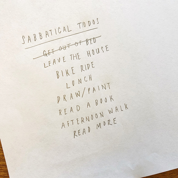
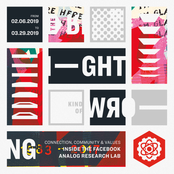
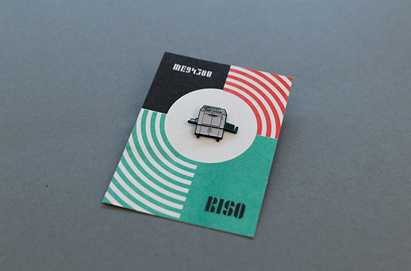
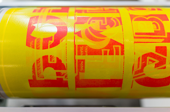
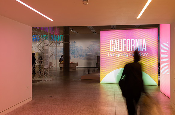
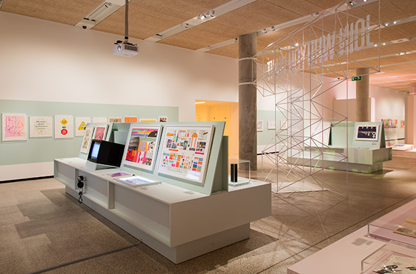
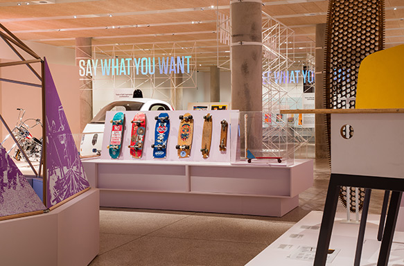
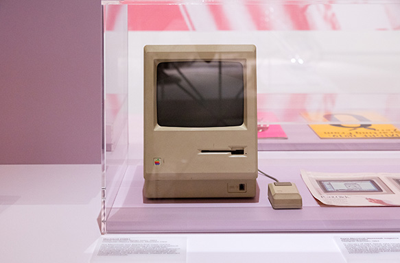
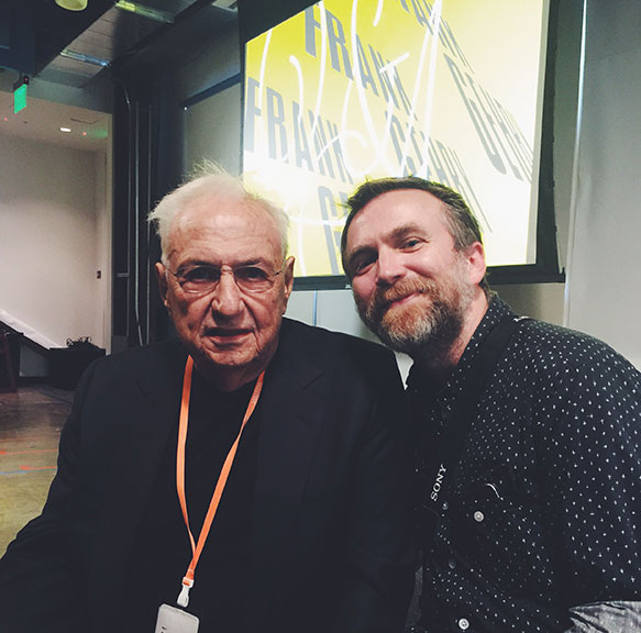
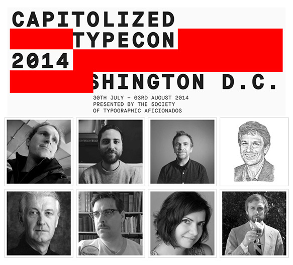
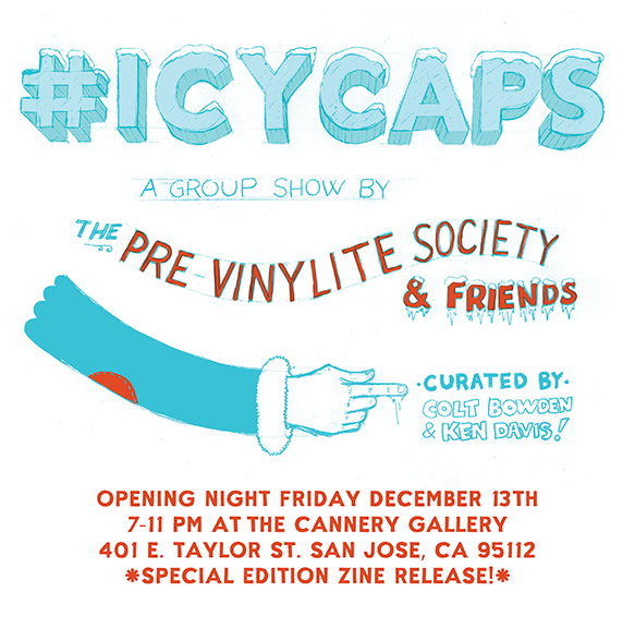
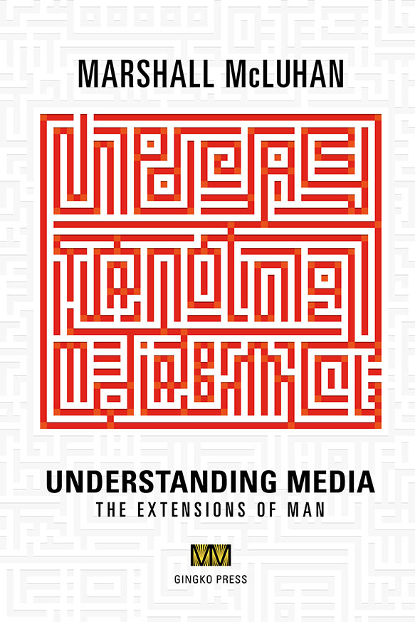
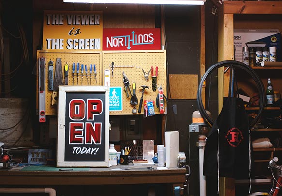
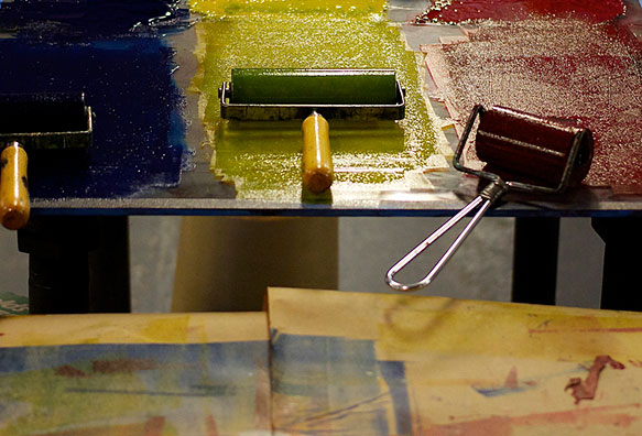
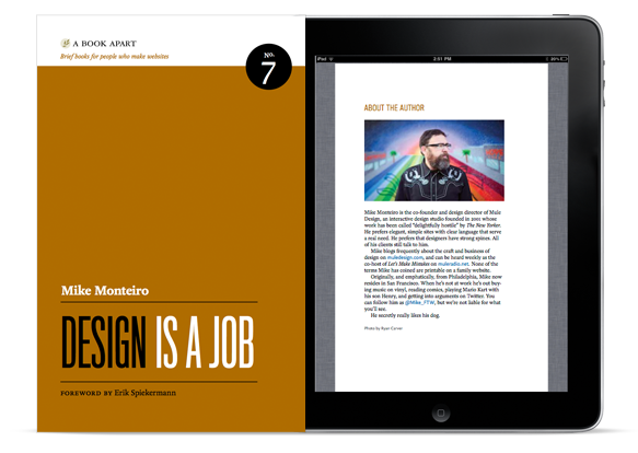


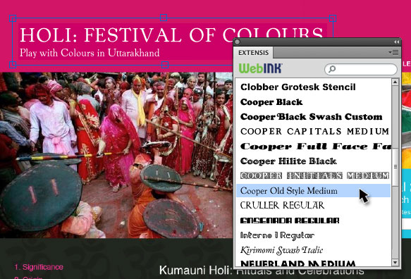
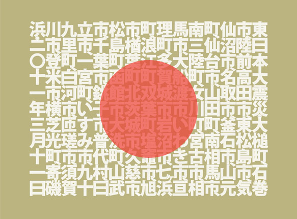
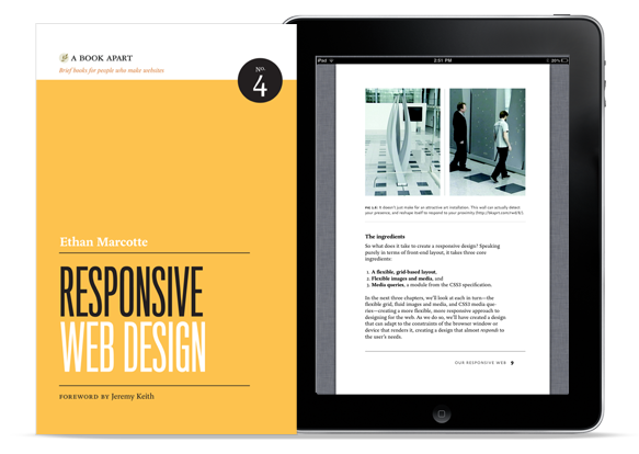
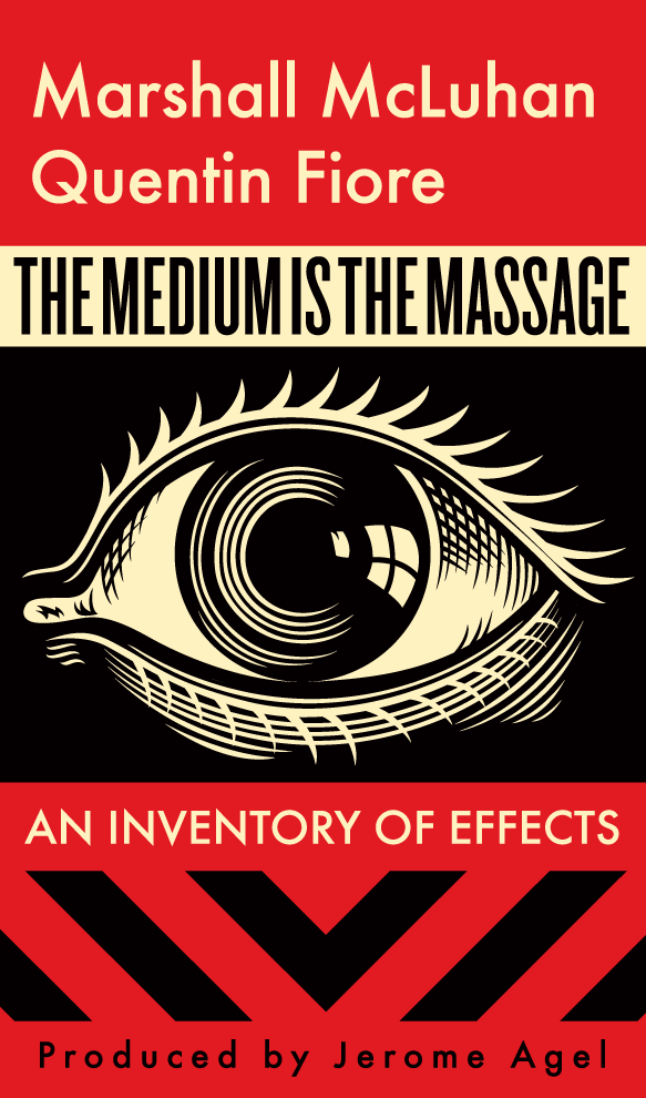
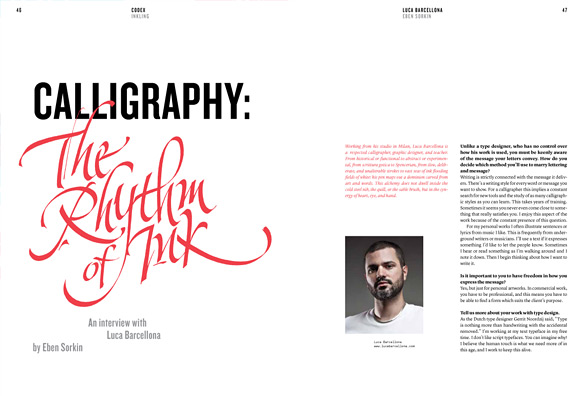
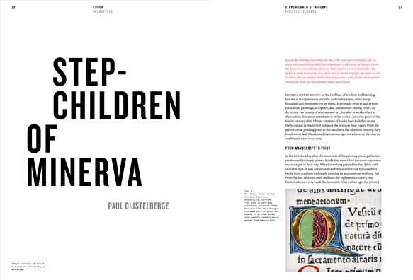
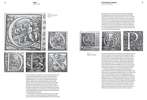
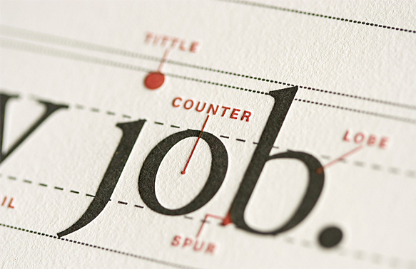
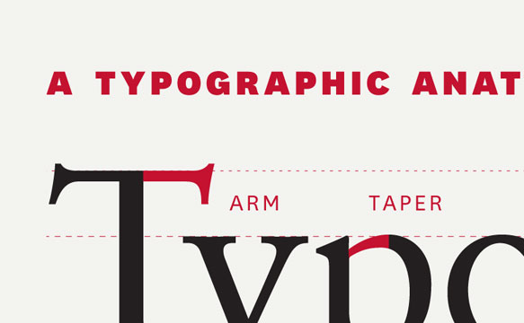
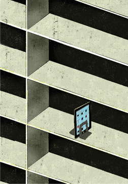
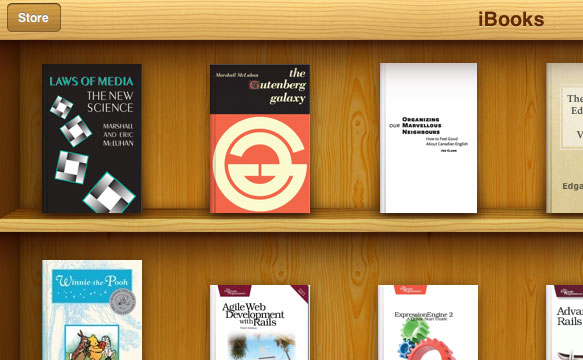
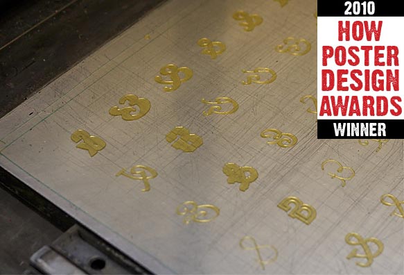
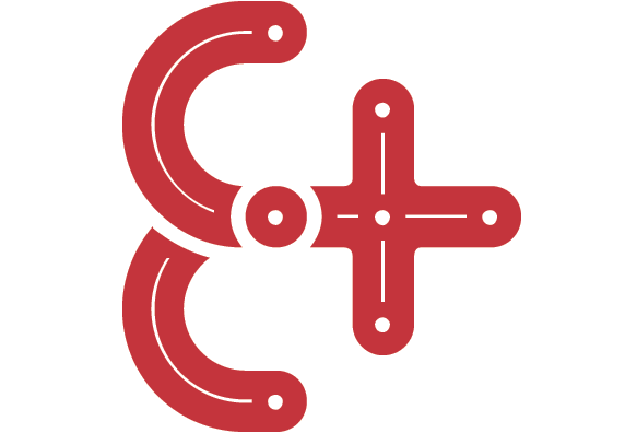
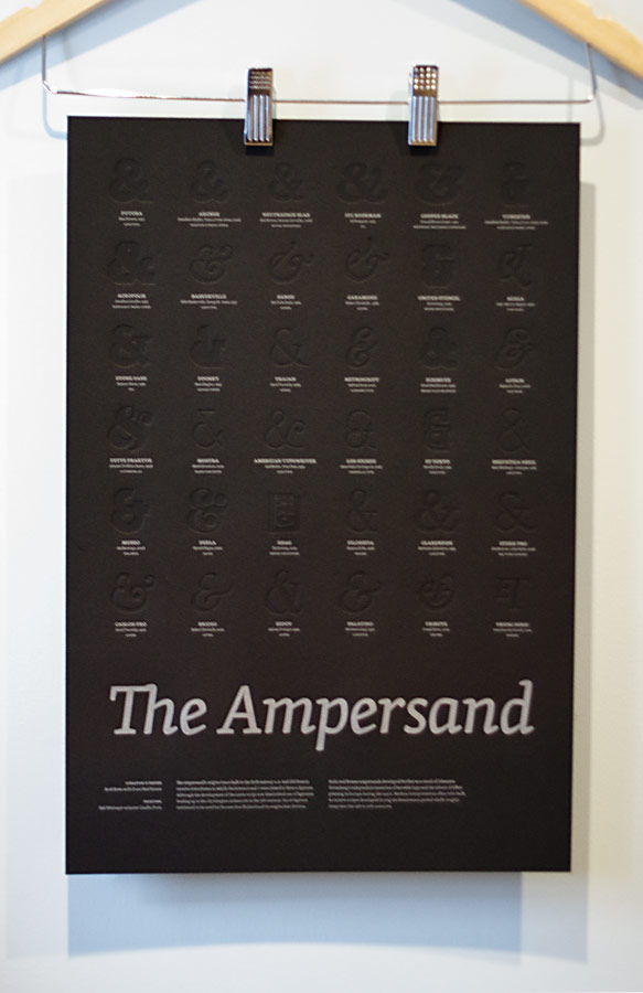
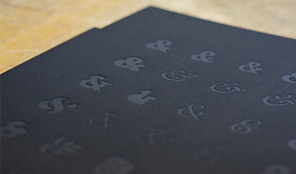
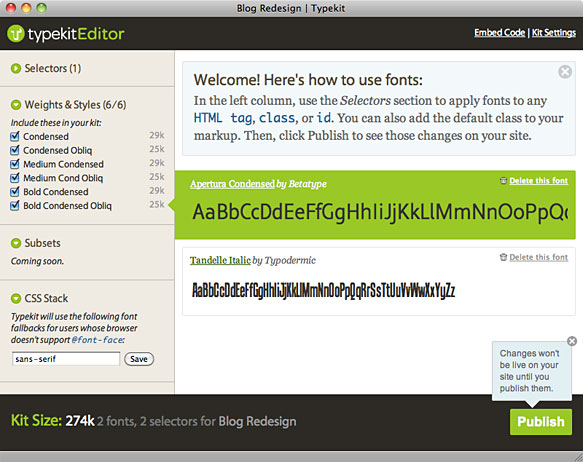

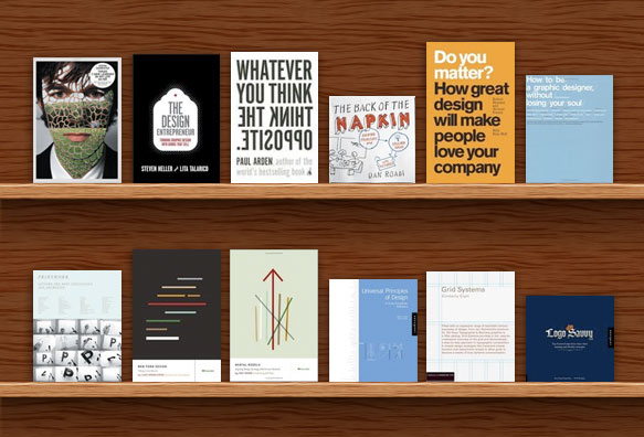

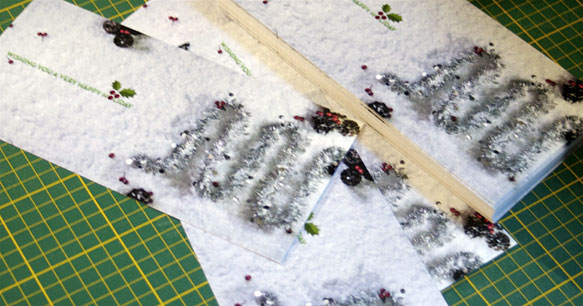
